|
|
|
Showing 711 - 720 of ~3731 |
| Image |
Comment |
| 08/09/2007 10:33:31 AM | Ladyby marvinComment: Greetings from the critique club :)
Well an image from Iceland! Cool! I don´t have a lot to say about this image so I´ll keep this short. First of all, I am not really surprised this shot didn´t do better cause I and probably heaps of other people are wondering how it ties in with the challenge as it appears to me that it´s taken out in the nature and nowhere near a street. It´s more what I would call a portrait.
The photo itself is pretty good, I actually like it except for the sky, I don´t mind blown highlights but in this photograph, I would have liked it much better had the sky been dark and gloomy to fit the feel of the shot much better. I do like the processing, maybe a tad too contrasty for my taste but nothing that is bothering me. I do like the b/w conversion and the toning of the image, nicely done.
Why only 513 pixles though? You have been here for more than 2 years and almost 200 challenges, surely you know that you will score better if you stay as close to the maximum allowed pixles as you can.
Anyway, nice shot, just don´t think it was in the right challenge, if it had been and also had been in a bigger rez, I think this would have easily gone over 6.
Kind regards from your own Iceland, Lárus. |  Photographer found comment helpful. Photographer found comment helpful. |
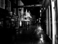
| 08/09/2007 10:18:11 AM | Streetlife in Yorkby SaswaaComment: Greetings from the critique club :)
Sorry but this is going to be a bit short, I don´t really have much to say about the image. It meets the challenge in my opinion, no doubt.
However, it´s pretty dark, too dark for my taste and there is well frankly not really something in the photograph that is interesting. Sure, there are people walking there but this is just another shopping street to me. I would vote this a 4 for those reasons. It´s not really a bad photograph but compared to the majority of the entries in this challenge, it simply doesn´t impress me.
Try using a longer shutter next time and use the histogram for metering, what you see on the back off the camera screen in nightshots can often be very misleading. Also I find it much better to take nightshots in the city not really by night but rather around sunset or sunrise, you have then an hour or half an hour window where you still have a hint of light in the sky and that often makes a very big difference.
Kind regards from Iceland, Lárus. | | Photographer found comment helpful. |
| 08/07/2007 12:51:22 PM | And then she kissed me!by dtremainComment: Greetings from the critique club :)
Well I want to start off by saying I probably would have voted this image a 4, 90% of that is I feel this image is shoehorned into the challenge by using the title to explain the photo, sorry but honestly, that´s how I see it. I just don´t see any extreme emotion in the photo itself, sure, the fireworks cleverly form the shape of a heart but where is the emotion in the picture itself? Sure, the title kindof explains that but I don´t really like when you need the title to explain the photo and try to avoid that at all times if I can, the photo should be able to stand by itself as an explanation as to how it meets the challenge, otherwise I could pretty much take just about any photo and explain how it fitted the challenge description.
I am really perplexed at the settings you used for this image, I usually use a much longer time and f11-16 aperture but I am glad this worked out for you, must have been difficult to time this properly. I use the other method, set up tripod, long time (usually 5-30 seconds or even longer) and f11-16 to make sure I get all of the firework, from start to finish, you must have known where the fireworks were going to explode :)
The photo then itself is pretty decent, the fireworks are well exposed, again I really like the shape of the blast making a heart and all the technicals and all that are pretty good. Sure, the composition is centered, but I don´t really see how you could have done anything different about that. Makes the photo maybe a bit like a "documentary photograph of a firework" since there is absolutely nothing else in the frame. I usually want foreground with firework, aurora borealis and lighting photos since that´s the only way those photos stand out from the rest, by themselves nightshots of these phenomenon are not really interesting to me.
Maybe had you taken a much wider shot and had a couple kissing in front of the firework, they just seen as silhouettes, this would have gotten a far better score, at least from me :)
Kind regards from Iceland, Lárus. | | Photographer found comment helpful. |
| 08/07/2007 10:38:56 AM | Romantic Eveningby NerveComment: Greetings from the critique club :)
I don´t really have too much to say about this image but I´ll do my best. First of all, I would have voted this shot a 5, means to me personally it´s not a bad photo but not good either. It definately meets the challenge, no question.
It´s just very hard to light glass, I have tried it and usually I think it works best if you try to put your lighting somewhere to the sides or way up or way down, as far away from the camera as you can get while still lighting the front side of the subject. You also have to be real careful about what is in the vicinity, cause when you shoot stuff like a wine bottle, or stuff that is curved i´ll pretty much show everything that is around it, like it does with those flower shaped lights (wich I actually like though). You essentially have to "package" the subject in, using white and black cards and just leave holes for the lighting and camera. That or get a lightbox :)
Having a candle in there makes it even trickier to light, you have to find out what setting works for the candle, so it doesn´t blow out as it did in this photo and then set the rest of the lighting to work around that, that´s pretty much the only way to do it if you want the candlelight to show well.
As for the rest, it´s all pretty well done, image seems clear and in focus, I don´t mind that the rose in the lower left corner is out of focus. You still should USM after resizing, not before, it´s generally the last thing you should do in the post processing phase. The white balance is a bit too warm for my taste but I am also glad it´s not neutral as it would lose that warm lighting from the candle so somewhere in between would have appealed more to me.
Kind regards from Iceland, Lárus. | | Photographer found comment helpful. |
| 08/07/2007 10:23:17 AM | Healthby LuguerComment: Greetings from the critique club :)
Well I just gave a critique on a very similar picture, (the one in the 26th place) and I can almost copy paste the comment I gave him, but first off, welcome to DPC and this is a nice way to start your career here, I did pretty much the same when I joined, scored a 6.1 something I think so keep at it.
It´s a nice shot, well done and I would probably have given it a 6 had I voted in the challenge. It´s pretty well lit and definately meets the challenge. All in all it´s pretty well done technically. I would probably have used something else than water in that glass, probably white wine and waited till it was not so misty, I think that mist on the glass is not really to my taste. If you wanted to give off the impression that the water is Ice cold, I would rather have suggested you just put an ice cube in the glass and water droplets on the outside, that would have done the job more pleasing to at least my eye.
I am not really surprised it didn´t score better, while well done there isn´t really anything that pops out from this picture, kindof mostly lacks that "wow" factor and I don´t know what that could have been. Something odd in or on the objects in the photo would probably have done the trick, like a worm coming out of one of the apples or a shark swimming in the glass (printing out one of course so it would fit, hehe) . Also I think personally I would have voted this higher if the backround had been an out of focus restaurant table instead of black but that´s just me.
Kind regards from Iceland, Lárus. | | Photographer found comment helpful. |
| 08/07/2007 09:51:40 AM | The Warmthby shalrathComment: Greetings from the critique club :)
I don´t have much to say about this image so I´ll keep this short. I do like it and probably would have given it a 6 had I voted in the challenge. It´s pretty well lit and definately meets the challenge. I would maybe have included some backlighting from the right had I taken this photo but not neccesarily sure it would have turned out better. Painting with light is well done and suits the subject. All in all it´s pretty well done technically.
However, I am not really surprised it didn´t score better, while well done there isn´t really anything that pops out from this picture, kindof mostly lacks that "wow" factor and I don´t know what that could have been. Maybe a goldfish swimming in that beer? The grinch reaching for the peanuts? Also I think personally I would have voted this higher if the backround had been an out of focus bar table instead of black but that´s just me.
Kind regards from Iceland, Lárus. | | Photographer found comment helpful. |
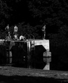
| 08/03/2007 10:38:48 AM | Adagio in B Minorby posthumousComment: Greetings from the critique club :)
Well well, I get assigned to one of your photos again, hehe :)
Again, I don´t really get how it ties in with the challenge, to me rythm was more about repetition of something, had maybe a couple of the boys been in the same position jumping into the lake or something, that definately would have met the challenge as I interpreted it but frankly, had I voted I would have given you the benefit of the doubt, however that doubt still would have prevented me from giving a very high score. Think I would have voted this a 6 because I really REALLY like the b/w processing work I am seeing from you lately, these tones really appeal to me and look very film like, wich is a huge compliment. Frankly am amazed you can pull off images with this b/w look with a p/s camera so coudos from you.
Composition is also very good, personally if I had processed this shot, I would have cropped it to a more square format, taking off the shadow at the bottom and a little bit off the trees at the top but I can understand why you decided to keep the crop as it is, it just would have appealed more to me personally if it was more square cropped.
Not really much more I can say except nice work, I dig it. Kind regards from Iceland, Lárus. | | Photographer found comment helpful. |
| 08/03/2007 10:18:43 AM | Balloons in the Sky Like Notes on a Scaleby Buckeye_FanComment: Greetings from the critique club :)
I don´t have a whole lot to say about this image so I´ll keep this shot. First of all, I don´t really see much rythm in the shot but I definately would have given you the benefit of the doubt and voted as it met the challenge, I probably would have given this a 6. It´s got great colors, both in the baloons and the sky. I don´t really understand why you used noise ninja on this shot, it´s taken at 100 iso and I suspect that created the halo´s around the baloons, something wich isn´t bothering me much but still would have been a better photo without the halo´s, whatever is causing them.
It´s a very pleasant photo to look at, lacks somehing to make it exceptional though, like a killer sunset sky or something but as it is it would probably make a decent postcard.
Kind regards from Iceland, Lárus. | | Photographer found comment helpful. |
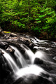
| 08/02/2007 11:06:29 AM | Parallelby jeroweComment: Greetings from the critique club :)
Well hello there buddy, what´s up! Personally think this image is underrated but still, I can understand the score. Think it mostly has to do with the fact that waterfall photos like this are very frequent there at DPC, especially during the summer months so you really need to put something extra into them these days to get high scores. You are of course aware of the blown highlights and definately think that hurt the score. I don´t really mind them, of course I would want more texture in those areas but they don´t really hurt the shot much I think, just a lot of DPC voters can´t stand them and draw away points for that.
At least the majority of the voters gave you a 6, that´s good. I don´t understand the high number of 4 votes, maybe people who are tired of waterfall photos like this and maybe some that didn´t really see any rythm to the photo.
Kind regards from Iceland, Lárus. | | Photographer found comment helpful. |
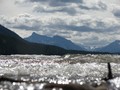
| 08/02/2007 10:43:19 AM | Rhythm of the Waves.by slytennisComment: Greetings from the critique club :)
Well I didn´t vote in this challenge but sorry, if I did I probably would have given you a 4. Most of that is due to the composition and depth of field and the fact that I don´t really see how it ties in with the challenge by just looking at the photo, I needed to see the title to see where you were going with this and I don´t think you should need to do that, use the title to explain how a photo fits the challenge.
The reason why I say so is because of your choice of composition and placement of depth of field, my eye is drawn nowhere near the moving water but instead at that mountain in the backround and the clouds, wich are pretty nice. I almost want to say I feel like the out of focus water is just in the way of what could have been a lovely photo of that mountain, I tried putting my hand over the bottom 1/3 or up to the point the water starts to be in focus and well I thought the shot improved a whole lot when doing that. Also that black object in the lower right corner is something that is really distracting me, I would have moved to the left and taken another photo without it or if that was not an option, taken it out while doing the post processing.
If you really wanted to show a photo that emphasized the movement of water as rythm, I would have just concentrated on that, taking a more closeup of a wave and let the backround just be what it may, here I feel like the backround is the main focus of the picture.
One other thing, the haze in the backround, it´s not really crystal clear and I think you just simply took this during the wrong time of day, try when going out to take landscape photos to stay close to either sunset or sunrise, you will get much softer lighting and usually less haze, your photos will have much more creamy lighting and be more pleasant to look at.
I think it´s good that you are experimenting by going down low close to the surface of the water and playing around with depth of field, definately keep up the experimenting, that´s the best way to learn.
Kind regards from Iceland, Lárus. | | Photographer found comment helpful. |
|
Showing 711 - 720 of ~3731 |
Home -
Challenges -
Community -
League -
Photos -
Cameras -
Lenses -
Learn -
Help -
Terms of Use -
Privacy -
Top ^
DPChallenge, and website content and design, Copyright © 2001-2025 Challenging Technologies, LLC.
All digital photo copyrights belong to the photographers and may not be used without permission.
Current Server Time: 08/17/2025 01:53:52 PM EDT.
|