| Image |
Comment |
| 07/29/2005 06:25:37 AM |
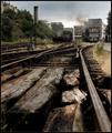
Railway Essentialsby KonadorComment: Well, normally I hate noise/grain but in this shot it works very well with the subdued colouring. Nice job and excellent choice. |
 Photographer found comment helpful. Photographer found comment helpful. |
| 07/28/2005 01:42:37 PM |
|
| Photographer found comment helpful. |
| 07/28/2005 01:38:05 PM |
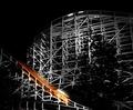
Coney Island's Bestby CutterComment: Cool, I am not a fan at all of selective desat but here it works very well, one of the best shots in the challenge as I am concerned. |
| Photographer found comment helpful. |
| 07/28/2005 01:33:53 PM |
Postsby tyrkinnComment: Barnafoss? I like the colours and sharpness but not terribly fond of the composition, IMHO it needs a foreground.
Ã�ááááfram Ãsland! |
| Photographer found comment helpful. |
| 07/28/2005 11:23:34 AM |
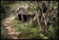
Fairyland by heidaComment: Nice, I love the subdued colours and the "mysteriousness" of this shot, great job, one of the best in the challenge IMHO. |
| Photographer found comment helpful. |
| 07/28/2005 11:17:20 AM |
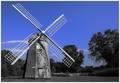
Weatheredby JayWalkComment: If I may be honest I think I would have liked it more if the whole shot had been b/w or in colour, this selective desaturation doesn´t appeal to me personally and also draws the attention to the sky instead of the windmill wich is presumably the connection to the theme "wooden". Having said that though I still think this is above average in this challenge, I like the composition. |
| Photographer found comment helpful. |
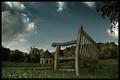
| 07/28/2005 11:10:07 AM |
Lonely Park Benchby deapeeComment: Nice scene, I like the composition but this shot has too much halo for my taste, in particular around the bench and also it´s a bit dark for my taste but I like everything else about it, 7 from me. |
| Photographer found comment helpful. |
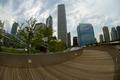
| 07/28/2005 10:13:12 AM |
Welcome To My Dream Spaceby flip89Comment: Clever use of a fisheye, I like the composition. It looks a bit flat though, maybe some more contrast would improve it? |
| Photographer found comment helpful. |
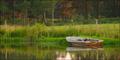
| 07/28/2005 10:10:02 AM |
Water Loggedby spydrComment: Nice, I like the framing, the 2:1 panorama crop works well here. |
| Photographer found comment helpful. |
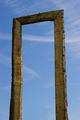
| 07/28/2005 10:06:32 AM |
portalby visaksenComment: I for one would have liked to see the surroundings about this portal, as it is not very interesting as it is right now. Also I believe this shot would improve if you had used a polarizer to make the sky more dramatic and there is a small dust spot almost in the dead center of the frame. In short I like this shot but due to all the reasons I just named it´s only an average shot in this challenge for me, 5 from me. |
| Photographer found comment helpful. |
Home -
Challenges -
Community -
League -
Photos -
Cameras -
Lenses -
Learn -
Help -
Terms of Use -
Privacy -
Top ^
DPChallenge, and website content and design, Copyright © 2001-2025 Challenging Technologies, LLC.
All digital photo copyrights belong to the photographers and may not be used without permission.
Current Server Time: 12/22/2025 12:12:00 AM EST.