| Image |
Comment |
| 09/21/2005 11:55:07 AM |
Hushby nico_blueComment: Nice job, even though it´s a tad too harsh for my taste the lighting works in this photo and I like the outcome, especially the green cast. 7 from me. |
 Photographer found comment helpful. Photographer found comment helpful. |
| 09/18/2005 08:26:36 AM |
We have never been to the Moon.by docpjvComment: Ohhh... the thumbnail looked so promising. What I mean is that the image quality is really lacking here, mainly the moon is too noisy (maybe because of an extreme crop?) Nice idea though and fitting for the challenge, 6 from me. |
| Photographer found comment helpful. |
| 09/18/2005 08:17:55 AM |
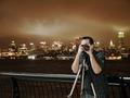
ICUCingMeby MPRPROComment: VERY nicely lit, how did you get him (yourself?) so well lit with the nighttime cityscape in the backround? Anyway, that itself makes a very otherwise normal and boring photograph interesting, not mind blowingly so but good job. 8 from me. |
| Photographer found comment helpful. |
| 09/18/2005 08:13:53 AM |
|
| Photographer found comment helpful. |
| 09/18/2005 08:12:37 AM |
"I've come to take over the World!"by banditComment: Nicely lit, no highlights and pristine sharp so technically very well done. I am not too fond of the pitch black backround though, this image would have scored higher with me if there had been an out of focus government building or even just a living room in the bakcround but still pretty nice, 6 from me. |
| Photographer found comment helpful. |
| 09/18/2005 08:09:16 AM |
The Puppeteerby MarkComment: Nice composition but way too much contrast for my taste, I definately want to see some texture and nuances in a photo and as far as I can see there are pretty much just two tones in the image, pitch black and deep red. Just wanted to explain why I only gave it a 5. |
| Photographer found comment helpful. |
| 09/18/2005 08:07:56 AM |
All in a Bookby kmbr2001Comment: Nicely lit, like the colours and tones in this image. I am not terribly fond of the composition though, I think I would have liked this image more if she were placed in the right corner of the frame and you would have had the same space to her left instead of her right. |
| Photographer found comment helpful. |
| 09/18/2005 08:06:48 AM |
The Face of Mental Illnessby L1Comment: Sorry but I don´t see how this is fits with the challenge theme at all. However, I like this shot, very nicely lit and totally disturbing, it has got a high visual impact so even though I personally think you are on a gray area regarding fitting to the challenge I still gave it a 7. |
| Photographer found comment helpful. |
| 09/18/2005 08:04:34 AM |
|
| Photographer found comment helpful. |
| 09/18/2005 08:03:56 AM |
What's a conspiracy?by okiesisiComment: Nice idea but either the focus is slightly off or this needs some sharpening, the boy is slightly blurred and as he is the main focal point of the shot I can´t help but deduct points for that. Also I am not really fond of the backround, the house is way to prominent and just draws attention from the boy and the plane... 5 from me as I like your thinking with this one, just not really fond of the outcome. |
| Photographer found comment helpful. |
Home -
Challenges -
Community -
League -
Photos -
Cameras -
Lenses -
Learn -
Help -
Terms of Use -
Privacy -
Top ^
DPChallenge, and website content and design, Copyright © 2001-2025 Challenging Technologies, LLC.
All digital photo copyrights belong to the photographers and may not be used without permission.
Current Server Time: 08/15/2025 09:29:09 AM EDT.