| Image |
Comment |
| 10/08/2005 07:45:48 AM |
Too much coffeeby alegugaComment: Nice shot, the coffee is well exosed and the backround is fitting, nicely lit and well composed.
I have to say though that I STRONGLY dislike the strong white frame with this relatively dark shot, it does nothing but draw my eye away from the shot. I know I am being anal and I normally frown on people that comment on frames but I just think this one is way overboard... I tried to ignore it for the vote though but I have a feeling I might have liked this shot more without the frame (or at least with a smaller frame...) 6 from me. |
 Photographer found comment helpful. Photographer found comment helpful. |
| 10/08/2005 07:39:44 AM |
San Quirico d' Orciaby GordonComment: Well, this shot is a bit hit and miss for me. I like the use of a slow shutterspeed but the fact that her head is motion blurred is "off" for me, if her head would have been still and her hands more moved I would have liked this shot heaps more. I like the composition though and the muted colours are fitting on one hand but on the other the backround with the people are too bright for my taste and draw too much attention. I was going to give this shot a 5 but I liked the "feel" of it and bumped to 6. |
| Photographer found comment helpful. |
| 10/08/2005 07:34:51 AM |
and a Slice of Cake please!by biggood53Comment: Jummy cake, wouldn´t mind a taste of that. However, this shot could use some sharpening, either that or it´s slightly out of focus and I gave a 4 because of that, I would have given a 5 if it were tack sharp. |
| Photographer found comment helpful. |
| 10/08/2005 07:29:34 AM |
Mocha choca latte yaya....by PollyBeanComment: A little bit grainy and dark for my taste but otherwise decent, I like the composition and DOF. However, it´s a bit flat, wouldn´t a small "s-curve" improve this shot heaps? 5 from me. |
| Photographer found comment helpful. |
| 10/08/2005 07:27:57 AM |
Pourable Breakfast with a Side of Sunshineby CoralComment: I can see where you were going with this but to be honest I don´t really like the outcome, take that with a grain of salt though as I really HATE lens flare and in this picture it isn´t flattering at all IMHO. I like the idea though, having a sunset in the backround but next time I would suggest you meter the whole scene according to the sun so that it´s not as overexposed and use a flash to light up the spoon to get a more balanced outcome. Also, if I might make a suggestion I would compose this almost the same but have the sun in the lower right corner instead of the middle but I like the placement of the spoon. 4 from me this time but I encourage you to try something like this again and experiment more with fill flash. |
| Photographer found comment helpful. |
| 10/04/2005 06:16:20 AM |
Dry martini?by hroiComment: Ohhh.. the thumbnail looked so promising... What I mean is that when I opened this shot there were a number of details that drag this shot down a little bit and all of them could have been avoided with just a little bit of effort on your behalf. To be specific, the drops on the table (or whatever surface the glass is standing on) just makes this seem sloppy and so do the water drops on the outside of the glass, like you were just lazy and didn´t make the time to clean up after each effort of the splash.
Anyway, sorry for the rant but I just hate to see such a good image spoiled with what I percieve to be laziness as I could very well have given this image a 9 or even a 10 if the only drops in the image were the ones in the air above the glass. To be clear though, I still think it´s one of the best in the challenge and I gave it an 8, I really like the splash part, great timing and this is very nicely lit and the backround is very fitting. |
| Photographer found comment helpful. |
| 10/04/2005 06:11:38 AM |
Harp; playing it smoothby peeteComment: Pretty cool, nice timing and the drop totally makes a pretty good but still just average shot to something much better. I also like that the image is very high key and the lighting is very good and so is the composition, one of the best images in the challenge as far as I am concerned, got a 9 from me. |
| Photographer found comment helpful. |
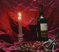
| 10/04/2005 06:10:10 AM |
Candle-Light Wineby ReallyColorBlindComment: Looks like you went totally overboard with brightening the backround as it looks very noisy and frankly I don´t understand why as the backround is pretty distracting and would have looked much better if it were darker. I also have to put a question mark about your composition as it´s both tilted downwards to the left and there is IMHO too much space to the right and not enough to the left. I still gave you a 4 as this is of course on topic but I think you can do much better than this, just put a little bit more effort in the image next time, that´s all... On the plus side the bottle itself is lit pretty well, normally I dislke glare in the glass but here it adds some interest to the shot. |
| Photographer found comment helpful. |
| 10/04/2005 06:04:26 AM |
Hot & Coldby barndogComment: A nice fit, that´s for sure. I gave this a 6 as I think it´s better than most shots in the challenge. On the downside I dislike that your glass is only half full and that there is no foam at the top, the beer glass would look so much more better if it were full with foam to the brink. On the plus side I like the grill portion of the shot, especially the flames that have nice texture and aren´t blown out as is easy to do with shots of fire. |
| Photographer found comment helpful. |
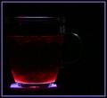
| 10/04/2005 06:00:08 AM |
Fruit Tea Firewaterby kari1Comment: Just way too dark for my taste, I am a big sucker for texture in an image and here there is hardly none so I coulnd´t give this more than a 4. Too bad as I like the lighting from the bottom idea and the composition... |
| Photographer found comment helpful. |
Home -
Challenges -
Community -
League -
Photos -
Cameras -
Lenses -
Learn -
Help -
Terms of Use -
Privacy -
Top ^
DPChallenge, and website content and design, Copyright © 2001-2025 Challenging Technologies, LLC.
All digital photo copyrights belong to the photographers and may not be used without permission.
Current Server Time: 08/15/2025 03:09:32 PM EDT.