| Image |
Comment |
| 11/28/2005 05:20:36 AM |
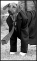
Suits Meby BrenbComment: Funny how that suit actually looks as if it fits him, wierd. Perhaps it´s the expression of the dog, can´t put my finger on it but he looks somewhat like a buisness man... Anyway, great job, like this shot, gave it an 8. |
 Photographer found comment helpful. Photographer found comment helpful. |
| 11/28/2005 05:06:04 AM |
Passionby zapgrafxComment: Very suggestive, like the whole idea behind the shot and the lightings good too, gave this a 7. |
| Photographer found comment helpful. |
| 11/28/2005 05:05:43 AM |
Back pain, joint pain, memory loss, metabolic efficiency, immune booster, energy, weight loss, appleby nico_blueComment: Ouch! Don´t envy the person that has to chow down on this daily :D
Like the shot, nicely lit, great DOF and good composition, gave it a 7. |
| Photographer found comment helpful. |
| 11/28/2005 04:45:27 AM |
Bad girl, bad girl, watcha gonna do ... ?by banditComment: Not really fond of selective desaturation just for the sake of selective desat and I don´t really see a purpouse to it here, my eye would still be drawn to the kids if it were in full colour or B/W as they are the only thing in the image that really draws attention. Anyway, selective desat aside I like this image, very fitting for the challenge and I love their expressions, makes the shot work. Gave it a 7. |
| Photographer found comment helpful. |
| 11/28/2005 04:39:37 AM |
mmmmmmmm...........by ericwooComment: I would suggest lighting this in another way than with a direct flash. It leads to ugly glare in the bottle and it totally blends in with the backround and frankly just looks snapshot like. Other than the lighting it´s ok, meets the challenge and composition is not bad. |
| Photographer found comment helpful. |
| 11/28/2005 04:35:46 AM |
Campus Of Adult Further Educationby BrianRComment: Too dark and oversaturated for my taste. Also this photo doesn´t have any meaning for me without the title as you can´t make out what the flag says, next time I would find an angle that will show what the flag says since that is the main point of your image. Gave this a 4. |
| Photographer found comment helpful. |
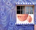
| 11/22/2005 12:41:05 PM |
Window Dressingby tembaComment: Pretty cool abstract, not 100% it goes with the theme of the challenge but I voted as if it did. Love the composition. |
| Photographer found comment helpful. |
| 11/22/2005 12:37:53 PM |
Buddyby rox_roxComment: Really nice image quality, good sharpness and colours. 7 from me. |
| Photographer found comment helpful. |
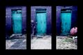
| 11/21/2005 05:42:42 AM |
Blue Backyardby gsalComment: In my opinion this is underrated, I really like it, especially the colours in it and a great idea for a triptych. I would probably have given this a 7 if I had voted.
There are two things that sort of make me think it might have scored higher. First, it doesn´t seem really sharp, did you forget to sharpen it after resizing it? Secondly, the black borders are a bit too much for my taste and kindof take away attention from the shots. |
| Photographer found comment helpful. |
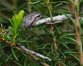
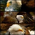
| 11/21/2005 04:43:29 AM |
Bird of Prey by CutterComment: Congrats on the yellow ribbon, hope you do´t take this the wrong way but I am glad you didn´t do better :D Excellent captures, all of them, I especially like the middle one and I would have given this a good rating if I had voted. |
| Photographer found comment helpful. |
Home -
Challenges -
Community -
League -
Photos -
Cameras -
Lenses -
Learn -
Help -
Terms of Use -
Privacy -
Top ^
DPChallenge, and website content and design, Copyright © 2001-2025 Challenging Technologies, LLC.
All digital photo copyrights belong to the photographers and may not be used without permission.
Current Server Time: 08/15/2025 06:52:46 PM EDT.