|
|
|
Showing 2661 - 2670 of ~3731 |
| Image |
Comment |
| 03/20/2006 12:35:52 PM | Strawsby OdieComment: This looks oddly familiar... :) |  Photographer found comment helpful. Photographer found comment helpful. |
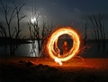
| 03/20/2006 12:35:19 PM | Ring by stare_at_the_sunComment: I like Nazguls version much better but this is pretty cool, the surroundings are cool. Just too much foreground for my taste. Anyway, one of the better shots in the challenge, got a 7 from me. | | Photographer found comment helpful. |
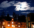
| 03/20/2006 12:34:32 PM | A Night At Homeby arjunasComment: The sky looks pretty awful, way to overexposed and not flattering at all. Next time I suggest you try and turn your back on the moon when doing nightshots, it´s so much brighter than your surroundings that there is no way to expose it correctly and the foreground other than with a double exposure. | | Photographer found comment helpful. |
| 03/15/2006 05:06:46 PM | Transitionby AnastasiaComment: Woohoo!!! Finally a ribbon :) Congrats, told Gary it wouldn´t be long and I am always right about these things, hehe. | | Photographer found comment helpful. |
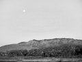
| 03/04/2006 12:50:24 PM | moon in the new mexican skyby blacksheepComment: Greetings from the critique club :)
Sorry but this is going to be a little short, this is one of those photos that I don´t really have that much to say about. It´s not bad, it´s not good either, very mediocre for my taste. To be honest, if I had voted, I would probably have looked at it for 1 second, given it a 5 and went on to the next one. There ist just simply nothing really interesting about this shot to me. I emphasize again though that it´s far from being bad though either.
As for meeting the challenge, it certainly does so in my eyes but I think (not sure so take this with a grain of salt) that technically "Duotone" means b/w with some other colour, like sepia toned, or green toned and such. While I would have voted it as meeting the challenge and I think that most people did since the challenge description specifically named b/w, I still think that a couple of people must have voted it with very low because it´s not a true duotone.
One other thing, I suspect this shot would look so much better in colour, with a deep blue sky and green trees and that hill probably brown and such. When I take a photo for a challenge, I try to to just that, take it FOR the challenge, not editing a shot to make it fit the challenge. I suspect you did just that, took a photo you liked that you took that week and just made it b/w to make it fit the challenge.
Sorry, I probably sound very negative for a photo that isn´t bad at all. I mean, it´s well exposed, the composition is good (not great though) and like I said, I would have given it a 5. I see that you are new at DPC, keep in mind that images that do well here usually have a "wow" factor, something people normally don´t see and this is definately lacking in that department. Try something outrageous next time and I´ll bet you will do much better :)
Kind regards, Larus. | | Photographer found comment helpful. |
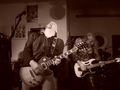
| 03/03/2006 05:14:47 AM | captain rockby KAIRYComment: Greetings from the critique club :)
First of all, let me wish you welcome to DPC, I see this is your first image here. A bit of a daunting task, to enter a 600+ entry challenge at your first go and only get 1 comment so I am glad I got this to critique.
I like this image but there are a couple of things about it that could have made it soo much better. I would have voted this a 5 if I had voted, wich is average with me and I would probably have gone with a 6 or a 7 if a couple of things would have been better in this shot.
First of all, your camera settings. 1/15th of a second is a pretty slow
so it will result in motion blur and an aperture of 4.4 is pretty small for indoor concerts. I don´t know what lens you used but when I take shots at concerts, I try to bring at least one with an max aperture of 2.8 or bigger since there is normally so little light available. I would have suggested settings such as at least 1/60, an aperture of about 2.8 or bigger and possibly a higher iso, like 800. I don´t mind the motion blur of the hands, it´s just that because of the slow shutterspeed, the head of the guitarist seems very blurry. Also, a bigger aperture would have blurred out the backround more, wich I find distracting.
Regarding the post processing, the image is very flat and could use a serious boost in contrast and also sharpening and it would look heaps better.
The composition is good, except for one thing, the head of the guitar is blocking the head of the guitarist in the back and that is bothering me a bit. Although the composition is good, it´s not great either, this is shot from a normal angle and not very exciting. Like I said, it´s composed well, I just think you could do better.
It certainly meets the challenge, no doubt about that.
Frankly I don´t understand the low score, well fortunately different people have different tastes but I would have given this a 5 and I have pretty high standards, I would have thought this had gotten a 5.28, not a 4.28 but then again, If I could predict how a shot would do beforehand and be all knowing, I would have 50 blue ribbons :)
All I can say is that I like it, mostly because it´s an exciting shot, good action and an allright concert shot. Use a faster shutterspeed and bigger aperture, increase the contrast and you would have a pretty good shot on your hands next time.
Kind regards, Larus. | | Photographer found comment helpful. |
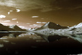
| 03/02/2006 08:52:04 AM | Tranquillityby gisliComment: Greetings from the critique club :)
Now this is going to be short and easy as there is pretty much nothing constructive or bad I feel I can say about this photo, you are one of my favorite photographers here and photos like this is one of the reasons. I really like this one, I would probably have given it a 7 if I had voted. It´s composed well, got a lovely tonal range, very serene scene and captured very well.
Still not the best that I have seen from you but I am not at all surprised it did so well in the challenge. Only to nitpick, the sky somehow isn´t awesome and I would have cropped out the white stuff in the lower right corner but other than that, very very good on all accounts. A photo I would have been proud to have taken myself.
As for meeting the challenge, dead on and absolutely. A worthy top 10 photo.
Kind regards, Larus. | | Photographer found comment helpful. |
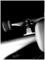
| 03/02/2006 08:12:59 AM | Skateboardby g3designComment: Greetings from the Critique Club :)
I am going to be a bit harsh but I think you can handle it, anyway, hopefully you value an honest opinion over a false one. The thing that popped straight into my head when I saw this is that I didn´t have a clue as to what I was looking at, and I don´t mean that in a good way like a good abstract, that captures your attention and doesn´t let go because you find it so intriguing that you simply must try and figure out what it was. It simply isn´t composed and lit interestingly, in my humble opinion ofcourse. Regarding the composition, there is just too much black space all around and no area in the shot that directly calls for attention except for that overexposed area that starts in the lower left corner and the front wheel that is in the right part of the frame is just barging in there like an uninvited guest, doesn´t hel at all. Wouldn´t this have been better if you had taken it at another angle and used the line of the side of the skateboard to guide the eye towards the wheels, starting in a lower corner and ending up in a top corner? As for the lighting, it´s too dark in the corners and too bright on the front of the skateboard, overexposing a big chunk of it...
To be honest, I would have voted this a 4. It simply isn´t a "WOW" type photograph and doesn´t seem like it´s very well thought out or that you put a lot of effort into it, just put your skateboard on the floor and blasted away with your flash. The stuff that normally does well here is the stuff that has that wow factor, stuff that stop the voter in his tracks and make him/her say, "wow, that is a beautiful photograph" or what I do constantly, "wow, why didn´t I think of that" :)
Sorry, I think I seem too negative here. I mean, it´s hardly a horrible photograph, I mean, 5 is average for me and 4 below average so it´s hardly that bad either. If you had composed this better, lit it with a more even lightsource things would have been quite different I think and you would have gotten a much better score. It is at least in good focus and quite a bit of people really liked it, you got 27 votes of 7 or higher so you hit the spot for a good deal of your voters and most of them gave it a 5 so it´s hardly bad. I just think you can do a lot better, that´s all :)
As for meeting the challenge, it certainly does so in my eyes but I think (not sure so take this with a grain of salt) that technically "Duotone" means b/w with some other colour, like sepia toned, or green toned and such. While I would have voted it as meeting the challenge and I think that most people did since the challenge description specifically named b/w, I still think that a couple of people must have voted it with very low because it´s not a true duotone. Anyway, a huge challenge and you ended up in the top 10% so that´s pretty well done, now keep at it :)
Welcome to DPC and hopefully this comment will serve as more of a "kick you in the ass and into the groove" rather than stop you from coming here.
Kind regards, Larus. | | Photographer found comment helpful. |
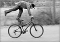
| 03/02/2006 07:48:32 AM | Flatlandby MadMan2kComment: Greetings from the Critique Club :)
First off, let me congratulate you at a new personal best, at least for now, I am very confident you can get a 6+ and soon too. I hadn´t even discovered photography when I was 16 so keep that in mind, you are lightyears better now than I was when I was 16 :) Keep at it dude!
I generally like this photo, I didn´t vote but would probably have given it a 6. I like the motion panning, just enough to blur out the backround but still keeping the bike and boy almost pristine sharp, I like that the rods in the wheels are blurred out (sorry, don´t know what they are called in english) I think this is an excellent choice to make black and white, I don´t think I would have liked this shot as well if it had been in colour. I am a big sucker for heavy contrasted b/w right now and this is perhaps a little bit too flat for my taste but it´s nothing that is bothering me, just a personal preference.
Regarding the composition, I feel it´s a little bit cramped towards the top, you almost cut off part of the boy so I think it would have been better to have slightly more room to the top and a little less at the bottom. I see you said you cropped this, if you have any more space at the top I would love to see a version like that.
As for meeting the challenge, it certainly does so in my eyes but I think (not sure so take this with a grain of salt) that technically "Duotone" means b/w with some other colour, like sepia toned, or blue toned and such. While I would have voted it as meeting the challenge and I think that most people did since the challenge description specifically named b/w, I still think that a couple of people must have voted it with 1, 2 and 3 votes because it´s not a true duotone. Anyway, a huge challenge and you ended up in the top 10% so that´s pretty well done, now keep at it :)
Kind regards, Larus. | | Photographer found comment helpful. |
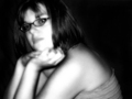
| 03/02/2006 05:39:11 AM | Simply Glowing!by Spartan151Comment: Greetings from the Critique Club :)
I am going to be a little bit brutal with you so just keep in mind that this critique is just about this one photo and not by any means any opinion on you specifically, just this one photo. Let me just start out by saying that I am not really surprised it didn´t do too well in the challenge, I myself would have probably voted this a 3 or a 4. Technically it´s nothing to shout hooray about, while the composition is not bad it´s nothing it´s just not exciting. The glow effect you put on it I don´t find flattering at all and in particular it blows out the highlights on her left shoulder, left knuckles and forearm and most of the face and since I am rather technically inclined, this is a huge drawback for me personally and enough for me to deduct points.
As for fitting the challenge, I think that is a bit of a stretch. What I immediately thought when I saw this shot was that it was a snapshot, like she was watching the TV and you disturbed her and snapped a shot as she was looking up. It´s a shame as she is a cute girl, I think you can do a lot better than this. I just don´t see what this shot has to do with fashion, and that is mainly why I would have voted it so low, this is more of a portrait look, tell me honestly, could you see this or a very similar shot in a fashion magazine?
Sorry for coming down so hard on you but I am just trying to be honest and if you dissagree, just keep in mind that I am no professional and have never even been to a photography class so what the heck to I know :) This is just my opinion.
A few good points though are that you have a good looking model so keep on using her, you captured the eyes pretty well wich is always good, people always look at the eyes first. Also the shot is in focus. Just put a little bit more effort into your entry next time and I am sure you will do better. Dress her up in something fashionable, if you don´t own fancy studio lighting, go outside in the "golden hour" and use available light that flatters the model and I bet the outcome will be much better.
Kind regards, Larus.
| | Photographer found comment helpful. |
|
Showing 2661 - 2670 of ~3731 |
Home -
Challenges -
Community -
League -
Photos -
Cameras -
Lenses -
Learn -
Help -
Terms of Use -
Privacy -
Top ^
DPChallenge, and website content and design, Copyright © 2001-2025 Challenging Technologies, LLC.
All digital photo copyrights belong to the photographers and may not be used without permission.
Current Server Time: 08/20/2025 09:04:11 AM EDT.
|