| Image |
Comment |
| 07/18/2006 11:05:05 AM |
Now all We need is a Mini Van.by BugzeyeComment: There is something that I can´t put my finger on regarding this photo that throws me way off, did you use a tool like shadow/highlights and took it to the extreme? Anyway, I must say whatever it is, wether the lighting was just very wierd that day where you were or if it was due to some PP tweaking this just looks wierd to me and I don´t really care for the outcome. 4 from me. |
 Photographer found comment helpful. Photographer found comment helpful. |
| 07/18/2006 11:00:10 AM |
Working on a six-packby snafflesComment: Like the idea, you just need to work on your lighting, have more of it specifically as this image is very very dark and extremely flat contrast wise. |
| Photographer found comment helpful. |
| 07/18/2006 10:59:30 AM |
|
| Photographer found comment helpful. |
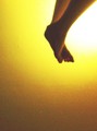
| 07/18/2006 10:59:01 AM |
Ascendingby lambie83Comment: Thumbnail looked nice but I was kindof dissapointed when I opened this shot, mainly for the lack of image quality. Specifically I dislike the out of focus feet, the noise in the backround and the blown out highlight in the upper corner and frankly gave this shot a 3, I think the image quality is that bad. Shame as I like the thought process behind the image and if you had executed it better I would have given this a MUCH higher rating. |
| Photographer found comment helpful. |
| 07/18/2006 10:57:37 AM |
|
| Photographer found comment helpful. |
| 07/18/2006 10:57:06 AM |
|
| Photographer found comment helpful. |
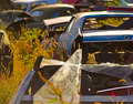
| 07/18/2006 10:56:43 AM |
Is this what we call progress?by willhadlComment: The broken glass that is out of focus and in front of the whole photo bothers me a bit, kindof an attention stealer but the rest of the shot I like, love the DOF and the coloring in it. 6 |
| Photographer found comment helpful. |
| 07/18/2006 10:55:25 AM |
|
| Photographer found comment helpful. |
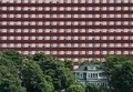
| 07/18/2006 10:53:37 AM |
Is Bigger Better?by KarenNfldComment: Nice juxtaposition of the houses, the backround house is a bit too busy though and draws too much of my attention that way. Maybe if you had desaturated the red in the shot so the color would not be so strong in them the image wouldn´t be so hard to look at. |
| Photographer found comment helpful. |
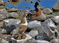
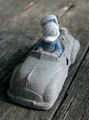
| 07/18/2006 10:52:08 AM |
Progressing toward Decayby elipsComment: I dunno what it is but I really like this shot, something about the sinister appearance of donald, he seems like he´s about to run over an old lady or something, lol! Nice lighting and tonality, great DOF. 7 |
| Photographer found comment helpful. |
Home -
Challenges -
Community -
League -
Photos -
Cameras -
Lenses -
Learn -
Help -
Terms of Use -
Privacy -
Top ^
DPChallenge, and website content and design, Copyright © 2001-2025 Challenging Technologies, LLC.
All digital photo copyrights belong to the photographers and may not be used without permission.
Current Server Time: 08/26/2025 08:50:36 AM EDT.