| Image |
Comment |
| 01/04/2007 06:30:40 PM |
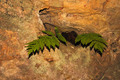
Fern in Caveby rod1Comment: Well sure, meets the challenge, no doubt. However, the lighting is what´s bothers me most, the obvious and harsh flash lighting to be specific. I see it´s shot in a cave (wich I find hard to believe, fern´s need sunlight to survive but whatever...) but that´s no excuse since your subject is stationary. A tripod, longer shutter and softer lighting coming from some angle than on camera would dramatically have improved this shot :) 4 from me. |
 Photographer found comment helpful. Photographer found comment helpful. |
| 01/04/2007 06:28:39 PM |
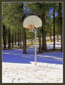
Got Game?!by elizadebComment: Well this is a shot that I say is neither bad nor good but two things dragged it a bit under 5. Usually I don´t really mind blown out highlights but here it kindof steals attention from the main subject, the basket. Secondly, the composition is hardly horrible but too centered for my taste, a shot wich had placed it better in the frame, perhaps according to the rule of thirds would have appealed more to me. 4 from me. |
| Photographer found comment helpful. |
| 01/04/2007 06:26:43 PM |
|
| Photographer found comment helpful. |
| 01/04/2007 06:20:48 PM |
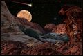
The Red Planetby BradComment: Well this is good, nice job with the processing. Two things though that bother me. First is the lighting on the foreground, it comes from a wrong direction on the red rocks that are in the front part of the photo and I would suggest darkening them. The other is the very slight movement of the stars, I either want them stationary or with very definitive startrails and this is somewhere in between but that´s just my personal preference. I like this outcome though and gave it a 7. |
| Photographer found comment helpful. |
| 01/04/2007 06:16:47 PM |
Declaration of Warby StrikeslipComment: Nice shot, lighting is ok and the backround is kindof cool, wish you had done a bit better job with the masking though as the top of their heads hairlines give it away but that´s just nitpicking :) |
| Photographer found comment helpful. |
| 01/04/2007 06:13:20 PM |
Limits by JudiComment: Well this is nice, I almost want to guess this is Gary´s work but processing not quite up to his usual level so if it is your´s, you got a little sloppy this time. Mainly the shadows and burning around the man give it away and the "a little over the top" sky and sunlight also not quite 100% to my taste. I still like this image a lot and gave it a 7 so don´t get me wrong and if this isn´t Gary, then at least I compared you to Kiwiness and that can´t be all bad :) |
| Photographer found comment helpful. |
| 01/04/2007 06:10:26 PM |
Twenty Below by Sunshine86Comment: I really dig this shot, not much more I can say but not enough for a 10 though, something missing for that but good enough for 9 from me and I am picky :) |
| Photographer found comment helpful. |
| 01/04/2007 06:09:46 PM |
Blizzardby JutildaComment: Well maybe it´s cause I have taken photos in a real blizzard several times and know what photos in them usually look like but this just screams "fake" to me when I opened the shot. I still like it though, don´t get me wrong and I really dig the composition. You probably know this though and while it doesn´t bother me, blwon highlights/white areas with little texture usually draws negative scores and comments here at DPC so if you are new, keep that in mind, people can be very anal about blown highlights here. 8 from me. |
| Photographer found comment helpful. |
| 01/04/2007 06:05:54 PM |
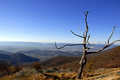
Winter Morning at Red Pine Mountainby jrtoddComment: Well, I have seen  arnit arnitdo similar stuff but they work much better in my opinion cause all of them are with the same color tone and hue and no black and white inbetween, that´s what mostly bothers me with it, also the fact that some of the squares are not really squares at all but have an odd shape, this just seems so chaotic and poorly though out if you pardon me for saying so while his collages of pictures look more organized and well laid out. Not bad though but not good either, makes the image too busy for my taste and I voted a 5. |
| Photographer found comment helpful. |
| 01/04/2007 06:01:50 PM |
No Giant Stepsby raishComment: Well three things bother me with this shot and made me vote a 3. The first and smallest thing is that there is no face in this shot to make me identify with anyone. Then I dislike the image quality, fisrt the color noise, most visible in the hands and then the selective desaturation, most visibleon the brown cap and blue jacket towards the tops.
Thirdly and this is the big thing, that backround just really looks fake and unreal and just doesn´t do it for me, sorry :( |
| Photographer found comment helpful. |
Home -
Challenges -
Community -
League -
Photos -
Cameras -
Lenses -
Learn -
Help -
Terms of Use -
Privacy -
Top ^
DPChallenge, and website content and design, Copyright © 2001-2025 Challenging Technologies, LLC.
All digital photo copyrights belong to the photographers and may not be used without permission.
Current Server Time: 08/22/2025 04:14:17 AM EDT.