| Image |
Comment |
| 09/07/2005 06:04:08 PM |
Death & Lossby AlexSaberiComment: **Critique Club**
Revisiting this photo I am again impressed. I remember this one well and thought that it would place better than it did. I had stated during voting that it might "do better in B&W with higher contrast". Typically when you see cemetary shots, they are higher contrast and in black and white. Your image would probably have appealed more to the masses had you taken this route, but you chose a different take on the "norm" and here I think it works.
The colors of the gravestone give it an almost sepia tone, but the greens in the grass add an interesting element of color. I really like the muted colors and personally feel that they add to the overall feel of the image. IMO the tilted perspective on the gravestone adds to the feeling of Loss in the image. The composition is good, but may be improved a little by off centering the gravestone to the left just a tiny bit.
Personally the only thing I can find that I don't like about the image is the blown out sky. Maybe some creative burning of the "hot spots" would have helped, but honestly I think that had you have taken the exact same shot just a few minutes later with a little different cloud cover, it would have placed much better.
Overall I do like the image and I stand firmly by the well deserved 7 I gave you during the challenge. |
 Photographer found comment helpful. Photographer found comment helpful. |
| 09/07/2005 01:51:40 PM |
Don't Lookby CaltropComment: **Critique Club**
Initial impression is that I agree with all of the comments you received during the challenge. The image is awfully busy, but don't be so hard on yourself. The capture itself is a good one! It's excellent stop motion and you captured the moment very well. Your timing on the shot was near perfect IMO. The biggest thing that takes away from the image is the cluttered background.
On further inspection, a few other details become obvious. The focus on your subject seems just a touch soft and his left foot is chopped off. This was probably due to the inherent drawbacks of trying to capture stop motion (and one of the reasons I don't even try). The expression on his face is priceless.
I agree with the other comments on using a shallower DOF to reduce the background clutter. My eye is also being drawn to the vibrant colors of the green sliding board in the background. A little selective desat and burning may have helped reduce that particular distraction. I think your cropping would have been dead on if you had a simple background, but with all of the clutter, cropping out more of the left side may help reduce some of the distraction in this case.
I also can't help but wonder if a B/W version with a little creative burning in the background might help also. Overall this is a great example of stop motion and a good image. I hope this helps and I look forward to seeing more of your work in the future.
As a side note I looked at your portfolio... You have some great images in there. Keep shooting!!! |
| Photographer found comment helpful. |
| 09/06/2005 02:16:25 PM |
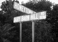
Dairy Barn Hillby bs-photosComment: *Critique Club*
Let me start by saying this was a very unique take on the challenge. The challenge details state "Take a photograph where the subject relates to milk or milk products" and the lack of actual dairy products may have accounted for the relatively low score.
My immediate impression of the photo was that the sign posts are a bit overpowering and could have been avoided with a little tighter cropping on the sign. A few commenters mentioned the flat contrast which I tend to agree with, particularly in the lettering of the sign. The sign also seems to get a little lost in the busy background of trees and shrubbery. Perhaps a slightly different angle that does not include the trees (if possible) could help bring more attention to the sign itself. The power lines in the upper left corner of the image also tend to draw the eye away from the sign. This also could have also been avoided with a slightly different angle and/or cropping.
Personally I like the "out of the box" thinking that led to this image and overall I think it's a good photo that could be dramatically improved with a few minor adjustments.
I look forward to seeing more of your work and good luck in future challenges! |
| Photographer found comment helpful. |
| 09/02/2005 07:13:43 PM |
|
| Photographer found comment helpful. |
| 09/02/2005 07:10:41 PM |
Difficult Lifetimeby Joey LawrenceComment: Way to capture the emotion!!! I love it. The focus seems just a touch soft, but feels right in this particular image... I'm afraid.... point off for no "&" or "and" in title. -7 |
| Photographer found comment helpful. |
| 09/02/2005 07:09:34 PM |
|
| Photographer found comment helpful. |
| 09/02/2005 07:09:08 PM |
|
| Photographer found comment helpful. |
| 09/02/2005 07:02:33 PM |
|
| Photographer found comment helpful. |
| 09/02/2005 06:57:16 PM |
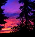
Dahila & Lightby mystical_princessComment: Ummm... not to sure about your spelling, may want to check that one. I love the image though and the water droplets make it. I'm so so fussy on the spelling, but others may be. - 8 |
| Photographer found comment helpful. |
| 09/02/2005 06:54:46 PM |
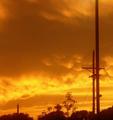
Dawn in Lane Countyby bcobleComment: Colors are over saturated and blown out in some areas... The image as a whole seems a bit noisy. I'm being a little harsh because I see so much potential in this image... I would like to see the unedited version. This one just feels too overprocessed, then again, maybe it's me. Oh and..... point off for no "&" or "and" in title. |
| Photographer found comment helpful. |
Home -
Challenges -
Community -
League -
Photos -
Cameras -
Lenses -
Learn -
Help -
Terms of Use -
Privacy -
Top ^
DPChallenge, and website content and design, Copyright © 2001-2025 Challenging Technologies, LLC.
All digital photo copyrights belong to the photographers and may not be used without permission.
Current Server Time: 06/19/2025 07:54:38 AM EDT.