| Image |
Comment |
| 11/16/2005 12:38:24 PM |
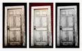
Which Door?by rexComment: Hmm... same image with three separate processing techniques. I'll have to say, I'm not a huge fan of the repetitive image (personal taste). The white background also seems to make the overall composition very busy to me. |
 Photographer found comment helpful. Photographer found comment helpful. |
| 11/16/2005 12:36:30 PM |
U3by ArtanComment: Uhm is that ewe 3? Really I like the image and title. Good overall composition. |
| Photographer found comment helpful. |
| 11/16/2005 12:33:46 PM |
Changeby TooCoolComment: Nice choice. The background is a little too busy for my taste. Maybe if the background image were darker with a little less contrast, it might help. Overall I like the image though! |
| Photographer found comment helpful. |
| 11/16/2005 12:28:32 PM |
Pre-Gameby alanfreedComment: I like the yellows and reds. Your use of color really ties the images together. |
| Photographer found comment helpful. |
| 11/16/2005 09:02:07 AM |
|
| Photographer found comment helpful. |
| 11/16/2005 08:57:11 AM |
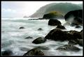
Stormy Seas at Dawn by DrAchooComment: WOO-HOOO!!!! Big Fat Way To Go there Doc!!! I've been following your work pretty closely, I'm very glad to see you ribbon on this one!! |
| Photographer found comment helpful. |
| 11/15/2005 01:41:46 PM |
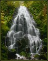
Fairy Falls Outtakeby DrAchooComment: Great shot Doc! This is a great example of a "centered" shot working very well. The shutter speed is perfect and gives a very surreal feel to the image. I am a huge fan of "misty falls" pictures. The greens also add an interesting element of color to the image. Did you shoot this on shutter-priority, aperture-priority, or manual? I think the shot is very well composed, but my only nitpick is the borderline/slightly blown highlights at the top of the waterfall. A little tweaking with the aperture/shutter speed in manual would've easily fixed that. Personally if I were voting on this image I would easily give it an 8, maybe higher. |
| Photographer found comment helpful. |
| 11/14/2005 02:20:24 PM |
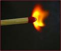
Not the DEAD End of a Match Stick....yet!by AzCKellyComment: Your timing on this shot was impeccable. The color of the flame is great, but the lighting on the matchstick is rather flat. I agree with Rikki on the border. The focus is OK but seems a little soft. I also feel the gray background is rather bland and a black background could give more "punch". One other small nitpick is the wordiness of the title. Personally I prefer short titles (for the most part). Your title seems like an attempt to force the image to fit the challenge. |
| Photographer found comment helpful. |
| 11/14/2005 01:48:56 PM |
|
| Photographer found comment helpful. |
| 11/14/2005 01:47:11 PM |
|
| Photographer found comment helpful. |
Home -
Challenges -
Community -
League -
Photos -
Cameras -
Lenses -
Learn -
Help -
Terms of Use -
Privacy -
Top ^
DPChallenge, and website content and design, Copyright © 2001-2025 Challenging Technologies, LLC.
All digital photo copyrights belong to the photographers and may not be used without permission.
Current Server Time: 06/21/2025 02:15:22 AM EDT.