| Image |
Comment |
| 11/12/2004 01:32:02 PM |
Septemberby jrs915Comment: A very light and delicate shot. The colours are very good and compliment each other well. The repeating curling plants take the eye into the picture and give it depth. The use of DOF is good and I think just right. Well done a six from me. |
 Photographer found comment helpful. Photographer found comment helpful. |
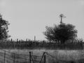
| 11/12/2004 01:29:45 PM |
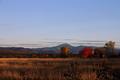
Augustby Prime_TimeComment: Let me start with the score, get it out of the way, a six from me. Now as to why, I like this kind of image and have tried to make them myself. The graininess and poster like edges give it an interest thats hard to define. I feel that the cropping is a bit out, I think less sky and more of the interesting looking foreground fence would be better. Also changing position so that the windmill is not hidden behine the tree cound have given interest in the distance. Well done though, a good shot. |
| Photographer found comment helpful. |
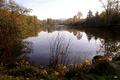
| 11/12/2004 01:25:43 PM |
Novemberby CantiqueComment: A nicely composed shot, a couple of points that didn't let me score it higher. The tricky lighting conditions here with the dark foreground and the bright light reflected from the water means just that, the foreground is dark, ist not that bad though. The bright sky is washed out, almost all white. A graduated filter may have helped darken the sky and allowed a brighter foreground. Its also a bit hazy in the distance, maybe the direction of the light or the time of day. Well done though a nice image. A six from me. |
| Photographer found comment helpful. |
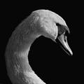
| 11/12/2004 01:20:47 PM |
October (Audubon Calander)by ellamayComment: Excellent shot. Its sharp, well composed, the light is good, the black background is used to good effect. Not quite as good as a few other images I've seen in the challenge but something to be proud of, I would be. Well done a 7 from me. |
| Photographer found comment helpful. |
| 11/12/2004 01:17:50 PM |
Novemberby jjbeguinComment: Stunning is the word that comes to mind. The hole in the clouds is very burnt but is balanced by the reflection on the water, very dark in the distance, a very dramatic effect. The row of houses is almost surreal in contrast to the background. The subdued colours helps the mind fit them into the image.
There's a graininess to the image, I don't know if its intentional or just as a result of the settings of the camera but it works quite well. The houses seem to dip down ever so slightly to the right, I find it distracting once I've noticed it.
Never the less a dramatic image and the winner in my opinion, a 9 from me.
|
| Photographer found comment helpful. |
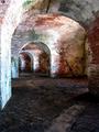
| 11/06/2004 08:05:45 AM |
Fort Pike - New Orleansby cpurserComment: I don't usually like people in my shots but in this case I thing one of more figures could have impoved it. I think its because of the large area of empty middle ground?
The colours are very good and the exposure I imaging would have been a bit tricky. The wall of the frist arch on the left is a little burn out but that's where the light is hitting from the source around the corner. The detail of the brickwork is nice and the cracks add atmosphere. There seems to be a lot of sharpening but I don't think is overdone.
The series of arches leads you into the shot but then cuts you off without something to focus attention on. I know that's not within your control but I'm just pointing out things that would lift the image a bit higher.
Its possible the shot might work better by darkening it and giving it a moody mysterious feel? At the moment its quite light and airy. Just an idea?
Its very nice I like it, well done a six from me. |
| Photographer found comment helpful. |
| 11/06/2004 07:28:37 AM |
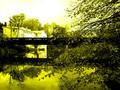
Serene Reflectionby whatdewucComment: A nice scene the colours are well captured. Is the misty effect natural or was it added?
The thing that first struck me when thinking of things that don't seem quite right was the horizon being right on the halfway mark, I think cropping most of the sky out would have helped the image. The next thing was the composition. The trees and shoreline on the right lead the eye down to the water and there needs to be something there for the eye to rest on. The trees that are there in the water are not a strong enough feature to hold the eye. The log? sticking out of the water in the middle of the shot crosses the division of water and land but not totaly and confusses things. I thing cropping and a slightly different viewpoint would have improved things.
Still a very nice image, well done. |
| Photographer found comment helpful. |
| 11/06/2004 07:20:37 AM |
The Valleyby soupComment: A pleasing view with some nice colours. I think there's a little too much sky in the shot and not enough foreground. I ssay that because the sky is a bit bland, had there been dramitic clouds then yes show lots of it.
I think the shot is a bit dark as well, the plants in the foreground anre almost silloetted. Also everthing seems to be happening on the right hand side of the shot. The mountains, the trees, the foreground interest are all towards the right.
Something else that keeps bugging me is the fact that the horizon doesn't seem quite level? It seems to be down to the right? With seascapes and landscape shots having the horizon absolutly level is critical. In this case it may just be an illusion but, the effect is still there and can be corrected.
To summarise, a change of viewpoint to balance the action and include more foreground. Lighted the image slightly. Correct the sloping horizon effect. Sorry if this long comment seems like I'm pulling the image to bits, that's not the intention. Its a nice image which coud be made better, well done. |
| Photographer found comment helpful. |
| 11/06/2004 07:09:23 AM |
Légaré Millby grandmarginalComment: I've been playing around with duotone images myself, (I assume this is a duotone?). Quite a pleasing composition, nice reflections. The highlighs are a little harsh I think.
I'm not sure that the yellow is the right tone for my taste but hey if it works for you that's what counts the most. Nice shot, well done. |
| Photographer found comment helpful. |
| 11/06/2004 06:57:54 AM |
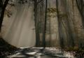
Pathway of Lightby scalvertComment: Amazing shot, one I've tried to capture many times without sucess. I lioke the way there is colour in the leaves yet most of the shot seems to be mono. Not sure if its selective desat or just the high contrast that makes it seem that way? Thats the way an effect should be subtle but still create the effect. The dappled light gives depth and the 3D effect, the road leads you into the shot, its a pity it bends off to the left so much but I guess the light wasn't going to hang around for too long and wait for you to better compose the shot? Excellent, a 10 from me. |
| Photographer found comment helpful. |
Home -
Challenges -
Community -
League -
Photos -
Cameras -
Lenses -
Learn -
Help -
Terms of Use -
Privacy -
Top ^
DPChallenge, and website content and design, Copyright © 2001-2025 Challenging Technologies, LLC.
All digital photo copyrights belong to the photographers and may not be used without permission.
Current Server Time: 08/22/2025 06:12:57 PM EDT.