| Image |
Comment |
| 04/08/2005 12:02:06 AM |
Chewyby gtroiaComment: This doggy and jacket had the potential for a great shot. The background is way too distracting. It really turns it into a snap shot rather than a portrait. With a solid background and a bit sharper focus this would be great. |
 Photographer found comment helpful. Photographer found comment helpful. |
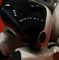
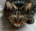
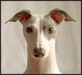
| 04/08/2005 12:00:38 AM |
Sleeping... so adorable!by MatthewComment: The crop here is a bit too tight or the DOF a bit too shallow. I had no idea what I was looking at and had to enlist help to figure it out. After I discovered the ear, it became a bit clearer. |
| Photographer found comment helpful. |
| 04/07/2005 11:56:19 PM |
|
| Photographer found comment helpful. |
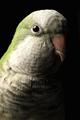
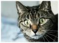
| 04/04/2005 11:49:06 PM |
Myiopsitta Monachusby hstegComment: I really like the dark treatment here. It really shows off the detail captured. Good job. |
| Photographer found comment helpful. |
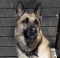
| 04/04/2005 11:48:06 PM |
Jakeby cadbikeComment: Great great eyes. I would have cropped this much closer to eliminate the distracting elements of the house. In on the right to the shoulder and on the left to balance. Beautiful dog. |
| Photographer found comment helpful. |
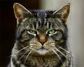
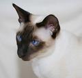
| 04/04/2005 11:43:52 PM |
Old Blue Eyesby agwrightComment: The only thing I see wrong with this shot is the angle. The down the ear angle is not flattering. Beautiful eyes. |
| Photographer found comment helpful. |
| 04/04/2005 11:40:45 PM |
|
| Photographer found comment helpful. |
| 04/04/2005 11:40:33 PM |
|
| Photographer found comment helpful. |
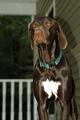
| 04/04/2005 11:39:30 PM |
Majestic Dogby johncoComment: This is a beautiful animal and nice composition with the exception of the missing lower half of the legs. I would recommend including either no legs or all of the legs in the shot. Another issue is the lighting/flash. The shadow on the wall is a bit distracting. I like the upward angle and the choice of background. |
| Photographer found comment helpful. |
| 04/04/2005 11:34:32 PM |
Stanley by ChasSourekComment: I really like the symetry of this shot. This works quite nicely as a dead center composition. The only thing keeping this out of my 10s is the odd shadow in the eye on the left. A tiny bit more light on that side would make this perfect. Great work. |
| Photographer found comment helpful. |
Home -
Challenges -
Community -
League -
Photos -
Cameras -
Lenses -
Learn -
Help -
Terms of Use -
Privacy -
Top ^
DPChallenge, and website content and design, Copyright © 2001-2025 Challenging Technologies, LLC.
All digital photo copyrights belong to the photographers and may not be used without permission.
Current Server Time: 08/26/2025 08:45:17 AM EDT.