| Image |
Comment |
| 10/02/2004 08:14:40 AM |
Lancing Collegeby marboComment: I think this is an interesting shot. I like the way the building is Illuminated, however I would've reduced the frame to exclude at least the buildingwhere the windows are lit up. 6 |
 Photographer found comment helpful. Photographer found comment helpful. |
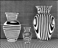
| 10/02/2004 08:12:02 AM |
Vases Filled With Waterby GolferDDSComment: I really like this picture. It does a good job of creating an interesting illusion while making the viewer take more time to look at it. Nice work. 8 |
| Photographer found comment helpful. |
| 10/02/2004 08:10:58 AM |
Mercyby hopperComment: This is a good portrait. I like the clarity you've captured in this picture; on her face and the tree as well. I just don't like the stray hair to the right of her face. 6 |
| Photographer found comment helpful. |
| 10/02/2004 08:10:03 AM |
Granite Totemsby rcrawfordComment: I love the vibrant blue color of the sky. If really does a good jub contrasting with the totems. I also like the bushes to the left of the shorter one. 7 |
| Photographer found comment helpful. |
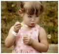
| 10/02/2004 08:08:29 AM |
Captivatedby sherComment: This is an interesting photo. You've indeed captured a good look on her face at the right moment. Her dress sort of makes this picture timeless, however the wristband throws off the facade. I do like the color though, it makes me feel as if I'm in the 50s. If only the wristband weren't there. 7 |
| Photographer found comment helpful. |
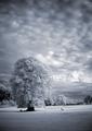
| 10/02/2004 08:06:18 AM |
hole 12, par 4by willemComment: Upon first seeing this photo I thought it was the middle of winter in an overcast day. The black and white really holds the viewer's attention and makes them look deeper into the photo. Great job with composition and subject. 8 |
| Photographer found comment helpful. |
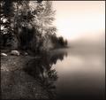
| 10/01/2004 07:38:48 PM |
Misty Morningby jodiecostonComment: Has this been B&W or Sepia? I would've kept the original colors for this picture. The mist doesn't pop out like it should with the colors of this picture. The reflection in the lake is nice, I really like the ripples. 6 |
| Photographer found comment helpful. |
| 10/01/2004 07:37:35 PM |
|
| Photographer found comment helpful. |
| 10/01/2004 07:36:58 PM |
"Back" Cover Girlby DougPazComment: Great idea, very creative! The only thing I would change is the surroundings. I like how it lines up, but it would be better on a chair not so large with a white background, in my opinion. 6 |
| Photographer found comment helpful. |
| 10/01/2004 07:35:56 PM |
Parrot Portraitureby buzzrockComment: So many great bird pictures! Great detail in the beak and feathers, my only dislike is the eye is a bit dark, and the white space seems a bit washed out. 7 |
| Photographer found comment helpful. |
Home -
Challenges -
Community -
League -
Photos -
Cameras -
Lenses -
Learn -
Help -
Terms of Use -
Privacy -
Top ^
DPChallenge, and website content and design, Copyright © 2001-2025 Challenging Technologies, LLC.
All digital photo copyrights belong to the photographers and may not be used without permission.
Current Server Time: 08/26/2025 02:07:48 AM EDT.