| Image |
Comment |
| 11/20/2004 11:38:54 PM |
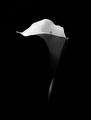
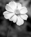
Calla Lilyby Keith ManiacComment: An excellent representation of the challenge! Love it! Lighting is great, lines, shadows, textures...you captured it all. 10 |
 Photographer found comment helpful. Photographer found comment helpful. |
| 11/19/2004 11:06:38 PM |
|
| Photographer found comment helpful. |
| 11/19/2004 10:43:56 PM |
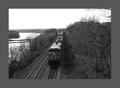
Heading Northby cdn1Comment: I think this would have more appeal for me without the think border..hmm... |
| Photographer found comment helpful. |
| 11/18/2004 10:38:38 PM |
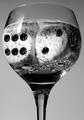
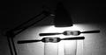
Dice Cubesby DCThiessenComment: hmm...hmmm...thinking outloud! TOL? anyway...this would be absolutely floawless to me and meets the challenge for me. I have one flaw and it is bugging me...the glare on the front of the glass just over the di on the left. 8 |
| Photographer found comment helpful. |
| 11/17/2004 10:56:18 PM |
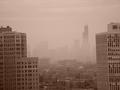
From Here to Downtownby TTraxxComment: I don't think this classifies as palette of grays. A nice shot, but would have fit the challenge better without the tone. |
| Photographer found comment helpful. |
| 11/17/2004 10:54:30 PM |
In Bloomby rshekarComment: great use of all the elements: light, shade, line, texture and form |
| Photographer found comment helpful. |
| 11/17/2004 10:32:33 PM |
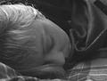
As My Love Sleeps...by taterbugComment: With all the 'debris' in the picture, it seems more like a scanned image. I guess I'm just not that fond of grain. It's just me. |
| Photographer found comment helpful. |
| 11/17/2004 10:25:48 PM |
|
| Photographer found comment helpful. |
| 11/17/2004 10:08:44 PM |
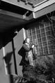
Untitledby GoldBerryComment: I like the shadow of the lampost and the white lines of the bars against the darker window, but the face of the model is a bit washed out by the light source. It is the only thing that disappoints me here. Otherwise...nice! One more think...I would have cropped out the roof. It changes where my eyes are drawn completely. I am viewing the picture now with the image cust off just above the models head. It is find this way for me....add that roof, it gets a bit busy! |
| Photographer found comment helpful. |
| 11/17/2004 10:01:57 PM |
|
| Photographer found comment helpful. |
Home -
Challenges -
Community -
League -
Photos -
Cameras -
Lenses -
Learn -
Help -
Terms of Use -
Privacy -
Top ^
DPChallenge, and website content and design, Copyright © 2001-2025 Challenging Technologies, LLC.
All digital photo copyrights belong to the photographers and may not be used without permission.
Current Server Time: 08/04/2025 01:34:15 PM EDT.