|
|
|
Showing 831 - 840 of ~2853 |
| Image |
Comment |
| 08/24/2015 06:48:10 AM | It is meal timeby tigerluongComment: *Hello from Sid and the Critique Club*
An appealing nature study that meets the open challenge.
Having commented and voted highly I get another opportunity to comment in more detail about your entry! I still like the subject and the way you have captured them but with closer inspection there are also aspects of the processing that I am not so keen on.
I assume you have used flash here which has blown highlights on the edge of the birds beaks and detail on the adult bird. Although you have used a low ISO there appears to be significant noise which is most unexpected it is probably a result of processing which has left quite an unnatural look.
I repeat I do like the subject, given your technical details your camera must have been very closely positioned to them assumedly triggered remotely? I'm sorry you didn't do better with this image but I have to say I think the processing let it down in the end. Thanks for your entry and good luck with your future entries, Sid |  Photographer found comment helpful. Photographer found comment helpful. |
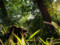
| 08/24/2015 06:14:55 AM | a feast of lightby posthumousComment: *Hello from Sid and the Critique Club*
An alternative approach that does not meet the challenge.
I'm imagining this the way it would normally be taken with the dog in sharp focus and the background trees soft and, to be honest, preferring it as I would expect it. I'm all for an alternative approach but it has to have a meaning this does not convey your meaning to me at all. The theme of the challenge is the golden hour, the sky that can be seen through the trees and the harsh shadows on the dogs face and the angle suggests that this was not the case, it feels more like a midday sun.
I do like the foreground grasses and the way the light is illuminating the blades, I also like their soft focus, I think without the dog this may have worked better. But, the dog is the obvious focal point, spoilt by the deep shadows on his face but equally by the fact that he is restrained by a lead when I want to feel his dynamic energy bounding freely through the lovely grasses.
I have been fortunate to critique other images from you, as you know, and I do like your alternative approach that often gives us added value but this one doesn't work for me, sorry, Sid | | Photographer found comment helpful. |
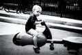
| 08/24/2015 05:56:50 AM | Ready to fly? Varoooomby Ja-9Comment: *Hello from Sid and the Critique Club*
A fairly pleasing portrait that meets this open themed challenge.
A portrait of a child at play that in itself will naturally have appeal to most viewers, and it does but there are several things about it that set it apart I assume intentionally but it doesn't work that well for me.
The moment you have captured is one that feels more posed than natural and his expression does not convey the sort of pleasure I would hope to see in this situation, there seems to be a degree of apprehension in his face. He is too central in the frame I would prefer to see him further to the left but I think this side on viewpoint could have been improved upon with a change of position looking up the seesaw towards him with him against a much less distracting background. Talking of which the chosen aperture has given you more DOF than is desirable for this composition.
The thing I have the biggest problem with is the processing, and again I assume you have deliberately chosen to present it in this way but I don't know why. I find it much too contrasty and grainy. I can only assume you have tried to emulate an old box brownie type of snapshot? This would make it a lot more understandable if you have and is starting to make a bit more sense to me now. Together with the other aspects I have commented on it feels as though you intended it be interpreted much more with the snapshot theme in mind, in which case well done.
As you can see that interpretation was initially lost on me and I'm sure, most of the viewers here, but well done for approaching it in this manner, (if you have), Sid | | Photographer found comment helpful. |
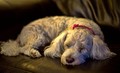
| 08/24/2015 05:36:21 AM | Catching a cat (nap)by RyanWComment: *Hello from Sid and the Critique Club*
A cute portrait that meets this open challenge.
A lovely engaging image of your pet doing what they seem to do a lot of, though your clever title conjures up visions of the dog chasing and catching cats in his dreamy slumbers. A good title is, I think, an essential element of the image and what the photographer had in mind when creating the image and is helpful to tell the viewer more about the image as a whole, so thanks for that.
I do like the image as a whole, I like the shallow DOF which enables us to focus on his head with his body in nice soft focus. What I am not so keen is the harshness of the light, it is forming a contrast on his ear that is too intense for the rest of this lovely peaceful soft light that enhances his fur, this small patch I'm afraid, does not, for me it detracts from the image as a whole.
I'm sorry you didn't get any comments during the challenge, I hope this helps, Sid | | Photographer found comment helpful. |
| 08/24/2015 05:25:55 AM | Crossing the Bridgeby RedIrishComment: *Hello from Sid and the Critique Club*
An engaging candid portrait that meets this open challenge well.
She looks a confident lady at one with the world and herself, a good opportune capture, well done. I like your composition with her walking into the frame but there is perhaps some 'dead' space above her that could have been replaced with a lower shot to perhaps generate a little more interesting view of her. She has a very dynamic pose that suggests she is a girl who knows where she is going, I love her red hair flowing in the breeze.
Your exposure is good and the perspective and DOF suggests this was taken at your maximum aperture for the focal length which is very appropriate for the shot. T~here's nothing you could have done about it but its a shame the bridge itself is in some need of maintenance. All in all a nice well executed image, well captured.
Thanks you for your submission, Sid | | Photographer found comment helpful. |
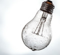
| 08/23/2015 07:23:22 AM | Frozen Lightby clickodakComment: *Hello from Sid and the Critique Club*
An original image that meets the challenge well.
I like your concept it it fits the challenge very well and your composition is very good, well done. The angle of the light, the very slight cropping and its position within the frame are all ideal for the subject. I like the ice and the water on the bulb it works very well adding another intriguing element to the image.
What I am not so keen on is the background, I wish it were a more uniform white throughout it would give the image even more impact than it already has. Having said that there may well be people here who prefer it this way, that is just my personal preference.
I think you have done a great here Marcel, thoroughly deserving of your high score and placing, well done, Sid | | Photographer found comment helpful. |
| 08/23/2015 07:00:23 AM | Once upon a time....by clickodakComment: *Hello from Sid and the Critique Club*
A cute image but does not meet the challenge.
The concept is cute and very appealing having the two teddies reading the book together tugs at the heartstrings and makes you go into soft mode! However, the execution could have been better, I don't think the focus is soft as your commenter has observed but the problem is a lack of sharpness which is due to camera shake. It may be that you used a tripod, I don't know, but at these sort of speeds unless you use a remote release you will introduce camera shake as soon as you press the shutter release. A way round this if you don't have a remote is to use the camera's self timer.
Your exposure is good and I like the chosen aperture and focus point on the eyes, I like the way the book in the foreground is in soft focus enabling us to focus on the bears themselves.
A very appealing image Marcel, sorry it didn't score higher for you, Sid | | Photographer found comment helpful. |
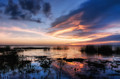
| 08/22/2015 09:15:34 AM | w a t e r s • e d g e by Ja-9Comment: *Hello from Sid and the Critique Club*
Congratulations on your second placing for a very appealing image that fully meets the challenge.
Your landscape is most suitably chosen for the challenge being all about the quality of the light. Not only do we get the benefit of the lovely skies but we get the lovely reflections too.
The exposure is good throughout with nice detail and tones. Your composition is good though I think I would have given slightly more emphasis on the water and placed the horizon a little higher to take advantage of more reflections and plant silhouette shapes.
Another very pleasing submission Janine well done, Sid | | Photographer found comment helpful. |
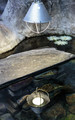
| 08/22/2015 08:32:53 AM | Light reflectionby clickodakComment: *Hello from Sid and the Critique Club*
An interesting take that meets the challenge well.
You have come up with an interesting concept to fulfil the challenge, your chosen scene adds further appeal. Your chosen aperture has created a shallow DOF and your focus is softly on the reflection which actually works quite well.
I do find the lamp itself which is in sharp focus rather bright and overpowering it dominates over the much more appealing lower half of the shot. I think a crop excluding the lamp would improve the shot a lot. I've just noticed one of your commenters remarks which seems to concur with what I have just said.
Thanks Marcel for an interesting approach to the challenge, Sid | | Photographer found comment helpful. |
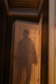
| 08/22/2015 08:08:52 AM | Back from the 40'sby mrjssimsComment: *Hello from Sid and the Critique Club*
A reasonable attempt that meets the challenge well.
You've achieved the desired effect on your subject but he just feels rather static and uninteresting. The lighting is uneven with the right of your 'ghost' much lighter than the left with a clear dividing line just right of centre top to bottom.
I'm not sure if you intended to have a ghost of the door too but the double exposure on the door for me spoils the effect in a way that is detrimental to the end result as a whole. Also spoiling the image is the lean to the right, it would benefit from straightening. A crop excluding all of the right up to the darker doorway would also help. I don't want to appear too negative, your commenters and voters have obviously appreciated it more than I but my suggestions are the things that I would have done to improve it.
Thanks for your submission, Sid | | Photographer found comment helpful. |
|
Showing 831 - 840 of ~2853 |
Home -
Challenges -
Community -
League -
Photos -
Cameras -
Lenses -
Learn -
Help -
Terms of Use -
Privacy -
Top ^
DPChallenge, and website content and design, Copyright © 2001-2025 Challenging Technologies, LLC.
All digital photo copyrights belong to the photographers and may not be used without permission.
Current Server Time: 06/22/2025 09:06:25 PM EDT.
|