| Image |
Comment |
| 06/01/2016 06:36:22 AM |
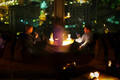
Isolated Perspectives II: Dividing Glassby riotComment: Hello from the Critique club
An excellent image that meets the challenge well.
Wow! What a steady hand you have! If I can pass on a tip that I use in low-light situations, a piece of string attached to the bottom of the camera long enough to reach the floor with your foot on it pull up hard against the string and hand-holding 1 second becomes a doddle.
Thank you for your detailed write-up which adds a lot about your motivation and thought processes which, unfortunately, the voter wouldn’t have had access to but really this deserved a higher score than you received. I do like the blur of the waiter I like the shallow DOF and I like all the glass elements and their different functions, it also illustrates how divorced we become from each other with these mobile contraptions that dominate our everyday existence. As you can tell, I like it a lot for all the reasons you’ve stated, I can imagine myself in exactly the same situation doing very similar and also playing with the other images you’ve thoughtfully included. I think we have to recognise that it may have a limited appeal but I do think you could have improved it with a closer crop excluding the foreground furniture and honing in on the couple so, same format clipped bottom and sides.
Thank you for a very stimulating image Eugene. |
 Photographer found comment helpful. Photographer found comment helpful. |
| 05/31/2016 05:38:53 AM |
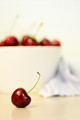
s w e e t • c h e r r yby Ja-9Comment: Hello from the Critique club
An appealing image that meets the challenge.
I like the concept and execution with the minimal DOF but I think it could have worked better. I find the cloth on the right very distracting I don’t think it contributes to the end result, quite the opposite. Also I think if you had shot from a lower angle putting the bowl of cherries lower in relation to the front cherry it would have improved the end result too. I do like the off-centre composition it works well. I also like the generally high-key result.
Thank you for your entry Janine |
| Photographer found comment helpful. |
| 05/25/2016 12:22:45 PM |
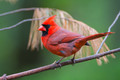
Male Cardinalby DrakeComment: Hello from the Critique club
An appealing study that meets the challenge well.
Good sharp accurate focus of this vividly coloured little fellow, what bird wench could possibly resist him! My initial reaction is that the background is a little distracting but then it could be argued it adds interest to what would otherwise be a plain background. Because it is obviously part of the tree on which he is sat I would say it adds to the overall effect. His alert posture certainly adds impact to the image. Well seen and taken. |
| Photographer found comment helpful. |
| 05/24/2016 04:43:30 AM |
|
| Photographer found comment helpful. |
| 05/23/2016 05:39:41 AM |
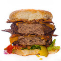
Bacon double-cheeseburger + hungry food photog....by snafflesComment: Hello from the Critique club
An appetising image that meets the challenge
Cor blimey Susan, I bet that kept you going for an hour or two! How do you keep your lovely figure with all that maple syrup and ginormous burgers? It stands out well against the white backdrop. Looking at Bear music’s comment I wonder if it is over-sharpened or its the highlights of flash that are evident amongst the textures? It looks as though the sharpening has adversely accentuated those highlights making them more obvious than is probably desirable. What I am more concerned about is the chromatic fringe on the edges particularly on the right, it does detract somewhat for me.
The things you have to do in the name of art, thanks for your submission Susan. |
| Photographer found comment helpful. |
| 05/22/2016 05:46:59 PM |
Panic !!! by clickodakComment: Congratulations Marcel, another very well deserved ribbon for a dynamic and excellent image |
| Photographer found comment helpful. |
| 05/22/2016 05:30:40 PM |
Auburnby riotComment: Hello from the Critique club
An appealing image that meets the challenge
A lovely portrait of a lovely model. The lighting is very effective with a lovely contrast between light and shade that gives a lovely modelling to her face. However, that very shallow DOF is not quite working perhaps as well as it could. The dominant eye is her left but it feels ever so slightly softer than her right eye which is in the shade and therefore less dominant though sharper. I love both the colour, shape and varied textures of her lovely hair it looks lovely. Her gaze is, as you say, both forceful yet somewhat neutral at the same time, very enigmatic.
Thanks for your submission |
| Photographer found comment helpful. |
| 05/22/2016 05:17:52 PM |
r h y t h m  by Ja-9Comment: Hello from the Critique club
An appealing image that meets the challenge
Another successful return to a familiar theme Janine, congratulations on your ribbon.
Thanks for your submission |
| Photographer found comment helpful. |
| 05/22/2016 05:15:39 PM |
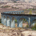
The Hogwarts Curveby MAKComment: Hello from the Critique club
An interesting image that meets the challenge
What an admirable feat and enduring legacy of railway engineering! Your image has captured some lovely detail in this magnificent structure yet, it all somehow fails to convince in an obscure way. The landscape itself feels strangely barren with a patchy smudginess particularly around some of the clumps of trees as though there has been some post-processing applied in certain areas? Given the detail in the man-made structure against the natural though unconvincing background it somehow feels as though it has been transposed onto the scene, I’m not saying that is the case but that is the effect. Also, magnificent a structure as it is, it just doesn’t feel an ideal choice of subject for the square crop, I’m sorry, but it all feels rather uncomfortable in a hard to define sort of way, it’s just not working for me.
Sorry you didn't get any comments during the challenge, I hope this makes up for it. Thanks for your submission Marac |
| Photographer found comment helpful. |
| 05/08/2016 07:13:07 AM |
Water & Waxby riotComment: Hello from the Critique club
An interesting image that makes a significant contribution to the free challenge
It’s pleasing to see you experimenting to find a unique angle to make your images stand out, well done. I would say, that in the main, the angle has worked though the wide angle distortion does have an effect that it is not always easy to control in a creative way so whilst its obviously distorted on the edges of the frame, because her hair is hanging over the edge of the bath the elongation is perfectly acceptable. The things I like less are all the blown highlights from the candle-only lighting which is inevitable to retain all of the important detail of the lady in the bath. The other thing is her right leg looks as though it has been amputated, its nice to have the leg raised but only slightly out of the water would have been better. A crop of just the bath alone significantly improves the end result, do we really need to see the end wall? Finally, some colour balancing would also have improved it.
Thanks for your original idea Eugene |
| Photographer found comment helpful. |
Home -
Challenges -
Community -
League -
Photos -
Cameras -
Lenses -
Learn -
Help -
Terms of Use -
Privacy -
Top ^
DPChallenge, and website content and design, Copyright © 2001-2025 Challenging Technologies, LLC.
All digital photo copyrights belong to the photographers and may not be used without permission.
Current Server Time: 08/29/2025 10:39:17 PM EDT.