| Image |
Comment |
| 02/08/2005 03:50:58 PM |
|
 Photographer found comment helpful. Photographer found comment helpful. |
| 02/07/2005 06:25:58 PM |
|
| Photographer found comment helpful. |
| 02/07/2005 06:22:27 PM |
|
| Photographer found comment helpful. |
| 02/02/2005 06:29:17 PM |
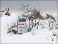
'S No Emergency Hereby Bear_MusicComment: Nice colours and decent composition but somehow I think that some more space to the right or to the top would help. -8 |
| Photographer found comment helpful. |
| 02/02/2005 06:26:51 PM |
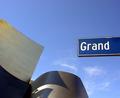
A Grand Concert Hallby beckettbootsComment: One of a very few that makes sense outside the challenge. Nice use of space. Beautiful flow and shadows in the building. A slight clockwise rotate would have straightened the sign. Perhaps a tad oversharpened? (9) |
| Photographer found comment helpful. |
| 02/02/2005 06:23:44 PM |
|
| Photographer found comment helpful. |
| 02/02/2005 06:21:03 PM |
Keep Leftby ArnarpComment: Funky.
Would a tighter crop at the top and bottom increase the impact? (6) |
| Photographer found comment helpful. |
| 02/02/2005 06:17:50 PM |
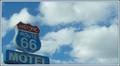
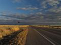
Good advice by BrennanOBComment: Strong balanced composition with a nice flow. One of a few images in the challange that the roadsign really fits the image. (9) |
| Photographer found comment helpful. |
| 02/02/2005 06:16:11 PM |
Lonely Signby supradaComment: A good idea. Perhaps a lower or a higher viewpoint would have made a greater impact. |
| Photographer found comment helpful. |
| 02/02/2005 06:14:43 PM |
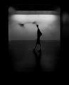
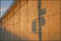
A Shadow of Its Former Selfby adyusComment: Very original. Good composition and colour. One of a very few images that has a mood to it. A very poetic title.
Good work. (9) |
| Photographer found comment helpful. |
Home -
Challenges -
Community -
League -
Photos -
Cameras -
Lenses -
Learn -
Help -
Terms of Use -
Privacy -
Top ^
DPChallenge, and website content and design, Copyright © 2001-2025 Challenging Technologies, LLC.
All digital photo copyrights belong to the photographers and may not be used without permission.
Current Server Time: 08/16/2025 04:14:00 AM EDT.