| Image |
Comment |
| 05/01/2005 10:37:45 AM |
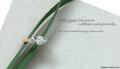
Writing a Love Poemby admart01Comment: Nice set-up and composition. I don't think the company name is necessary, but I do like the text and font in the main message. The green ribbon is a nice choice as it stands out well, but is not too overpowering. |
 Photographer found comment helpful. Photographer found comment helpful. |
| 05/01/2005 10:36:03 AM |
OUTBACKby DrJOnesComment: One of the more inventive uses of text in this challenge and a wonderfully professional shot, at that. It looks ripped from the pages of some overly glossy magazine. Good luck and nice hair. |
| Photographer found comment helpful. |
| 04/29/2005 01:40:45 PM |
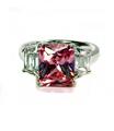
Pinkby rebelgirlComment: Great color on the stone and a good job managing reflections. It's a beautiful shot, but it's missing something in my opinion...I can't put my finger on it, though. Good luck. |
| Photographer found comment helpful. |
| 04/29/2005 01:35:27 PM |
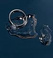
Forever Iceby MatthewComment: The shapes here are incredibly interesting, but I'm not sure what I'm seeing. Also, the shot appears slightly pixelated...you know, those jaggy things. Maybe it's a shot in front of a computer screen...people here like those. I like this shot but there is something I can't quite put my finger on...good luck all the same. |
| Photographer found comment helpful. |
| 04/29/2005 01:32:27 PM |
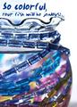
Kid Stuffby pcodyComment: Wow, this stuff looks like candy...rock candy, I guess. Great colors and a nice choice for fonts. |
| Photographer found comment helpful. |
| 04/29/2005 01:31:26 PM |
Omega DeVille Automatic Chronometerby fplouffeComment: Great shot...the reflections are very well done. The only thing I can complain about is the very tight crop at the top of the shot..seems just a bit too close for comfort, but, hey, that's just me. |
| Photographer found comment helpful. |
| 04/29/2005 01:24:10 PM |
Go Aheadby StrikeslipComment: I like the perspective in this shot, but the color seems a bit off, almost as though the shot is too yellow. The purple was a good choice to balance the shot, though. |
| Photographer found comment helpful. |
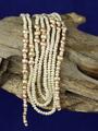
| 04/29/2005 10:36:07 AM |
Natural pearlsby aKiwiComment: As something that I have fallen victim to myself, I have to wonder about your background color. In the Wacky Foods challenge, my shot had a bright green background that was probably a mistake. I think the background has a false look to it, and could have been better in a different, less dominate color. I like the wood, but I think a different set up of the pearls could have been more pleasing, say if they were more spread out like vines on a log. |
| Photographer found comment helpful. |
| 04/29/2005 10:30:34 AM |
|
| Photographer found comment helpful. |
| 04/29/2005 10:20:16 AM |
L'amour Éternelby fotodudeComment: I like the range of colors in the shot from red to white and most everything in between, but I would like to see more of the jewelry in focus (honstly, I am not sure what these are, but I am a man so that can be explained via stereotypes). |
| Photographer found comment helpful. |
Home -
Challenges -
Community -
League -
Photos -
Cameras -
Lenses -
Learn -
Help -
Terms of Use -
Privacy -
Top ^
DPChallenge, and website content and design, Copyright © 2001-2025 Challenging Technologies, LLC.
All digital photo copyrights belong to the photographers and may not be used without permission.
Current Server Time: 08/05/2025 06:59:54 AM EDT.