| Image |
Comment |
| 06/28/2005 05:07:20 PM |
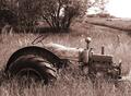
Out to Pastureby dw_photoComment: Although metal isn't the first thing that jumps into my mind when I see this shot, I do have to say that this is a wonderful image with a crisp, but not too crisp look, and a good choice for the color cast. All in all, this is a very good photograph. |
 Photographer found comment helpful. Photographer found comment helpful. |
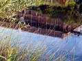
| 06/27/2005 04:32:26 PM |
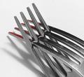
Fork Playby karmatComment: It looks like the inverted fork has blood on the tines, possibly from slicing through the other fork. At first, I found the red reflection distracting, considering the remainder of the photo is basically black & white, but the small splash of color is growing on me. |
| Photographer found comment helpful. |
| 06/27/2005 04:30:39 PM |
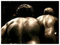
Old Iron Backsidesby janbruderComment: Good eye. I like the exposure in this shot despite of, or maybe because of, the very dark and very light areas. Good luck. |
| Photographer found comment helpful. |
| 06/27/2005 04:29:03 PM |
Copper Potsby Mary Ann MeltonComment: I would like to see this as a black & white with a deep, contrasty look. Granted, that is just me, but I think it could add to the shot's appeal. |
| Photographer found comment helpful. |
| 06/27/2005 03:29:18 PM |
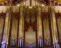
Pipesby banmornComment: This image is well done, perfectly balanced, and has nice coloring. However, it almost has a static feel to it that I am put off by. Also, the way the peak at the top of the ceiling is cut off make me want to scroll up higher...it just seems to interrupt the flow of the lines, which all tend toward the vertical. |
| Photographer found comment helpful. |
| 06/27/2005 03:22:53 PM |
H. & R. 922by glad2badadComment: I like the way the light hits the gun but I still feel that this image is a bit too underexposed...didn't want to say 'dark' since that could be misconstrued as a commentary on your subject matter. I think a brighter image could have been more effective. |
| Photographer found comment helpful. |
| 06/09/2005 06:52:15 PM |
House of Cardsby ChasSourekComment: This should do well, either because of or in spite of it going against conventional thought on what comprises construction. The real winning aspect of this shot is of course the beautiful shapes and repetition. |
| Photographer found comment helpful. |
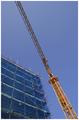
| 06/09/2005 06:48:50 PM |
Developmentby cheekymunkyComment: I've looked at this photo for a while now, and I can't put my finger on how I feel about it. On one hand, I like certain aspects, like the complimentary colors, but I am undecided about the composition. Something seems lacking, almost out of balance to me. Honestly, this shot held my attention, which is more than many can say. Good luck...sorry I couldn't be more insightful. |
| Photographer found comment helpful. |
| 06/09/2005 06:44:48 PM |
Highway 45by srdanzComment: Very beautiful accept that one thing I know you are aware of and I know everyone is commenting on, even me. I like the detail and the strong graphical sense of the image...good shapes and negative space. |
| Photographer found comment helpful. |
| 06/09/2005 06:41:39 PM |
|
| Photographer found comment helpful. |
Home -
Challenges -
Community -
League -
Photos -
Cameras -
Lenses -
Learn -
Help -
Terms of Use -
Privacy -
Top ^
DPChallenge, and website content and design, Copyright © 2001-2025 Challenging Technologies, LLC.
All digital photo copyrights belong to the photographers and may not be used without permission.
Current Server Time: 08/05/2025 04:57:58 AM EDT.