| Image |
Comment |
| 02/15/2006 04:44:21 PM |
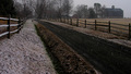
Countrylandby seebrownComment: I think you did a great job of keeping your photograph on topic. Nice picture throughout but find the dark road?? a bit distracting would of like to have seen it with a little more detail. |
 Photographer found comment helpful. Photographer found comment helpful. |
| 02/15/2006 04:42:37 PM |
Nothing but dirt roads...by CEJComment: My eyes are drawn to the sign a little to much with the color on your desaturated photograph. I wish you would of focused more on the country theme instead of the sign. |
| Photographer found comment helpful. |
| 02/15/2006 04:40:58 PM |
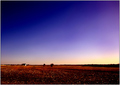
Heaven and Earthby elsapoComment: Very nice colors but find the it hard to see much detail in the ground area. Still a nice shot. |
| Photographer found comment helpful. |
| 02/15/2006 04:38:57 PM |
Rough Sole!by permapierComment: Nice shot and understand your theme. However it could of been setup better to show country life. With that said I like the way you focused on the worn out soles of the boots. Lighting ok and dof is good. 6 |
| Photographer found comment helpful. |
| 02/15/2006 04:34:31 PM |
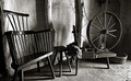
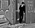
The Old Countryby front_elementComment: Nice country theme and a good black and white. The composition seems a bit distracting with all the elements being up against the wall but you probably could not help that. 7 |
| Photographer found comment helpful. |
| 02/13/2006 08:13:24 PM |
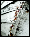
Broken Boatby gsalComment: Without your title I would of found it difficult to identify your subject. Very abstact for this challenge and your title. The way you presented it to us is still good with nice contrast and focus. You are showing us the rustic look with bolts but doing nothing to show us a broken boat. What I see is old wood with cracks and bubbling/cracking paint. I would suggest a full or mostly full view of the boat to bring your subject alive. Still a good shot. |
| Photographer found comment helpful. |
| 02/13/2006 08:09:21 PM |
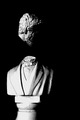
Bustedby IzadoraComment: Nice B&W tone and the focus is good. I would of liked to see just a bit of the face and the image larger. |
| Photographer found comment helpful. |
| 02/13/2006 08:07:48 PM |
Old Brokenby JuganComment: I like the photograph but would of loved to see some sharpness and contrast with a slightly larger dof. As-is the photograph looks like it has been run through neat image or an equivalent program and I believe some pertinent details were lost that could of added to your image. |
| Photographer found comment helpful. |
| 02/13/2006 08:04:52 PM |
|
| Photographer found comment helpful. |
| 02/13/2006 08:03:42 PM |
Broke off...got to eat it nowby TammerComment: Focus kind of soft and the shadows are a bit distracting. I feel you subject is a stretch on the challenge theme but still fits. Good luck in this and future challenges. |
| Photographer found comment helpful. |
Home -
Challenges -
Community -
League -
Photos -
Cameras -
Lenses -
Learn -
Help -
Terms of Use -
Privacy -
Top ^
DPChallenge, and website content and design, Copyright © 2001-2025 Challenging Technologies, LLC.
All digital photo copyrights belong to the photographers and may not be used without permission.
Current Server Time: 08/18/2025 01:06:45 PM EDT.