| Image |
Comment |
| 09/29/2004 07:56:37 PM |
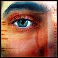
Photoreceptionby JPRComment: Doesn't feel very photographic to me. Too much like a picture of a page in a textbook. I suppose that's what it is? I need some more artistic elements. |
 Photographer found comment helpful. Photographer found comment helpful. |
| 09/22/2004 05:23:36 PM |
Touch The Skyby bigfishComment: While it *is* a bit grainy, the colors are great, and the arm draws the eye into the picture. I like it. |
| Photographer found comment helpful. |
| 09/22/2004 05:17:40 PM |
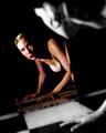
Right Here In My Armsby karolinaComment: The lighting is the main problem here. It looks like an on-camera flash from the shadows casted and the flatness and harshness of the lighting. |
| Photographer found comment helpful. |
| 09/20/2004 09:18:32 AM |
The other sideby mrorange002Comment: I don't think you 'choked' on this one! It's great! I could definitely see this on a big 30x20 poster on the wall. :) |
| Photographer found comment helpful. |
| 09/20/2004 03:03:25 AM |
Smoker Confinedby mrorange002Comment: I agree, this is fabulous! Definitely should be in the top 5 if not the top 3. What's with those voters?!
OTOH, I can see how the bit of noise particularly visible in the very edges of the smoke right above the lower lip detracts a little from an otherwise positively fantastic image. |
| Photographer found comment helpful. |
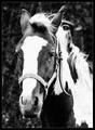
| 09/18/2004 04:28:27 PM |
Old Horseby Ecce_SignumComment: Nice B&W pic. I think the main problem is that the grain is too coarse. Maybe a finer grain and/or less amount of grain would improve it? With this much coarse grain a lot of detail is lost. |
| Photographer found comment helpful. |
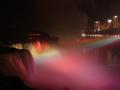
| 08/25/2004 02:06:59 AM |
Niagara Falls Illumination by Resusit8uComment: Congrats on this fabulous picture and well deserved ribbon.
Also, this is the first ribbon winner taken with this particular camera! |
| Photographer found comment helpful. |
| 08/11/2004 03:32:48 AM |
|
| Photographer found comment helpful. |
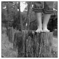
| 08/11/2004 03:31:59 AM |
2 feetby PoobaComment: Nicely done. I like how the brightest spot isn't on the edge of the frame, but there is a falloff towards the corner. |
| Photographer found comment helpful. |
| 08/11/2004 03:30:55 AM |
Kate and her Feetby BobsterLobsterComment: Nice simple composition. I like how the feet are in focus and her face is a little blurred. It might be nice if the wall above were as white as the bottom part of the image, but that's minor. 7 |
| Photographer found comment helpful. |
Home -
Challenges -
Community -
League -
Photos -
Cameras -
Lenses -
Learn -
Help -
Terms of Use -
Privacy -
Top ^
DPChallenge, and website content and design, Copyright © 2001-2025 Challenging Technologies, LLC.
All digital photo copyrights belong to the photographers and may not be used without permission.
Current Server Time: 08/21/2025 12:52:00 PM EDT.