| Image |
Comment |
| 07/08/2004 12:04:32 AM |
|
 Photographer found comment helpful. Photographer found comment helpful. |
| 07/07/2004 09:01:37 PM |
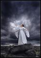
flirtaceous. by theodor38Comment: From the critique club:
A portrait is a study of character in a visual form. Photographic technique is carefully examined even by the neophyte. This is because we all communicate with people daily and we can not help at times, to study their facial expressions. We are sometimes moved by how the light plays upon the facial features and the hair. Of course, the human eye, being more sensitive than a camera is able to capture more detail.
Your self portrait exudes a warm candor, so warm, in fact, that its minor technical oversights are almost made so unimportant that they fall by the wayside. To do a self portrait of this caliber is indeed a remarkable feat and it speaks of your inherent talent. So, let us proceed with the assumption that this is a great self portrait.
However, let us make believe that you were photographing the subject from the viewpoint of the camera and make this a perfect 10. The chosen light scheme required another fill light in the front. You know about the inverse law of the intensity of light. Two lights of same value, placed at identical distance yield 100 percent. Move one light back half the distance of the other and this light is now 25 percent effective. Well, the frontal fill light of same value could have been placed just over a full distance and this would have aided the detail in the left eye of the subject and reduced the 2nd zone at the crease of the smiling cheek line and gave a hint more detail in the hair line. This would have retained the identical character of the lighting and the only drawback would have been a slight reduction in the definition of the dimple.
The composition is strong and the offset placement fit the image like a glove. You also managed to maintain a consistent coloration between face and hands. The highlights are a bit subdued, but the study remains very strong regardless. There are two distinct schools, those that love and those that hate the well defined highlights. One group says, highlights are too formal and stiff for candid and modern portraits. The other group uses them much like the artist that sketch faces or to add shape and form.
In looking over your portrait, I accept it as is. You achieved almost the impossible because you put forward such a wonderful and natural pose just like when an expert photographer elicits the best from its subject. Great job. |
| Photographer found comment helpful. |
| 07/07/2004 04:29:19 PM |
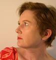
Forty-Nineby charmayneComment: from the critique club:
First: the composition is strong excepting the ambiguity of the angle. Just a little more to the right to concentrate on the profile. The lighting is very nice and gentle and suiting the pensive mood you are portraying. Minor improvements include asking the model to wet lips just before shooting. Personally, I would have requested a slight curl of the slip to suggest an incipient smile. Not complete, not halfway. The very start. However, this would make it a different portrait. Placing subject just further from background would have also elimitated the shadow detail at bottom of head. Since you cropped a part of the head, the eye will linger at the visible part.
The major fault with this image is its color balance. Whenever a portrait is done you will find color differences between face and neck and shoulders and arms. The best advise I can give is to opt for a slight desaturation and make certain you have a white balance reference. For example, the red and yellow have crept into the eyes. This is more prevalent when the shot is done with incandescent light.
Since this is your first attempt, rest assured that you did very well for you managed to introduce character and the idea for the angle was good. |
| Photographer found comment helpful. |
| 07/07/2004 03:35:32 PM |
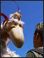
Man Meets Giant Birdby BobsterLobsterComment: From the Critique Club:
Outside of the cups which can be cropped out at the loss of some shoulders, this is a very good composition. It is a fun shot and the clear blue sky adds an ideal background. Regarding the challenge extraordinay, there are other meanings which creep up, such as bizzare, fantastic and the grotesque. Then, we all seem to have our own definitions and the confusion mounts. One will ask, well, if the bird were real. then....ah, but then it would be a different picture.
What you chose to do here is add a little levity. The composition is strong because you chose this good angle and put the bird right in the man's face. I believe you are on the right track and look forward to your other entries. The use of a simple reflector would have help with some fill light, otherwise your exposure is good and you have good texture.
Personally, I loaded the wrong file for this project and you can go and beat up on me. |
| Photographer found comment helpful. |
| 07/07/2004 02:19:32 PM |
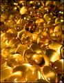
All Naturalby briphotoComment: A strong shot. I am giving it 7. It would be an 8 or 9 if the gold type was not so lost. |
| Photographer found comment helpful. |
| 07/07/2004 02:17:43 PM |
|
| Photographer found comment helpful. |
| 07/07/2004 02:11:13 PM |
|
| Photographer found comment helpful. |
| 07/07/2004 02:06:16 PM |
|
| Photographer found comment helpful. |
| 07/07/2004 02:01:39 PM |
|
| Photographer found comment helpful. |
| 07/07/2004 02:00:28 PM |
|
| Photographer found comment helpful. |
Home -
Challenges -
Community -
League -
Photos -
Cameras -
Lenses -
Learn -
Help -
Terms of Use -
Privacy -
Top ^
DPChallenge, and website content and design, Copyright © 2001-2025 Challenging Technologies, LLC.
All digital photo copyrights belong to the photographers and may not be used without permission.
Current Server Time: 08/26/2025 02:16:44 AM EDT.