| Image |
Comment |
| 06/06/2006 09:28:58 AM |
|
 Photographer found comment helpful. Photographer found comment helpful. |
| 06/06/2006 09:21:49 AM |
marked for lifeby gocComment: Surely one of the most interesting portraits !
B&W gives a special strength , this photo has a magic that hypnotize the viewer . Simply excellent ! |
| Photographer found comment helpful. |
| 06/06/2006 09:07:58 AM |
|
| Photographer found comment helpful. |
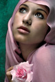
| 06/06/2006 09:03:56 AM |
Make All My Dreams Come Trueby librodoComment: So delicate , like a classical Madonna Dolorosa , simply beautiful !
So far the best in this challenge.
Gave it a 10 and would have given 11 (if possible) if the rose was natural. |
| Photographer found comment helpful. |
| 06/06/2006 08:35:09 AM |
Ring of Fireby kanoComment: Hi !
What a nice photo ! I think it should have deserved a higher score , excellent execution ! |
| Photographer found comment helpful. |
| 06/06/2006 08:17:49 AM |
t h e f i n a l s p o t l i g h tby minicaerComment: From the Critique Club :
Hi Erica ,
A top 20 in your second challenge : congrats !
I'm a bit surprised that you have received 20 comments and you don't have marked any as useful , I'm quite sure that the people who have taken time to leave them would appreciate that.
It's an interesting photo , you have captured a lovely moment and the lighting creates a dramatic effect.I agree with sanx that it would have looked even more impressive with the ballerina facing in the opposite direction.
In advanced editing you could have softened a bit the light on the right leg , nothing very important as I think that it's more a very impactive shot than a technical one.
Well done , keep it up.
Please feel free to email me about this critique , this is only a personal opinion. Message edited by author 2006-06-06 08:53:07. |
| Photographer found comment helpful. |
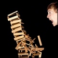
| 06/06/2006 04:46:52 AM |
Just one piece...by DjabordjaborComment: From the Critique Club :
Hi Magnús !
Congrats ! This was your personal best and still is (for the moment...) your personal best place.
I agree with you about the look , I prefer the funny one of your self portrait ;-)
I really like the lighting on the wood pieces and the crop of the composition.The falling tower fills very well the space , with the lighting and sharpness it's really powerful !
As Larus ,pineapple and ericwoo pointed out in their comments during the challenge , I think that you could have improved it including a hand placing a piece or near the head. By the way , did you take some photos (without destroying the tower) to see different head's effects ? It could have helped.
It was a great idea and you have done an excellent job as reflected in the score. Well done !
Just a question of time to see you ribbonned ! |
| Photographer found comment helpful. |
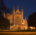
| 05/22/2006 06:45:11 AM |
Historic Winchester Cathedralby kanoComment: From the Critique Club :
Hi Kano ,
You're right , it's a beautiful building. Now with the movie "The Da Vinci Code" it seens that some places are becoming fashionable , not sure if this is good or not ...
Title I'm not good choosing titles for my own photos and never vote lower because of a title but I think that you needn't to add "Historic".
Composition I suppose that you have try to choose the best place to take the photo , sometimes there are elements impossible to move or avoid. Personally , I think that it's a nice view.
Impact Again I have to suppose that you chose to take the photo at this hour of the day/night to avoid people.It's maybe a bit flat (except the bright light) , the sky is very dark and there is not enough contrast with the cathedral. Playing with the hue/saturation of the blue tones and with usm (aplying different values) would have helped the Cathedral to stand out.
Good luck in the future.
Mambe
|
| Photographer found comment helpful. |
| 05/19/2006 10:08:24 AM |
|
| Photographer found comment helpful. |
| 05/19/2006 09:26:42 AM |
Meby MatthewComment: I've stayed long minutes looking at your photo ... it's excellent ! You seem relaxed , at ease.
Good lighting , composition , pose , textures ! One of my fav ! |
| Photographer found comment helpful. |
Home -
Challenges -
Community -
League -
Photos -
Cameras -
Lenses -
Learn -
Help -
Terms of Use -
Privacy -
Top ^
DPChallenge, and website content and design, Copyright © 2001-2025 Challenging Technologies, LLC.
All digital photo copyrights belong to the photographers and may not be used without permission.
Current Server Time: 08/30/2025 02:31:39 AM EDT.