| Image |
Comment |
| 09/23/2005 07:20:23 PM |
Days of Decadenceby FotoMunkiComment: Critique Club
Hi Mark. I really like the perspective of this shot on a subject that is larger than life. I can see a few things which I feel may have hindered your submission from getting a higher score. Firstly, the shot seems to be somewhat washed out. Had you sharpened the image a bit more and used shadows/highlghts, it may have drawn out greater detail. Secondly,the columns edges appear to have some "sawtoothing" on them. Not knowing what your origianl was like or at what iamge quality you had been shooting, I'll say you may have cropped too small. Along the "frieze? line" I can see that your contrast is out of whack. This is a very delicate thing to tune and it mushed out that part of the photo. I believe these elements had cost some points. Good luck in future challenges.
Ivo |
 Photographer found comment helpful. Photographer found comment helpful. |
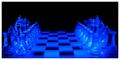
| 09/23/2005 06:49:29 PM |
Waiting for Ordersby A ShrubberyComment: Critique Club
AHA!! With a username like that, you must be a Monty Python fan. Congrats on a decent score for your second challenge. This is a very creative shot and I think you did an admirable job. It appears that you had illuminated the chessboard from the botton, hence the effect. This is a tough shot to get perfect focus unless you have a tripod and even then, you run the risk of camera shake by depressing the shutter with your finger. Had you set your camera on a tripod, or a flat stable surface, set the timer to activate the shutter, your focus would have been much better........oh well, live and learn. I see that you had the camera set at f8 as the shot may have been blown out otherwise. Good thinking. The composition is good but as you know, the shot is tilted slightly. Other than that, this is somehwat of an advanced technical effort and all in all, you executed it very well. It will be interesting to see how your work advances as you do more challenges and build up your portfolio. Well done!
Ivo |
| Photographer found comment helpful. |
| 09/23/2005 02:33:51 PM |
No Titleby kyeboshComment: Critique Club
Hi Logan. Good shot. You've captured a really nice expression on your subject's face. The shot looks like it is quite natural and has a good feel to it. Now for the analysis. The colors are somehwhat drab and the placement of the subject within the image is not very flattering. I find the drainpipe and the turquise paint between her legs to be distracting. I might suggest sharpening the image and playing around a bit with shadows and highlights. Though the angle is different, it makes your subject appear quite small. Looking through some of your other shots, I'd say that you could do better though it is not really "that bad" but it is really not "that great" either. This is just my opinion. Hope it is somewhat useful.
Ivo |
| Photographer found comment helpful. |
| 09/23/2005 01:43:33 PM |
The Sparkle Of Innocenceby sajinComment: CRITIQUE CLUB
Hi Bobby. Great shot. You've captured the essence of what these little creatures are all about. I have a daughter about the same age. As far as the image goes, there are several things I really like and some I think could use enhancement. The expression is priceless and the tones are quite gentle. Your lighting was well done and the focus is golden. I'm a little thrown off of the placement of your subject but you may have been stuck by not having the room to allow more room in your original. I also find that the hardwood floor could have been darkened since it is a bland background. Though I like borders, it has crept into the shot and empasized the weak placement of the image. I'd try cropping tighter on the left to compensate for that. This would eliminate some of the background as well.
All in all, it is a great capture as your sore has clearly indicated. Go get more now ......... and tell her to go clean her room!! ;-)
Ivo
Message edited by author 2005-09-23 13:48:37. |
| Photographer found comment helpful. |
| 09/23/2005 01:54:58 AM |
|
| Photographer found comment helpful. |
| 09/21/2005 06:10:49 PM |
|
| Photographer found comment helpful. |
| 09/21/2005 06:10:24 PM |
|
| Photographer found comment helpful. |
| 09/21/2005 06:09:29 PM |
|
| Photographer found comment helpful. |
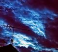
| 09/21/2005 06:08:07 PM |
Frequencyby shadowComment: The colors give a really foreboding feel. Good luck! |
| Photographer found comment helpful. |
| 09/21/2005 06:07:32 PM |
|
| Photographer found comment helpful. |
Home -
Challenges -
Community -
League -
Photos -
Cameras -
Lenses -
Learn -
Help -
Terms of Use -
Privacy -
Top ^
DPChallenge, and website content and design, Copyright © 2001-2025 Challenging Technologies, LLC.
All digital photo copyrights belong to the photographers and may not be used without permission.
Current Server Time: 08/09/2025 07:20:25 AM EDT.