| Image |
Comment |
| 06/28/2004 04:43:16 PM |
Bill & Kimby TooCoolComment: Bill and Kim look a bit out of focus and overexposed. It's quite a standard wedding-shot. |
 Photographer found comment helpful. Photographer found comment helpful. |
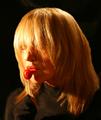
| 06/28/2004 04:42:31 PM |
MyTootsieby neilmwilsonComment: i would have liked to see the eyes a bit more. Very intruiging picture |
| Photographer found comment helpful. |
| 06/28/2004 04:41:37 PM |
Going to the Chapelby crabappl3Comment: the church in soft-focus on the background is brilliant in this shot. Her shy look also. I find the crop a bit "tight", maybe a bit more space around would have helped. Also it is a bit pale. |
| Photographer found comment helpful. |
| 06/28/2004 04:40:05 PM |
Self-portrait With Flowersby carlacrypticComment: very brave shot. because it is of yourself, because it is so close and because of the very radiant colors. A bit to much lighting on the right side (viewers right) of the head and the closeness is a bit overwhelming. But I love the colors! |
| Photographer found comment helpful. |
| 06/28/2004 04:38:16 PM |
|
| Photographer found comment helpful. |
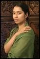
| 06/28/2004 04:37:33 PM |
Didiby RoosterComment: beautiful. I like the background very much, but I can imagine some people find it a bit distracting. not me though. 7 |
| Photographer found comment helpful. |
| 06/28/2004 04:36:35 PM |
It's In The Eyesby K-RobComment: His (her?) head is beautiful in focus and the eyes are very telling. Too bad that the body is very much out of focus. I would have liked a deeper DOF, or a different crop from just the head. |
| Photographer found comment helpful. |
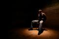
| 06/28/2004 04:35:16 PM |
Hostageby BeagleboyComment: interesting shot but it gives me the creeps. somehow I have this standard opinion that a portrait should bring out the person at its best, and this picture tells nothing about the person. So for a portrait i don't really like it. As a picture it is very powerfull, but scary. |
| Photographer found comment helpful. |
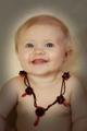
| 06/28/2004 04:33:41 PM |
Where's the Party?by photomComment: very nice capture of the "open" innocent look of the child. The lighting around her (his?) head is almost like a halo. I am not too sure about the necklace. I understand you needed some color, but it lookes a bit too "posed" with the necklace. |
| Photographer found comment helpful. |
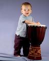
| 06/28/2004 02:13:56 PM |
My First Portrait Attempt! (My Son Karson)by ConcreteDonkeyComment: very good, esp. for a first attempt. Brilliant move to emphasis his small size by putting him next to the jembe. As I noticed in other child pictures, a light blue/lilac background often makes little children look a bit pale. I think either white or some stronger color would be better. Apart from that it is beautiful. |
| Photographer found comment helpful. |
Home -
Challenges -
Community -
League -
Photos -
Cameras -
Lenses -
Learn -
Help -
Terms of Use -
Privacy -
Top ^
DPChallenge, and website content and design, Copyright © 2001-2025 Challenging Technologies, LLC.
All digital photo copyrights belong to the photographers and may not be used without permission.
Current Server Time: 08/22/2025 01:59:22 AM EDT.