| Image |
Comment |
| 06/27/2003 09:11:33 AM |
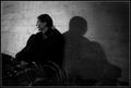
Timeless Youthby dodobirdComment: If people couldn't see something they really should fix their monitor settings. I can see your son very good. And I like your technique! It makes the photo interesting. The face of your son expresses a somewhat darker mood and the very dark lighting goes with that. |
 Photographer found comment helpful. Photographer found comment helpful. |
| 06/25/2003 12:40:36 AM |
Me-Myselfby justineComment: Now I see who is behind all the nice comments, justine! :)
The lighting is ok, but I would have cropped out the white areas on the left side and on the top. The massive blur is nice. |
| Photographer found comment helpful. |
| 06/24/2003 11:50:22 PM |
Lazy Summer Daysby BigSmilesComment: Good idea. This photo has potential. The composition is good (off-centered) and it was a deliberate colour choice of your dress. The green vs. pink works good. Only thing I don't like here is the lighting. It's a bit flat and bland. Maybe a shot at a different time, like during sunset, could have helped. Still an 8. |
| Photographer found comment helpful. |
| 06/24/2003 11:46:28 PM |
Moiby dimitriiComment: Great lighting. I like the use of negative space here. I don't see anything wrong here. |
| Photographer found comment helpful. |
| 06/24/2003 11:45:33 PM |
meby heidaComment: Wow! This photo transports emotion. I like the lighting and the composition. A very creative self-portrait. 9 |
| Photographer found comment helpful. |
| 06/24/2003 11:26:01 PM |
Back Pocketby scab-labComment: A creative take on the challenge. Very unique! Only (minor) flaw is that the third (bottom) photo is a bit too overexposured in my opinion. But still a 9. |
| Photographer found comment helpful. |
| 06/24/2003 11:11:25 PM |
My way homeby puppy52Comment: I think this photo is way too much underrated. It's my favourite from the challenge. I love the colours and the simplicity, yet it fulfills the challenge theme in a smart way (in my opinion). |
| Photographer found comment helpful. |
| 05/22/2003 09:34:59 PM |
Primary Cloverby tyrkinnComment: Greetings from the Critique Club, Haraldur :)
Composition: I think the landscape format is ok, but I agree that putting the subject off-center would be a good idea. Somehow it doesn't look right the way it's now. The structure is "leaning" a bit to the left, out of the center of the image. Putting it on the right side it would "lean" toward the center.
Another change I personally would like to see is a bit _more_ negative space of the sky, i.e. a more wide view (zoom out).
Lighting: Great! This is the best part of the photo. I love the blue. The mix of natural lighting at evening and the glow of the glass thing is great. You wrote you wanted to capture the light when it was purple. I think it was a good decision to.It fits to the blue of the evening sky and this makes it more pleasant to look at because it doesn't distract from the clover neon sign.
Focus: As far as I can see the focus is good.
Challenge: Yes, the challenge was met.
Creativity: A good eye recognising alll three primary colours but the lighting you used makes this photo special.
Ok, that's it. I hope it helped you.
Stephan |
| Photographer found comment helpful. |
| 05/20/2003 11:35:20 PM |
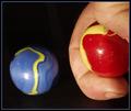
The Shooterby autoolComment: Greetings from the Critique Club, Richard! :)
Composition: In my opinion the photo needs more space. Your hand is very near the blue marble. It's not like you're really aiming at it from such a short distance. A landscape composition with the blue marble on the one end and the red one on the other would make it more clear that it's the kid's game you want to show. Another issue I see is that the blue marble seems to float because all background is totally black. There is no reference point like the floor to see.
Lighting: Hmm.. you wrote you used subdued light? Well actually I would say it's a bit harsh. Almost like flash. I think that's the biggest issue on this photo. The lighting doesn't look good.
Focus: All in focus. This makes the photo look a bit flat. Especially in combination with that lighting. Maybe a more narrow DOF would add drama to the shot. I don't know if you tried it but I think some motion blur to show a movement of one marble would make the photo more interesting and your message more understandable.
Challenge: Yes, it meets the challenge.
Creativity: I don't know if you left the dirt under your fingernails there on purpose, like jmsetzler thought, but I agree that this adds to the kids theme. But like justine'scomment suggests, a different setting, not this clean studio shot, would have made this more understandable. Aynway, I think you had a good idea and your photo shows more creativity than flower shot number xyz.
Ok, that's it. I hope I could help.
Ciao, Stephan |
| Photographer found comment helpful. |
| 05/20/2003 10:47:22 PM |
Real Glass(es)by ursulaComment: Greetings from the Critique Club, Ursula!
Composition: A good simple setup without distractions. Nothing spectacular but it concentrates on the glasses to show the refraction.
Lighting: I think there is a bit too much contrast. The paper is full white and the border of the glasses is pitch black. I think a bit more nuances in lighting would improve the photo.
Focus: The DOF is very wide. The letters in the background are still pretty sharp. Did you try a more narrow DOF? I think that would look better, but that's personal preference. I can see some strange pixels among the letters in the shade of the glasses. I don't know if ot comes from oversharpening in postprocessing but it looks like that. Also did you use some kind of despecle filter? I would expect more detail in the sheets of paper (at the botom of the photo).
Challenge: Yes, challenge met. You actually show an attribute of glass. I like that more than some of the other photos which seem to contain a glass object for the challenge but the photo is not really about the glass.
Creativity: I think the photo lacks drama. It's not a bad shot but I miss something which makes it special. Maybe a ring with a fine engraving in a dark language could have helped ;-)
Ok, I hope I could help.
Ciao,
Stephan |
| Photographer found comment helpful. |
Home -
Challenges -
Community -
League -
Photos -
Cameras -
Lenses -
Learn -
Help -
Terms of Use -
Privacy -
Top ^
DPChallenge, and website content and design, Copyright © 2001-2025 Challenging Technologies, LLC.
All digital photo copyrights belong to the photographers and may not be used without permission.
Current Server Time: 08/31/2025 07:44:02 AM EDT.