| Image |
Comment |
| 08/17/2002 09:29:00 AM |
Palm Puppyby MorganComment: Cute subject. The photo looks fuzzy which in my eyes is good in this case, because it fits to the subject. However creativity is not so good and the photo is not really one where I say "Yikes! That's amazing" (and I'm not much better in this ;-)) -stephan |
 Photographer found comment helpful. Photographer found comment helpful. |
| 08/18/2002 04:40:00 PM |
New Life, New Father, New Loveby SonifoComment: First I thought "Oh no, not another baby photo" but then I saw that it's the whole scene and the gesture of the father you wanted to portray. The sunset and the frotal lighting are beautiful and it really adds to the photo. The photo transports a warm and good mood. It wouldn't be necessary to have such an almost over-explaining title. The photo works on it's own. -stephan |
| Photographer found comment helpful. |
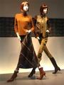
| 08/18/2002 04:34:00 PM |
Styleby MiekaComment: Very "stylish" ;-) Creative interpretation of "something new". I like this photo. The setup of the display dummies creates an interesting dynamic. Also the lighting is good. -stephan |
| Photographer found comment helpful. |
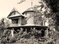
| 08/09/2002 05:01:00 PM |
Beyond Repairby FranziskaLangComment: I can't really say why, but I like this photo very much. Nice composition. The photo has an appealing simplicity. To me the house looks old and abandoned. So you met the challenge very good. The way how to roof in the background goes straight up and has these lines pointing to the subject is nice. I also like the broken window halfly hidden behind the tree. Maybe a touch overexposured because the area to the left of of the window is a little blown out, but I see that it was a difficult scene. High contrast between the white wall and the shadows created by the trees on the right side. -stephan |
| Photographer found comment helpful. |
| 08/10/2002 11:21:00 PM |
Fond Memoriesby SonifoComment: I like the lighting. The photo really looks like from a photo album of my grandma ;-) Composition good. I like how the tree(? or bush?) on the right side frames the photo. -stephan |
| Photographer found comment helpful. |
| 08/10/2002 11:27:00 PM |
The Originalby CreativeFlyPhotoComment: Very good photo! Nice subject, I don't even own a player for these "big black compact disks" ;-) Excellent DOF. The grain is ok, it makes the photo look even older. Also very nice how the lighting reflects in the furrows. One of my favourite photos this week. -stephan |
| Photographer found comment helpful. |
| 08/10/2002 11:35:00 PM |
Everlasting Beautyby BaldurComment: I like how the statue is hidden in the bushes. Maybe an inteded underexposure would have created more contrast between the statue and the surrounding. Different light (sunset!) also can make a photo much more interesting and dramatic. -stephan |
| Photographer found comment helpful. |
| 08/09/2002 05:44:00 PM |
Something Oldby sulamkComment: I'm not sure if the light from below at the medals was a good choice. For itself it looks good, nice contrast and very dramatic, but I think it does not fit to the photo in the background. It almost looks like the medals were put into the photo in postprocessing (what I don't think was actually done). But there is such a high contrast between the two subjects that it looks strange. Also in regard to the colors. The medals are highly saturated but the photo has very soft colors which really look old. Now it could be that this contrast was intended. If so then, well, I don't like it ;-) It also would be nice to see the medals completely. Instead I see the dark cloth or something like that. I also don't like that the right edge of the photo is visible. Anyway, it fits the challenge and it's a good idea. -stephan |
| Photographer found comment helpful. |
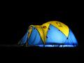
| 08/04/2002 09:44:00 PM |
ENRON HQ - address pending...by clickerComment: nice idea and a good photo. i like the colors and lighting. only sad thing is that the photo only fits to the challenge because of the title. but it's still a wonderful photo, so i vote it fairly high. maybe an enron logo on the tent would be nice. |
| Photographer found comment helpful. |
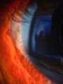
| 07/09/2002 12:13:00 PM |
No reprieve.by millerComment: it looks like the eye of a wild animal targetting his vicitm (looks like you ;-) nice idea! unfortunately its very blurred and it does not look good on the photo. nice colors but a bit dark. |
| Photographer found comment helpful. |
Home -
Challenges -
Community -
League -
Photos -
Cameras -
Lenses -
Learn -
Help -
Terms of Use -
Privacy -
Top ^
DPChallenge, and website content and design, Copyright © 2001-2025 Challenging Technologies, LLC.
All digital photo copyrights belong to the photographers and may not be used without permission.
Current Server Time: 09/02/2025 11:58:41 PM EDT.