|
|
| Image |
Comment |
| 01/02/2006 05:54:34 AM | colorsby eggfoxComment: Greetings from the Critique club...
Every now and then there's an image on this website that defies the normal run of the mill, and proves that users here do know what a good photo looks like..
You've entered an almost abstract image into a technical challenge, and come out with a very respectable score. I think that's simply cool...
The commenters during the challenge have almost all said that they can't see where the focus point is, and although the challenge didn't say you absolutely had to have something in focus, it would probably improved your score.
Outside the context of the challenge itself this is a very strong abstract image. The center is on a thirds line, and you have leading lines from every area of the image into that center focus point.
Often people will complain that leading lines in a photo should actualy lead somewhere. In this case you have nothing, an empty space that dosn't hold the attention of the viewer. I think in this case it's great! Because my eyes don't 'stick' at the dark center I can get back out and follow another one of the lines back into the center.. Your eyes literally explore the photo.
The subtle rim of the glass holding the straws re-enforces the center point, and links the photo back to a real world object that we can all understand.
The only distraction I find is the small highlights on the rim of the glass. Otherwise this is a wonderful photo.
Cheers, Chris H. |  Photographer found comment helpful. Photographer found comment helpful. |
| 01/02/2006 05:34:35 AM | Frosty's Flakesby TransitComment: Greetings from the critique club...
What a fun image!
No problem with meeting the challenge here, so I wont even talk about that.
First impressions.. My eyes went up the line of snowmen, then straight to the distracting dark blobs on the right hand side of the frame. I would have liked to see this almost cropped square, getting rid of the disractions on the right, and reducing the amount of distracting detail on the left. (footprint?)
Technically this image is great. You've done well with a difficult exposure and focus is just right on the front chap.
Going back to the cropping, I'm sitting here holding up bits of paper on the screen.. Feel free to do the same. :-). Negative space (Blank area in a picture) works really well if your subject or object is interacting with the space. A portrait with the subject looking into the blank space, or walking towards the 'blank' side of the image. In this case where you have a group of 'people' staring straight at the camera the open space around the characters dosn't add anything. This is obviously a gross generalisation, but in this case I think it stands true.
Interestingly, to my mind the strongest element in this shot is actually the least in focus. The chap at the back, pearing around the next in line is a wonderful touch. It's almost like he's trying to upstage the other snowmen.
Again, a wonderful, fun image which I think would have done better in DPC voting cropped a little tighter. In the real world this would make a stunning Christmas card image, or post card... Great work and well visualised.
Cheers, Chris H. | | Photographer found comment helpful. |
| 12/07/2005 01:30:59 AM | | | Photographer found comment helpful. |
| 10/31/2005 01:04:03 AM | | | Photographer found comment helpful. |
| 10/30/2005 03:50:40 AM | | | Photographer found comment helpful. |
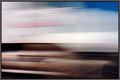
| 10/10/2005 05:35:08 AM | Motoring.jpgby pumaComment: Not sure if I like this or not, and I do like some abstract stuff, but then that's the nature of the game really, with an abstract shot you either 'get it' or you don't. ;-).
I like the pattern from the blurred wheel hub though, I just find the white splash quite distracting, as it almost cuts the image in half.
Interesting colours in the lower half, almost chocolate. Mmmmm, Chocolate. | | Photographer found comment helpful. |
| 10/09/2005 06:52:24 AM | Sunset on Mt Ruapehuby rayz1Comment: Nice shot... It seems every time I'm up that way the top is clouded in these days.. Although when we lived at Waiuru Dad took some amazing photos of the cetral plains and mountains.. (I was a bit young way back then..) | | Photographer found comment helpful. |
| 09/28/2005 01:41:56 AM | 3 to the power of Thirdsby KiwiShotzComment: Very cool photo...
I stopped in almost the same spot earlier in the year and took some snaps with the coolpix 2500... on a bright sunny day though, so quite boring photos.. The contrast between the light and dark, and the colours really make this. | | Photographer found comment helpful. |
| 09/27/2005 02:01:14 AM | Airborneby MarkComment: Hi-ho from the Cirtique Club...
Just reading your comments, and those of the commenters, I think you're being a little hard on yourself. This is a cool photo. It didn't do all that well in the challenge, but the small number of comments tell me that most voters didn't 'get' it rather than thought there were flaws in the image.
It would have been really neat to have the background more out of focus.. As you noted in your comments it's a little busy maybe, but your sisters expression and the big kick to the head more than make up for that!
The exposure is good, with only the small white sky highlights top right distracting my eye from the energy and motion in the shot. The colours are great as well, the strong greens and skintone are pleasing to the eye, with nothing challenging to grasp for the viewer.
The only thing I find disturbing is that the top of the photo is cut off by the frame for the swing. It's almost as if there are two photos here, the one above and the one below. Cropping off the top of the image, keeping most of the wooden framing makes this more balanced to my eye.
I think this image suffered in the voting because people didn't get 'perspective' from the photo. That asside you obviously saw what you wanted, and captured it perfectly. Well done.
Cheers, Chris H. | | Photographer found comment helpful. |
| 09/22/2005 02:06:21 AM | Staring into the Oceanby kmbr2001Comment: Hi-ho from the Critique Club...
This is a classic 'Subject looking away into distance' portrait, which you've pulled off quite well.
Your composition is good, with the 1/3rds rule applied quite well and the subject staring into the photo, rather than out of it.
As a couple of comments noted the shadows on the eyes are a little distracting. A portrait often works better with good light in/around the eyes. Possbily some fill flash, or a white reflector placed below the subject (Big bit of white paper would do it) to bounce some light up. On a beach you get often the effect from the sand anyway, but the sun is quite bright from above in this case.
I personally don't mind the blue, it is quite a bright colour compared to the rest of the shot, and certainly grabs my attention, but there is enough detail in the face to avoid getting 'stuck' on it. The background is not distracting, and adds just the right level of context to the photo. Your subject is looking out to sea, and my eyes tend to follow the line of his gaze, re-enforced by the strip of darker land in the background.
The only thing I don't like here is the post-processing you've used. There appears to be a 'fringe' around the blue hoody, and the detail in the sand has a slight 'double vision' look about it. You've softened the background but unfortunatley created a distraction at the same time. Generally you don't want editing to compete with the subject for attention in a portrait.
Overall a nice shot, with only a few minor negatives for me.
Cheers, Chris H.
| | Photographer found comment helpful. |
Home -
Challenges -
Community -
League -
Photos -
Cameras -
Lenses -
Learn -
Help -
Terms of Use -
Privacy -
Top ^
DPChallenge, and website content and design, Copyright © 2001-2025 Challenging Technologies, LLC.
All digital photo copyrights belong to the photographers and may not be used without permission.
Current Server Time: 07/31/2025 07:49:47 AM EDT.
|