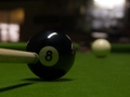
White ball side pocket - Langdon Feb 2002by
kari1Comment: * Greetings from the Critique Club *
First up, what a great take on one of Langdon's top photos. The reversal of the white ball and black ball work a treat.
Two things strike me straight away as to why this photo placed where it did. One would be the photo looks dark (on my monitor anyway) and two the focus looks soft!
The crop is almost spot on and has worked well. It would of been nice to get a lot more light on the 8 ball to really make it stand out though, especially where the number is located and this is where I feel the photo has suffered the most. A much brighter image would of done wonders.
As I mentioned about the focus, it looks soft around where the main focal point should be, that being the figure 8 on the ball. The lack of light may make this appear worse than it is perhaps? I found it strange that no one else mentioned the focus in your comments...maybe I'm getting old? ;)
To be honest, I prefer the colour in your photo to Langdon's original (I feel a site ban coming on). The felt colour is a lot nicer on yours.
All up, it was a good effort but the voters didn't click to it. You've got some nice photos in your portfolio and I'm sure it won't be long until we see you featuring higher up the results table. Well done and best of luck with future challenges.
Neil