| Image |
Comment |
| 04/09/2006 09:35:38 PM |
R O S E by PhilosComment: Nice work. Some people may find the eyes too white but I love it! |
 Photographer found comment helpful. Photographer found comment helpful. |
| 04/09/2006 09:31:10 PM |
|
| Photographer found comment helpful. |
| 04/09/2006 09:20:13 PM |
|
| Photographer found comment helpful. |
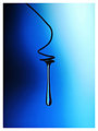
| 04/04/2006 10:17:24 PM |
A Drop of Blueby RikkiComment: Without a doubt this is my favourite of the four. The blue background is very well done. It's amazing how you created an interesting photo out of a basic item! Well done Rikki! |
| Photographer found comment helpful. |
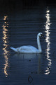
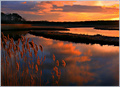
| 04/03/2006 04:59:19 AM |
A Swan in the Limelightby theSajComment: * Greetings from the Critique Club *
Hi Jason! What an interesting photo. I thought it may finish a little better than what it did but that's voters for you!
To me it appears a fraction dark (on my monitor anyway). I would of liked to have seen slightly more, especially on the swan and the water immediately surrounding it. There are so many different ways that you could of done your dodge and burn here and maybe dodging some of the water surrounding the swan may of helped.
I really like the crop you used, especially showing the stick in the water in the foreground. It adds a nice bit of depth to the photo. The reflections on either side of the swan work a treat and is well done.
Your focus is well done and the DOF between the swan and the foreground sticks balances nicely.
All up, a great photo which should of done slightly better. Best of luck in your future challenges and I'm sure you'll hit some of your goals for 2006! Well done
Neil |
| Photographer found comment helpful. |
| 04/03/2006 12:32:40 AM |
|
| Photographer found comment helpful. |
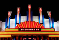
| 04/02/2006 12:30:24 PM |
The Regalby shankswareComment: * Greetings from the Critique Club *
Hi Tony. Well, I'm going to have to agree with some of the comments you received as well as probably a lot of voters. It just looks a bit wierd without the bottom half of the theatre. I would of loved to have seen what was at pavement level. Damn cars!
But, would those cars of 'added' to the photo as well? Without knowing the place of your subject, it's hard for me to tell if you are located directly out the front of the theatre or across the street so I can't really say what the situation was. It's a shame because I love everything else about this photo.
The colours coming from the neon lights are captured really well and the focus looks good. I may of preferred a little less space at the top of the photo?
All up, I feel I'm looking at only half of the photo. As I mentioned, without knowing the situation it's hard for me to say how much better it would of looked or not. I'm sure you had your reasons for framing as you did.
You've had some fantastic scores so far this year. Well done. Keep it up and best of luck with future challenges.
Neil |
| Photographer found comment helpful. |
| 04/02/2006 12:57:42 AM |
|
| Photographer found comment helpful. |
| 04/02/2006 12:54:37 AM |
Valentineby DrJOnesComment: This looks like a DrJones image. Very well done! Very interesting portrait. |
| Photographer found comment helpful. |
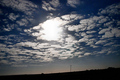
| 04/02/2006 12:11:42 AM |
Runaway Cloudsby KitaComment: * Greetings from the Critique Club *
Hello Kita. My first impression of looking at this photo is that I think your choice of subject really cost you here. As per some of your comments you received, it's not very interesting to look at and a lot of people obviously felt that way.
There's not too much in the silhouette to catch someones attention. Maybe having been closer to the power pole and bringing that as the main focal point may of helped reshape the image and add that bit of life to it that it's calling out for.
The cloud pattern is probably the main attraction in the image. Its a nice formation across most of the sky. Perhaps if you had tried cropping so that the bright light is in the top left corner instead of the middle of the photo, therefore highlighting that main formation across the whole top of the image as the cloud in the top left is a little broken up.
Colour colour colour! I feel it really needs more colour across the sky to help bring it all out. Perhaps the time of day and exposure limited this slightly.
You have had some wonderful entries in your short time here on DPC and some scores that make my entries look pretty sad. Although this was probably not one of your better photos I'm sure you would of learnt a lot from it and that is what makes us better. Well done and best of luck with your future entries! I'm sure within time you'll have a nice collection of ribbons to rival your mum's.
Neil |
| Photographer found comment helpful. |
Home -
Challenges -
Community -
League -
Photos -
Cameras -
Lenses -
Learn -
Help -
Terms of Use -
Privacy -
Top ^
DPChallenge, and website content and design, Copyright © 2001-2025 Challenging Technologies, LLC.
All digital photo copyrights belong to the photographers and may not be used without permission.
Current Server Time: 08/14/2025 08:19:22 PM EDT.