| Image |
Comment |
| 12/23/2004 01:35:38 PM |
Happy Holidaysby artvetComment: very interesting.. at first I thought this was too simple, but I think it's growing on me. the more I look at it, the more I like it!! lighting is nice and even, composition is good, the border is subtle but classy.. good job! 9 |
 Photographer found comment helpful. Photographer found comment helpful. |
| 12/20/2004 12:28:56 AM |
|
| Photographer found comment helpful. |
| 12/20/2004 12:26:20 AM |
Bows and Bellsby roonieComment: cute, but I think it would have been smarter to focus on the bell, which to me is more visually interesting. either way, very well composed. nice shot! |
| Photographer found comment helpful. |
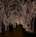
| 12/20/2004 12:25:10 AM |
Foggy Small Town Chrissmusby SweetlipsComment: perfectly symmetrical and aligned.. no small feat! good job!
i've always been taught that in photography, your eye is drawn immediately to either a) the area of greatest dark/light contrast, or b) the most dramatic color. In this case, unfortunately, that's your border. A border should add to the picture subtly, not distract from it dramatically. I would suggest next time using a tiny red border and a think black or white border instead. |
| Photographer found comment helpful. |
| 12/20/2004 12:22:43 AM |
Classic Snowmanby PDavisComment: the truck in the background seems really random and distracting.. is there a purpose in it that i'm not getting, or did you just have no way around it in order to get the shot you wanted? |
| Photographer found comment helpful. |
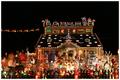
| 12/20/2004 12:21:33 AM |
Oh Electric billby TLL061Comment: HAHA, cute title!! that house is INSANE!! I'm not sure if I would classify this as "classy," though ;) on the technical side, i would have cloned out that wire on the right, it's rather distracting |
| Photographer found comment helpful. |
| 12/20/2004 12:17:51 AM |
Taking Holiday Pictures.by docpjvComment: gorgeous shot, but the red and blues are really distracting. i recommend cloning out inconsistencies like that! |
| Photographer found comment helpful. |
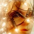
| 12/20/2004 12:16:32 AM |
fairy lightsby whiteroomComment: fun picture, but it would have been far more impressive had you used a human face and oversized christmas lights (the big bulb ones) to achieve the same effect. i personally prefer borders, and I think one would improve this pic, but I certainly wont consider that in my voting. Good picture, very creative!!!! 8 |
| Photographer found comment helpful. |
| 12/20/2004 12:13:21 AM |
27 Yearsby ahazeComment: I really like the simplicity of this.. It would be nicer if the background were consistent, instead of darkening at the top.. Still a nice photo! |
| Photographer found comment helpful. |
| 11/22/2004 02:35:04 PM |
The Artist by scalvertComment: brilliant!! never in a million years would I have guessed how you did this.. absolutely fantastic, a 110% deserved blue :) |
| Photographer found comment helpful. |
Home -
Challenges -
Community -
League -
Photos -
Cameras -
Lenses -
Learn -
Help -
Terms of Use -
Privacy -
Top ^
DPChallenge, and website content and design, Copyright © 2001-2025 Challenging Technologies, LLC.
All digital photo copyrights belong to the photographers and may not be used without permission.
Current Server Time: 06/19/2025 01:40:37 AM EDT.