| Author | Thread |
Comments Made During the Challenge  |
|
|
12/23/2004 09:47:49 PM |
|
the border's absurd IMO. The shot itself does nothing for me either. |
|
|
|
12/23/2004 03:33:29 PM |
|
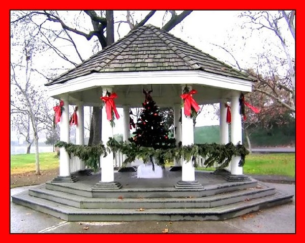
meets the challenge well but I think this would have done better if the red of the frame was a closer match to the red of the bows, and maybe not quite as wide |
|
 Photographer found comment helpful. Photographer found comment helpful. |
|
|
12/23/2004 08:46:09 AM |
I personally don't think the border does anything to enhance the picture.
Plus the sky looks over exposed.
A nice idea though.
Maybe would have looked a lot nicer at sunset or sunrise. |
|
| Photographer found comment helpful. |
|
|
12/22/2004 08:23:32 AM |
|
The main image is okay but a little bland. However, the border is really too much. 3 |
|
| Photographer found comment helpful. |
|
|
12/21/2004 08:53:30 PM |
|
Very simple but festive outside spaces Festive desoration and clear picture. |
|
| Photographer found comment helpful. |
|
|
12/20/2004 04:02:56 PM |
|
wow, is that border overkill. |
|
|
|
12/20/2004 07:49:23 AM |
|
I think the red border distracts attention away from the image. If you really wanted red, maybe you could have sampled the red in the ribbons & used that red. Good work. |
|
| Photographer found comment helpful. |
|
|
12/20/2004 07:34:07 AM |
|
The photo is nice enough. The border, however, is another story. A border should not overpower the subject of the photo - this one does. |
|
| Photographer found comment helpful. |
|
|
12/20/2004 12:28:01 AM |
|
Whoa... turn down the border! Seriously, it really takes away from the shot... |
|
|
|
12/20/2004 12:25:10 AM |
perfectly symmetrical and aligned.. no small feat! good job!
i've always been taught that in photography, your eye is drawn immediately to either a) the area of greatest dark/light contrast, or b) the most dramatic color. In this case, unfortunately, that's your border. A border should add to the picture subtly, not distract from it dramatically. I would suggest next time using a tiny red border and a think black or white border instead. |
|
| Photographer found comment helpful. |
Home -
Challenges -
Community -
League -
Photos -
Cameras -
Lenses -
Learn -
Help -
Terms of Use -
Privacy -
Top ^
DPChallenge, and website content and design, Copyright © 2001-2026 Challenging Technologies, LLC.
All digital photo copyrights belong to the photographers and may not be used without permission.
Current Server Time: 07/01/2026 06:24:38 PM EDT.