| Image |
Comment |
| 03/20/2007 11:03:45 AM |
Portraitby keoneComment: overall, the color is a little flat. otherwise, a pretty good shot. |
 Photographer found comment helpful. Photographer found comment helpful. |
| 03/20/2007 11:03:13 AM |
Focusby AnnComment: thomas johannsen? he's awesome! if you'd have included his legs, i'd know for sure. :) |
| Photographer found comment helpful. |
| 03/14/2007 08:05:12 AM |
|
| Photographer found comment helpful. |
| 03/10/2007 12:44:30 AM |
The Prophet by Joey LawrenceComment: it's stuff like your india work that makes me want to put my camera in the closet, pull the covers over my head, and just give up. but then i realize that it takes shitty photographers like me to make good photographers like you look even better. :P |
| Photographer found comment helpful. |
| 03/06/2007 08:13:47 AM |
|
| Photographer found comment helpful. |
| 03/05/2007 08:31:07 AM |
MPHby kevip6Comment: congrats! not only is the ribbon cool, but not a single vote below 4 is quite the accomplishment around here. great job...great photo! |
| Photographer found comment helpful. |
| 03/05/2007 08:30:19 AM |
DNA by yankoComment: a well-deserved win, even if the top 3 was a squeaker. congrats on an awesome execution of an awesome idea. :) |
| Photographer found comment helpful. |
| 03/03/2007 04:05:54 PM |
|
| Photographer found comment helpful. |
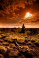
| 03/03/2007 02:40:02 PM |
~ B E N T ~by gocComment: greetings from the critique club!
i should be diplomatic, but i love this shot. it makes me want to visit croatia even more than i did before.
the color and placement of the subject is great. my only suggestion would be to somehow have tried to eliminate the mass of grass on the left. if you could have moved higher to get more of the fence in the shot, that would have given you some great leading lines right to the subject. as it is, the grass is a bit distracting, but the excellent use of depth of field mitigates it.
congratulations on a fine shot and the great post-processing of it.
rob |
| Photographer found comment helpful. |
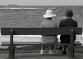
| 03/03/2007 02:28:36 PM |
Watching the Ships Go Byby RamblinRComment: greetings from the critique club.
first of all, i have to admit that i do not care for selective desaturation in general. with that in mind, here are a couple of points i would like to make.
1) the photo is lacking contrast overall. the desaturated parts end up been mostly a mottled gray that actually has some tint to it. the rest of the image should pop even though you've obviously chosen the ship as the focal point.
2) i'm not sure this is exactly what people thought they'd see in a "street photography" challenge. while i'm not directly tied to the presence of an actual street in the photograph, this doesn't have the urban, gritty, action feel that i would expect a photograph to have in this challenge. this seems to be more of a peaceful scene, whereas "street" photography is really about action or commotion.
3) the crop on the bench is pretty tight. i like that the people are off to the right, but the bench feels closed in. i think a wider angle that is not so "bench centered" might relieve some of the visual tension in the photo.
i hope this helps you out!
rob
|
| Photographer found comment helpful. |
Home -
Challenges -
Community -
League -
Photos -
Cameras -
Lenses -
Learn -
Help -
Terms of Use -
Privacy -
Top ^
DPChallenge, and website content and design, Copyright © 2001-2025 Challenging Technologies, LLC.
All digital photo copyrights belong to the photographers and may not be used without permission.
Current Server Time: 06/20/2025 07:54:53 AM EDT.