| Image |
Comment |
| 07/08/2005 12:54:51 PM |
Atomic Circleby hugoPComment: i think a higher angle would help. from this angle, you don't really get the red "ripples." great idea. |
 Photographer found comment helpful. Photographer found comment helpful. |
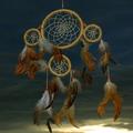
| 07/08/2005 12:54:08 PM |
My dreancatcherby RUEDISCHMUTZComment: the composition seems really centered and not very exciting. nice sky. colors could be brighter in the foreground. |
| Photographer found comment helpful. |
| 07/08/2005 12:52:50 PM |
|
| Photographer found comment helpful. |
| 07/08/2005 12:52:35 PM |
|
| Photographer found comment helpful. |
| 07/08/2005 09:50:54 AM |
|
| Photographer found comment helpful. |
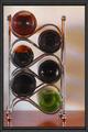
| 07/08/2005 09:50:43 AM |
My Shoutby Jade 11Comment: this is a GREAT idea but i think it could have been implemented better. the background should be seamless, and i would like to see a composition where all the bottles are the same or just one is different to give the shot a focal point. also, the border doesn't really do anything for me. |
| Photographer found comment helpful. |
| 07/08/2005 09:48:24 AM |
Concentricby papaComment: wierd...for a second i couldn't tell which direction this was pointing. great idea. |
| Photographer found comment helpful. |
| 07/08/2005 09:45:57 AM |
|
| Photographer found comment helpful. |
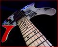
| 07/08/2005 12:23:40 AM |
Mayday ! Mayday !by taterbugComment: **critique club**
great shot, especially considering the camera :D
this has great lines and really good color to it. i would suggest adding another light from underneath and behind to further define the thickness of the guitar. right now it seems to blend into the background and looks almost fake-thin.
i'm sure the graphics on the guitar are cool, from this angle they do kind of distract. while the colors are great, the darker splotches detract from the photo overall.
finally, the backdrop should either be more prominent or removed. the blue ghosting in the background is almost enough to be distracting. |
| Photographer found comment helpful. |
| 07/07/2005 03:41:55 PM |
|
| Photographer found comment helpful. |
Home -
Challenges -
Community -
League -
Photos -
Cameras -
Lenses -
Learn -
Help -
Terms of Use -
Privacy -
Top ^
DPChallenge, and website content and design, Copyright © 2001-2025 Challenging Technologies, LLC.
All digital photo copyrights belong to the photographers and may not be used without permission.
Current Server Time: 06/22/2025 09:52:33 AM EDT.