| Image |
Comment |
| 06/23/2003 01:57:19 AM |
|
 Photographer found comment helpful. Photographer found comment helpful. |
| 06/23/2003 01:44:52 AM |
Delicate Pinkby OneSweetSinComment: Nice composition and fits the challange well. Perhaps while shooting if you were shootong it from a little left, yu could have avoided the interference with the flowers below. But then you would have lost the central portion of the flower...the main elemet of interest! Tough situation. I guess given the circumstances, it is a good shot. May be the same flower in side lighting could have created a more dramatic effect. |
| Photographer found comment helpful. |
| 06/16/2003 04:34:00 AM |
Holdin' It All Togetherby karmatComment: I like the style of your border but I guess the black is a little overpowering. Also I think when you are trying to compose like this symmetry is very important. If you had organized the clips on the left a little better, it would have brought the mirror magic in the image.
Also I guess slightly reducing the amount of grey in the clips on the left would have balanced the frame better.
Over all a nice attempt!! |
| Photographer found comment helpful. |
| 06/16/2003 01:49:48 AM |
|
| Photographer found comment helpful. |
| 05/07/2003 03:02:39 AM |
Got Till It's Gone by arnitComment: undoubtedly the best in this challenge. i wouldn't know how many glasses you must have broken for this , but definitely it has paid off! a full 10 |
| Photographer found comment helpful. |
| 05/05/2003 08:10:11 AM |
Berkeleyby GeneralEComment: Very nice image and composition..Perhaps the text is too overpowering. |
| Photographer found comment helpful. |
| 05/05/2003 05:46:46 AM |
An Evening Strollby moodvilleComment: Perfect for a post card..perhaps rotating a little clockwise to make the horizontal line perfectly horizontal could have helped. A little croppping in the front and right also may improvize the composition.7 |
| Photographer found comment helpful. |
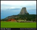
| 05/05/2003 05:43:26 AM |
Devils Tower National Monumentby SonifoComment: Very nice colors..perhaps the fore groud is a little too much. You can crop a little in front and a little on the right and that may help.7
|
| Photographer found comment helpful. |
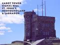
| 05/05/2003 05:41:14 AM |
Cabot Towerby orussellComment: nice choice of font and a good timing for taking the image.. I like the fact that the human being is at the right place in the overall composition. The font works well with the overall intent of the image. Perhaps it is a too close to the tower..that part is a little disturbing.6 |
| Photographer found comment helpful. |
| 05/05/2003 05:35:14 AM |
Surf, Sand and Sunby JeileenComment: I like the movement in the text and the overall image, I think the text is a little too overpowering for the image. may be a lighter color would help. |
| Photographer found comment helpful. |
Home -
Challenges -
Community -
League -
Photos -
Cameras -
Lenses -
Learn -
Help -
Terms of Use -
Privacy -
Top ^
DPChallenge, and website content and design, Copyright © 2001-2025 Challenging Technologies, LLC.
All digital photo copyrights belong to the photographers and may not be used without permission.
Current Server Time: 08/04/2025 05:05:42 PM EDT.