| Image |
Comment |
| 05/17/2004 07:38:19 AM |
|
 Photographer found comment helpful. Photographer found comment helpful. |
| 05/17/2004 07:37:41 AM |
The Freshest Juiceby bruskiComment: looks like a commercial!! The colours are fine, but I think it's just too small cropped on the edges and too big on the upper and bottom site..maybe a light from the site would have lit up the orange, making it more sparkling orange on the sites!! |
| Photographer found comment helpful. |
| 05/17/2004 07:34:53 AM |
Tulipby Ecce_SignumComment: what's that in the background????? the clutters are disturbing me..my eyes keep going over there, and miss that lovely simple tulip..another bakcground would have been fine.. |
| Photographer found comment helpful. |
| 05/17/2004 07:32:59 AM |
The Sleeping Beeby s4nd3r99Comment: it's not sleeping, is it? :)
that's what you call dead centre! Even the surrounding is working with you, cause it is curling around the bee..The DOF is just a little too small...I would have liked to see the bee more in focus, and maybe a bit (teeny) more light on it..but the sharpness is great! |
| Photographer found comment helpful. |
| 05/17/2004 07:31:09 AM |
Flower Center Pieceby WildpurpleComment: this is not centered, this is overall composition! It is a moving picture, in the sense that it looks like the flowers are falling down..the picture is not sharp, too saturated and you did something to sharpen it, but it damaged your pixels..the border is strange..I like the colours, but the rest, I think, needs more improvement... |
| Photographer found comment helpful. |
| 05/17/2004 07:28:57 AM |
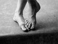
Sandi's Feetby scribeComment: somehow this picture keeps attracting me... at first I thought it was ridiculous; just two feet in a picture..but I must say, it is getting nicer and nicer to look at. The shadowing is great, it's okay that there is this dark part on the bottom to give balance to the feet...you managed to make a centered composition off centre though (looking at the lines), but that's okay! Good contrast, good picture! |
| Photographer found comment helpful. |
| 05/17/2004 07:25:31 AM |
Just Dandyby ellamayComment: I know this picture has been done before (even I did it!) but yours is truly great! It shows so much detail and I love the cropping..everything is in place, you worked great together with nature! It resembles a mandala!
The colours are great, very peacefull, love the lighting (how did you manage to get all..fluffies (don't know the English word :P ) so white???
Superb this...(I imagine the picture with a larg wooden frame)
10!!! |
| Photographer found comment helpful. |
| 05/17/2004 07:19:42 AM |
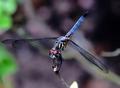
Dragonflyby Beerme425Comment: sharp, colourfull, centered, with macro's centering the subject is natural..in this photo it does the trick again! |
| Photographer found comment helpful. |
| 05/17/2004 07:19:01 AM |
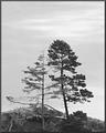
Embraceby LucidLotusComment: the background is to gray and the trees don't show much detail..the idea though works fine for me! I wonder why you made the picture black and white?? |
| Photographer found comment helpful. |
| 05/17/2004 07:17:31 AM |
sevenby slonkoComment: how cliche the roses and the waterdrops on them! I don't think this is a nice picture to look at, the composition doesn't do the flowers well, and the black background doesn't fit the colour of the roses.. Technically, I think it's a pity that some roses in the circle are more lit than others..the rose in the middle is beautifully lit though! maybe without the others, only the rose in the middle would have been more nice to look at..then the kitsch (is that English?) would have worked for the photo.. |
| Photographer found comment helpful. |
Home -
Challenges -
Community -
League -
Photos -
Cameras -
Lenses -
Learn -
Help -
Terms of Use -
Privacy -
Top ^
DPChallenge, and website content and design, Copyright © 2001-2025 Challenging Technologies, LLC.
All digital photo copyrights belong to the photographers and may not be used without permission.
Current Server Time: 06/18/2025 12:49:33 AM EDT.