| Image |
Comment |
| 07/28/2004 07:58:06 AM |
|
 Photographer found comment helpful. Photographer found comment helpful. |
| 07/28/2004 07:56:56 AM |
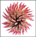
Fire of everydayby joaobaComment: Great lighting and clean background. The cropping feels a bit awkward at the bottom, as well as having the subject off center, yet not on the thirds. |
| Photographer found comment helpful. |
| 07/28/2004 07:56:03 AM |
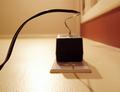
The Wireby dahlinComment: This would be very cool is more of it were in focus... The blurriness really detracs for me. |
| Photographer found comment helpful. |
| 07/28/2004 07:55:09 AM |
|
| Photographer found comment helpful. |
| 07/14/2004 08:50:05 AM |
Hurtby moviemanComment: I'm not sure you needed to select some of the words you did to make the point... Might have beena bit of overkill as I would have had the same photographic impression with a few of them left out or substituted. Also would have been more impactful to me to have the subject fill more of the frame and have the words closer together. |
| Photographer found comment helpful. |
| 07/14/2004 08:36:13 AM |
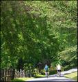
Free Wheelingby admart01Comment: This image is overexposed - the highlights on the right cyclist's shirt are blown out. Onfortunately, a sa subject, this makes for a distraction. Might have been better to spot meter lower in the shot and take some underexposure in the trees. |
| Photographer found comment helpful. |
| 07/14/2004 08:33:11 AM |
... of Expressionby awpollardComment: I think a b/w treatment in this image would help to eliminate some of the distractions - which are all in color. |
| Photographer found comment helpful. |
| 07/14/2004 08:28:40 AM |
Freedom from the Cityby andywightmanComment: This shot has potential, but my initial thought was that there isn't enough contrast between the design elements. With the right lighting, or a more dramatic sky (sunset/sunrise) this would be vastly improved. |
| Photographer found comment helpful. |
| 07/14/2004 08:26:57 AM |
...No Worries, Just Funby L1Comment: I think a more open crop that expanded the beach scape would help the aesthetics of this shot. |
| Photographer found comment helpful. |
| 07/14/2004 08:23:28 AM |
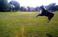
Freedom in Playby melismaticaComment: I love the shot, but it's very blurry. I've been trying to get one of these with my dog, but always run into the bluriness as well. |
| Photographer found comment helpful. |
Home -
Challenges -
Community -
League -
Photos -
Cameras -
Lenses -
Learn -
Help -
Terms of Use -
Privacy -
Top ^
DPChallenge, and website content and design, Copyright © 2001-2025 Challenging Technologies, LLC.
All digital photo copyrights belong to the photographers and may not be used without permission.
Current Server Time: 06/19/2025 08:34:12 PM EDT.