| Image |
Comment |
| 05/27/2004 10:43:24 PM |
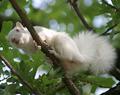
The Ever-Elusive Albino Squirrelby DefyTimeComment: How did this not win? What's newer and different
than an albino squirrel? I know I've never
seen one before. As I'm sure hardly anyone has.
Is it because the picture wasn't shot well?
No. The squirrel is very clearly shot, close-
up in vivid color. Sure the
leaves above it are above it are blurred. But that's
negative space. trivial.
8th is great but you deserved even higher.
|
 Photographer found comment helpful. Photographer found comment helpful. |
| 05/27/2004 10:17:44 PM |
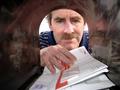
Any Mail Today?by SammieComment: I would be surprised if this picture doesn't finish in the top 10...
Composition is great. The sides of the mail box funnel the
attention towards the person getting his mail. And it definitely fits the theme of unusual viewpoint. Good job!
I give this a 9. |
| Photographer found comment helpful. |
| 05/24/2004 10:09:02 PM |
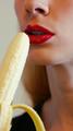
Nanners...the new forbidden fruitby BigZenDragonComment: I like the idea of this picture, however the banana is blurry and her mouth
is crystal clear. Shouldn't it be the other way around, given the
theme of this challenge?
On the other hand, I do like the sensual way her mouth seems
to anticipate the err..banana.
I give this a 7 |
| Photographer found comment helpful. |
| 05/24/2004 10:02:10 PM |
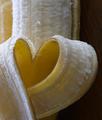
I Love Bananas by CantiqueComment: This gets the "why didn't i think of that" award...it's so simple...but it works!
Slight blur just above the heart shape. But okay, since it emphasizes the focal
point of the title.
shape. I like it....a 7 |
| Photographer found comment helpful. |
| 05/24/2004 09:54:14 PM |
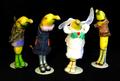
Bananarama on Tourby drgsoellComment: So clever! This will recieve high marks for originality I'm sure.
And solid black background works well here.
Contrasts with all the yellows...and colorful banana outfits
I can't believe I just typed that. lol
I'm giving this a 9.
Bravo! I give it a 9.
|
| Photographer found comment helpful. |
| 05/23/2004 04:40:06 PM |
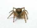
Here's looking at you, kid!by dsa157Comment: Terrific macro photo of an unusual subject. Fits the theme well. Obviously
a fine camera, given the clarity of the zoom. And
the white background contrasts well with the multi colored spider so
the composition is good too. Even if you don't like spiders, this picture
is hard to ignore. Well done. An 8 |
| Photographer found comment helpful. |
| 05/23/2004 04:39:29 PM |
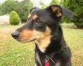
Contemplationby jimmyn4Comment: This picture would garner a higher score in an animal theme, but here
it isn't centered enough. Having it face the camera and not 3/4 like it is here,
would help big time. It's a nice clear picture of a cute dog, but just isn't
centered enough. And to really have it centered, have the dog further back from the camera instead of filling up so much space. This would further emphasize
the centeredness of the dog.
Still a good clear pic though, so I give it a 6. |
| Photographer found comment helpful. |
| 05/23/2004 04:28:47 PM |
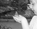
fly away with meby mamabear5612Comment: The picture has the big AWW factor, as it is adorably touching, with child
and butterfly. I believe butterfiles should be in color, to better appreciate
their beautiful wings. But on the good side, it is centered so it fits the theme.
And i know it wasn't easy to have a butterfly to stay on a person's hand,
even if perfectly still. In color I would give it a higher score, but as it is, I give you
a 7 |
| Photographer found comment helpful. |
| 05/23/2004 04:20:59 PM |
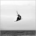
On Any Windy Sundayby jimmythefishComment: I like action shots, because they're a challenge to pull off, and more interesting
to look at.
Nothing wrong with black and white, but in action we'd have chosen to have it
in color. Your picture fits this broad theme as it is centered.
And even if the water
is not the main subject, it would be nice if it was less blurry. Still all in all, a good
effort...I give you a 6. |
| Photographer found comment helpful. |
| 05/23/2004 04:13:04 PM |
Amanda's Eyesby deafwolfComment: Not the most creative idea but beautifully simple. Soft focus is good , but just
a tiny bit more sharpening would help some. Your picture fits the theme,
but how about her facing the camera and not 3/4? That way both of Amanda's
eyes would be at the center of your composition. I give it a 7. |
| Photographer found comment helpful. |
Home -
Challenges -
Community -
League -
Photos -
Cameras -
Lenses -
Learn -
Help -
Terms of Use -
Privacy -
Top ^
DPChallenge, and website content and design, Copyright © 2001-2025 Challenging Technologies, LLC.
All digital photo copyrights belong to the photographers and may not be used without permission.
Current Server Time: 08/25/2025 12:50:35 AM EDT.