| Image |
Comment |
| 04/04/2007 03:50:00 PM |
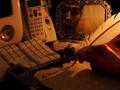
My Dearest Langdon,by bdennyComment: Another Langdon birthday challenge? :-)
I like the quill pen, ink bottle, and the caligraphy writing
in contrast with the modern devices of today.
Interesting shade of sepia for the whole photo.
What about have the modern tools in color and the older
tools in black and white? This is advanced editing, so it's allowed.
Could be slightly sharper in focus.
Overall, I like the concept. Creative. |
 Photographer found comment helpful. Photographer found comment helpful. |
| 04/04/2007 03:39:13 PM |
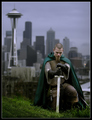
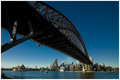
Longing for Home by robaComment: Very nice concept, and great execution. Muted lighting is fine for
this composition. Good DOF with the skyscrapers blurred behind this
Medieval Man. Is he looking down because he's being knighted?
IMHO I still would have had him look towards the camera, with
a look of pride in his eyes.
Overall, I'd give this an 8 |
| Photographer found comment helpful. |
| 04/03/2007 02:11:09 PM |
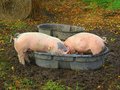
Pigs at Lunch, Family Styleby annigComment: MMM bacon. Sorry that was uncalled for.
As for this photo's
technical merits IMHO: Fine, overall. Except I would not have
included the roll of hay and the empty gray
tub in the back, within camera view, as they divert some attention from
the subject, the three pigs. Those objects could have been
blurred out as an alternative, which adds to depth of field.
Also it would have been nice if this photo
showed the head of at least one of the three pigs, even if it were
side angle only. This would capture more interest I believe.
The lighting, sharpness, and contrast seem fine. |
| Photographer found comment helpful. |
| 04/03/2007 01:52:16 PM |
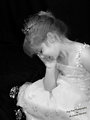
Princess.jpgby angelfireComment: Cute kid, pretty dress, hair is nice and seated position is classic.
The lighting is overly bright. Slightly dimmer lighting,
and a slightly softer focus would be a good alternative.
And having her face turned more towards
the camera, either full or three quarter angle,
might work better.
Otherwise, A lovely portrait. |
| Photographer found comment helpful. |
| 04/03/2007 05:48:32 AM |
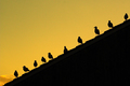
Birds of a feather flock togetherby lentilComment: I like the diagonal line of the silhouetted birds.
The symmetry of that is nice. And the
yellow hued sky is a nice contrast to the dark shadings
of the house roof. Well composed. |
| Photographer found comment helpful. |
| 04/03/2007 05:36:52 AM |
|
| Photographer found comment helpful. |
| 04/03/2007 05:15:42 AM |
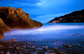
Still in the blueby Rino63Comment: High contrast and over saturation of colors usually hurts
a photo. But this one is an huge exception. Good job. 10 |
| Photographer found comment helpful. |
| 04/03/2007 05:14:53 AM |
|
| Photographer found comment helpful. |
| 04/02/2007 02:22:04 AM |
Young Farmerby MadukesComment: I can kind of see where you were going with this, so It's fine
that the background, his arm and shirt are blurry. But his face should be in better focus. Cute kid though.
|
| Photographer found comment helpful. |
| 04/01/2007 02:34:46 AM |
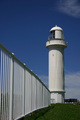
The Lighthouseby dewdodesignComment: A photo doesn't need to be dramatic or exciting to be good. And
this photo shows that. I like the vertical row of bars on the white fence
the fence, stretching towards the lighthouse. And the lighthouse
itself is good to look at with it's simple lines. |
| Photographer found comment helpful. |
Home -
Challenges -
Community -
League -
Photos -
Cameras -
Lenses -
Learn -
Help -
Terms of Use -
Privacy -
Top ^
DPChallenge, and website content and design, Copyright © 2001-2025 Challenging Technologies, LLC.
All digital photo copyrights belong to the photographers and may not be used without permission.
Current Server Time: 08/25/2025 12:47:46 AM EDT.