| Image |
Comment |
| 11/16/2007 08:44:43 PM |
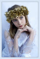
The Elusive Smileby Blue MoonComment: Light enlarges, dark diminishes....
The bright white tummy makes her look fat. You could burn it down ... or crop it (perhaps up to the bottom of the jacket).
Edit to add: I do love her smile here. I like the way she smiles even with her eyes. Message edited by author 2007-11-16 20:45:10. |
 Photographer found comment helpful. Photographer found comment helpful. |
| 11/16/2007 08:43:04 PM |
|
| Photographer found comment helpful. |
| 11/14/2007 07:49:46 PM |
|
| Photographer found comment helpful. |
| 11/14/2007 07:47:01 PM |
Ashleyby njsabsComment: Awesome portrait! Beautifully lit, beautifully processed. |
| Photographer found comment helpful. |
| 11/13/2007 08:03:51 AM |
Cliffby lovethelightComment: Perfect execution! There's nothing more to say. The lighting is perfect. The crop, the B&W treatment, his pose and natural smile. All well done. |
| Photographer found comment helpful. |
| 11/05/2007 07:28:10 AM |
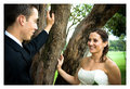
Sandy Grant2 221a.jpgby lentilComment: I like this. This kind of image (where the couple are looking at each other) are so much more engaging than images where the couple are looking at the camera. |
| Photographer found comment helpful. |
| 11/05/2007 07:26:58 AM |
|
| Photographer found comment helpful. |
| 11/05/2007 07:26:34 AM |
Sandy Grant 1 037a.jpgby lentilComment: Pretty girl. Love the shallow DOF on her. It would have been nice to get one more just like this without the hand behind her. |
| Photographer found comment helpful. |
| 11/05/2007 07:25:10 AM |
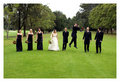
Sandy Grant2 259.jpgby lentilComment: Great idea for posing. I love images like this where everyone is looking at the B&G. The fact that others, in the image, are doing so, adds interest and forces you to look as well (sort of a "people'd negative space"). |
| Photographer found comment helpful. |
| 11/02/2007 01:21:13 AM |
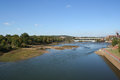
Drought by SDWComment: Having just come home from a 3-day photographer's convention, I'll pass along one of the tips expressed by several of the speakers. They said:
Every image should have a foreground, a middle ground, and a background.
That said ... I would consider this image mostly background, with no fore nor middle. And that explains why the image doesn't really "stand out". As you look at it, there is nothing in the image to "draw you in", to make you "want" to look at it. There is no specific subject ... the entire image *is* the subject.
Now, from a documentary point of view, the image is great. And perhaps that lends it somewhat to the photojournalism side of things. But had this image been submitted to the challenge, I'm sure the voters would have been lackluster in their voting specifically because of that lack of "wow factor".
Hope this helps.
|
| Photographer found comment helpful. |
Home -
Challenges -
Community -
League -
Photos -
Cameras -
Lenses -
Learn -
Help -
Terms of Use -
Privacy -
Top ^
DPChallenge, and website content and design, Copyright © 2001-2025 Challenging Technologies, LLC.
All digital photo copyrights belong to the photographers and may not be used without permission.
Current Server Time: 06/19/2025 06:44:27 PM EDT.