|
|
|
Showing 1521 - 1530 of ~2015 |
| Image |
Comment |
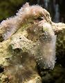
| 07/08/2005 10:59:21 PM | Coral Morphsby HeavyComment: Composition: 6, Better than average composition. You filled the frame and avoided centering the subject.
Technical: 6, Sharp where it needs to be. Background is out of focus (good), illustrating shallow (but not real shallow) DOF.
Appeal: 4, I think that for an aquarium owner, this would probably hold more appeal. Perhaps you could broaden the ability by playing with the light and color intensities on the coral... make the image more dynamic.
Challenge: 5, Appears to meet the change as a "close-up" but doesn't go all out. A better image for this challenge would be focus right in on just a portion of the anemone (sp?) on the right.
Overall Calculated Average Score: 5, Okay image... could use a little more creativity. |  Photographer found comment helpful. Photographer found comment helpful. |
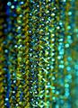
| 07/08/2005 10:53:54 PM | Now I'm cleanby JinjitComment: Composition: 3, Too static (straight up and down). Next time try an angle to give it more energy.
Technical: 6, Nice and sharp in the middle, shows (good) shallow DOF.
Appeal: 3, Lacks a strong "subject" (a specific reason to look at the image). Throw a bug in there and ya got something! No, but really... it needs something to focus the viewer's attention
Challenge: 5, Appears to fit the challenge, but it's hard to tell. It needs some kind of context to let the viewer know the size of the objects in the image.
Overall Calculated Average Score: 4, Technically not a bad image... it's just that, beyond being "abstract", it lacks a reason for the viewer to want to spend more time looking at it. | | Photographer found comment helpful. |
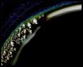
| 07/08/2005 10:50:16 PM | Espressoby aznymComment: Composition: 7, Nice angled curve
Technical: 6, Sharp where it counts while showing shallow DOF
Appeal: 3, For me, it's just too "dark" overall (which may be very appealing to some, but for me, a happy person who likes bright colors, it doesn't work well).
Challenge: 5, Hard to put the size into context ... what are we really looking at? Is it something small and really close up? Or something larger? In other words, I think it needs something to help give the image context.
Overall Calculated Average Score: 5, Not really a bad pic, and technically okay, just not one that appeals to me. | | Photographer found comment helpful. |
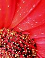
| 07/08/2005 09:54:39 PM | $$Bing Bing$$by groggyfroggyComment: Composition: 8, I like the boldness in moving the subject all the way to one side and leaving the rest of the image in negative space.
Technical: 6, Nice sharp subject. Good lighting and exposure.
Appeal: 7, I like the colors, both of the cherry and the background.
Challenge: 4, It's a nice close-up ... but if I were to simply stumble upon this image in a gallery, I wouldn't categorize it as a macro and probably wouldn't think to call it a close-up. So I'm going for slightly less than middle of the road 4 here.
Overall Calculated Average Score: 6, This is a really nice image and one that I would like more outside of the challenge. Basically, I just wish it were a stronger competitor as far as the challenge is concerned. | | Photographer found comment helpful. |
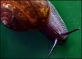
| 07/08/2005 09:43:03 PM | mountain snailby arlanbartComment: Composition: 8, Like the angle of the snail across the image. For a higher score, I tend to prefer looking forward into a subject rather than down on top of it.
Technical: 6, Snail is mostly in focus, but part of it almost looks like motion blur (snail moving too fast?!? ), You could have applied a little gaussian blur to the green surface or cloned out the spots.
Appeal: 6, I like the colors
Challenge: 7, Nice close-up ... almost macro.
Overall Calculated Average Score: 7, NIce | | Photographer found comment helpful. |
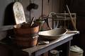
| 07/06/2005 06:48:49 AM | Great-Grandma's Kitchenby L1Comment: I didn't get to vote in this challenge, so I'm just taking a quick peek at the finishers. This one is awesome Laurie. It looks like a painting! | | Photographer found comment helpful. |
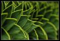
| 07/05/2005 01:09:32 PM | Caution - monkey tree!by photobornComment: I started out with a 5 on this but decided I had been too quick to judge. I've changed my vote to a 7.
I like the repeating pattern. I like the use of DOF to accentuate part of the image and not the rest. I like how the border keeps your eye from wandering away. Nice colors and sharpness.
What could make it better? Perhaps a stronger central subject. I mean, what if the leaf that is in sharp focus had a ladybug climbing up?
Hope the comments help. | | Photographer found comment helpful. |
| 07/05/2005 01:06:23 PM | Flamencoby saracatComment: The images that always suffer from a lack of comments are the ones that are right in the middle ground. Everyone comments on the awesome shots. Some comment on the bad shots. But the middle ones, very few people say anything. So here I am to explain why I voted a 5:
This shot is fine as far as the subject matter goes. I do like the cropping and the angle. The sharpness seems okay (perhaps a tad over sharpened?). I think my main fault with it is the subjet matter itself... I'm sure you and others will disagree so this is probably more a matter of choice. I'm just looking for a little more "pizazz" to set an image apart from the rest.
| | Photographer found comment helpful. |
| 07/05/2005 01:03:15 PM | Bug's Lifeby ZippyComment: The images that always suffer from a lack of comments are the ones that are right in the middle ground. Everyone comments on the awesome shots. Some comment on the bad shots. But the middle ones, very few people say anything. So here I am to explain why I voted a 5:
This image has pretty good sharpness and I'm leaning towards a 6. You caught the bug at a good angle and all. I would like to have seen a little more less clutter to the background (perhaps crop out some of the unimportant stuff) and perhaps a little more detail in the bug's head.
Hope the comments help. | | Photographer found comment helpful. |
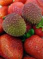
| 07/05/2005 10:07:06 AM | Infiltratorsby GeneralEComment: The images that always suffer from a lack of comments are the ones that are right in the middle ground. Everyone comments on the awesome shots. Some comment on the bad shots. But the middle ones, very few people say anything. So here I am to explain why I voted a 5:
This image qualifies as a close-up (not a macro), and has pretty good sharpness and depth of field. I really like the reds in the surrounding strawberries. Where I think it lacks is in the main subject. Something different, even little whisps of whipping cream or some other "stark contrast" to the red of the strawberries, would have added interest to the image. You might also play with lighting to add a little difference in highlights and shadows.
Hope the comments help. | | Photographer found comment helpful. |
|
Showing 1521 - 1530 of ~2015 |
Home -
Challenges -
Community -
League -
Photos -
Cameras -
Lenses -
Learn -
Help -
Terms of Use -
Privacy -
Top ^
DPChallenge, and website content and design, Copyright © 2001-2025 Challenging Technologies, LLC.
All digital photo copyrights belong to the photographers and may not be used without permission.
Current Server Time: 06/27/2025 03:18:40 PM EDT.
|