|
|
|
Showing 441 - 450 of ~1262 |
| Image |
Comment |
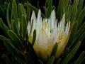
| 12/09/2005 06:13:15 PM | White Proteaby tonyvComment: A wonderfully delicate looking shot. I love the interplay of colors, from the flat black backing, to the deep greens, and then yellows and whites of the flower. Quite a gorgeous shot! |  Photographer found comment helpful. Photographer found comment helpful. |
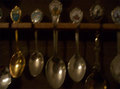
| 12/07/2005 07:28:32 AM | Spoon Collectionsby coatedbtrmlkComment: Amy, I hope you're not discouraged by your first shot's final score. You should definitely keep shooting and keep entering challenges. I look forward to seeing much more of your work here! | | Photographer found comment helpful. |
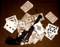
| 12/01/2005 08:41:11 AM | DEBT COLLECTIONby meowComment: Brilliant concept! I'd also like to see a much tighter crop - maybe the barrel, trigger area of the gun and a few fragments of playing cards and bills. Really fill the frame with that pistol - great impact! | | Photographer found comment helpful. |
| 12/01/2005 08:39:20 AM | Spoon Collectionsby coatedbtrmlkComment: This picture has wonderful potential, but suffers from some problems that will hurt its scoring in this challenge. It looks like you were shooting in fairly dim light, and your camera used a longer shutter speed to compensate. At that speed, it was unavoidable that your hand moved a bit while the shutter was open, blurring the spoons considerably. It's a shame not to be able to make out the detail present at the ends of the handles, for that surely would have been a great point of interest in your photo. Brace the camera on a steady object or use a tripod when shooting in dim light to avoid that motion blur. You can also bring in some brighter lights, shining them from the side to avoid the glare and reflection that would come from lights above or behind you. Keep shooting and entering challenges! | | Photographer found comment helpful. |
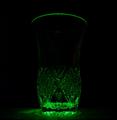
| 11/29/2005 08:01:59 PM | Green Laser Through A Vaseby PixlmakerComment: Greetings from the Critique Club
by strangeghost
COMPOSITION
I like the monochromatic approach, and the liberal use of negative space. The way the rim of the glass seems to float in the void above the pattern is interesting. I wish you had pulled in a little tighter on the glass patterning though. That is an area of visual interest but it seems a little indistinct. Though I like the square crop, I might have recommended chopping a little more of the space from above the rim and to the sides (notwithstanding my comment about negative space above)
TECHNIQUE
An ambitious attempt here. Black background, unusual lighting and light source, and a stark minimalist approach combine to make a shot stand or fall on visual appeal and technical merit. Your bold use of black space leaves very little detail upon which to hang things like focus, sharpness, etc. There's not enough detail in the glass etching to really tell if focus is good or not. I think you might have tried for a little bit more light - either supplementing the laser light with another light source, or playing the laser light around the glass during your exposure ("painting" the glass), or even backlighting with the laser. As shot, there is so little detail that the eye is left with a relative vacuum of focal points.
OVERALL IMPACT
I really want to like this image a lot more than I do, and I suspect that voters agreed with this sentiment, given your 4.79 final score. I sense a lot of unfulfilled potential in this shot. I wonder if you experimented with a macro effect, zooming in on the etched pattern? I wonder if you looked at other points of view, and as suggested above, more and different light and lighting effects?
Fairly minimalist voter comments, which tells me you likely got tons of quick 4-5 votes and moved on. DPC really demands that you capture the voters' attention and give them some initial "wow." I think your shot had the potential to do that, but fell short of the goal. Keep shooting and keep trying for interesting effects like this.
| | Photographer found comment helpful. |
| 11/17/2005 09:14:48 AM | Shannonsby jeffzoetComment: Very nice work with the lighting. Because of the limitations of the triptych size, I might have considered a head or torso-up shot instead of full body. She's stunning and all three shots are well done. Nice contribution to the challenge! | | Photographer found comment helpful. |
| 11/17/2005 08:18:12 AM | Cold Morningby JadeleeComment: I'm proud of you Jade. You have a photograher's eye. Keep shooting! | | Photographer found comment helpful. |
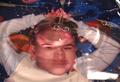
| 11/12/2005 01:31:19 PM | Transparent Ripplesby MattOComment: Greetings from the Critique Club
by strangeghost
COMPOSITION
An unusual and eye-catching take on the challenge! At first glance you assume the person is underwater (cool!) but then it dawns that you've used a transparent dish of some type (still cool!). The comp is pretty straightforward, mostly centered, with a little perspective distortion and a lot of water distortion. The rippled distortions of the face are interesting and tend to draw attention to the center. The left elbow is chopped much more than the right, and the space at the top gives an overall unbalanced feel.
TECHNIQUE
There are a couple of lighting issues that really weaken the photo IMO. First, the awful reflective glare at the bottom right, and scattered elsewhere, e.g., the forehead, are huge distractions and should have been avoided by more careful lighting and subject placement. The second issue is the white balance, which is off causing there to be no really white areas of the image that seem as though they ought to be white (bottom half of shirt). These are enough to decrease the appeal of a photo in a challenge alone. The profusion of bubbles didn't help you either. Rather than pouring water to achieve your rippled effect, I wonder if you had experimented with dropping drops or simply doing a little gentle sloshing with the container you had suspended over the subject? The bubbles pretty much overpower the ripples for me.
OVERALL IMPACT
Decent visual impact upon initial look, but then the distracting elements begin to take their toll. You're final score of 4.85 most likely reflects the voters concluding as well that this was a photo lacking that punch or pop that DPC challenges seem to demand. Most of your commenters certainly seemed to appreciate your shot - as did I, but many mentioned the same problems I did. This is the type of shot that I believe has great potential if you have the patience to work out the kinks in setup and in post-processing. Eliminate the distractions, perfect the composition - simple and clean, make the colors pop, etc. Good attempt and please keep shooting!
| | Photographer found comment helpful. |
| 11/09/2005 06:55:24 PM | She is more transparent than the rest...by TOYComment: Greetings from the Critique Club
by strangeghost
COMPOSITION
An intriguing image. The composition manages to convey a sense of business and loneliness at the same time. The subject is a bit difficult for me to make out though. Appears masculine for some reason (not sure exactly why I think that) but your title suggests it's a woman. The passersby are ghostly and impersonal - maybe a bit too ghostly? Overall, I like the space and context - not too close, not too far. Just right. Excellent comp.
TECHNIQUE
Here's where your pic really gets interesting for me. Choosing the right shutter and aperture to capture the motion must be tricky, and I really like your result. The lighting has an orange caste that I like a great deal. It really feels like a somewhat dirty street scene lit by those ghastly cheap sodium vapor lights that you find in many urban areas. Your use of shutter and aperture to capture the action is nearly perfect. I might have liked to see the ghostly walkers a have a bit more definition, but that's splitting hairs in a very technically difficult shoot that you pulled off extremely well. Your depth of field is very great, which is a little surprising given your large aperture. I'm curious what lens you used, and whether it was a zoom or fixed.
OVERALL IMPACT
Quite a lot of impact, IMO. I'm very happy to have had a chance to study this image closely. As I suggested above, there is a great deal of emotional tension here, implied abandonment, poverty, and the down-trodden ignored by the insensitive masses. It's not easy to pack such a punch into a simple picture, but you've done it. Your final score of 5.7 is a bit disappointing in my view, but then it's easy to see why many DPCers would pass pretty quickly by (nice irony there, no?) if they're not immediately wowed by something.
I just paused to read over your comments and am gratified to see that others recognized what I saw in this image as well. You should be proud of this accomplishment regardless of its final place in the challenge. I am honored to have been selected to critique it. | | Photographer found comment helpful. |
| 10/30/2005 02:15:49 PM | Gateway to Clevelandby bobdaveantComment: Greetings from the Critique Club
by strangeghost
COMPOSITION
The composition is a little too cluttered. The blue bridge and its reflection in the water appear to be the subjects, but there is further construction in the background that appears superimposed behind it. All the boats and buildings on the left and right make for a confusing and busy scene. It certainly qualifies as wide angle with the great expanse of water in the foreground giving the picture a feel of great breadth. I love the bird at upper left. Very nice touch! Too bad the water's a bit dirty directly in front.
TECHNIQUE
Great sharpness, focus, contrast, nothing to complain about at all!
OVERALL IMPACT
While this is a technically excellent photo, it lacks that subjective punch needed to make the viewer stop and stare. I think it's tough for a photo of a busy scene to do that - there is no clear single subject to command attention and become the centerpiece of your pic, and no sense of drama or emotional draw.
Pretty sparse, eh?
| | Photographer found comment helpful. |
|
Showing 441 - 450 of ~1262 |
Home -
Challenges -
Community -
League -
Photos -
Cameras -
Lenses -
Learn -
Help -
Terms of Use -
Privacy -
Top ^
DPChallenge, and website content and design, Copyright © 2001-2025 Challenging Technologies, LLC.
All digital photo copyrights belong to the photographers and may not be used without permission.
Current Server Time: 08/12/2025 11:07:41 PM EDT.
|