| Image |
Comment |
| 05/13/2006 11:47:33 AM |
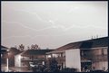
Turned Night Into Day (12:05 a.m.)by espy2Comment: While you've done an excellent job of capturing a lightening strike (not easy, I know!), the fact that you've also turned night into day is what leaves this image severely lacking. IMO, if you would have pp'd the shot so the sky darkens again, the contrast between dark sky and while lightening is what makes a shot like this pop. |
 Photographer found comment helpful. Photographer found comment helpful. |
| 05/13/2006 11:45:49 AM |
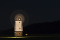
Whirling Blades With Moonlit Skyby rioloboComment: Wow. I think if you'd selected a much tighter composition on the mill with the blurred whirling blades, you might have had a top 20 shot here. To me, the negative space doesn't work because I want to see detail and texture on your very interesting subject!! |
| Photographer found comment helpful. |
| 05/13/2006 11:43:51 AM |
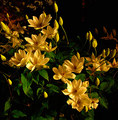
Henry around midnightby claudia26Comment: It doesn't look like a typical night shot, but it has a very definite appeal. The darkened and muted tones somehow maintain a rich saturation. Nicely textured with shadows as well. I like the shot! |
| Photographer found comment helpful. |
| 05/13/2006 11:41:53 AM |
|
| Photographer found comment helpful. |
| 05/13/2006 11:40:16 AM |
Scammonden Reservoirby KHoltComment: A very nicely composed shot with beautiful lines all over. It seems a little too dark overall, but a very nice shot nonetheless. |
| Photographer found comment helpful. |
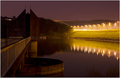
| 05/13/2006 11:39:34 AM |
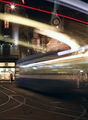
R I V E R W A L Kby manic35Comment: A beautifully selected location from which to shoot, but the various competing lines have left you with a disturbingly tilted distant horizon. That line of shore in the distance "feels" like it should be the horizontal anchor point of the photo. The fact that it's tilted toward the upper left makes me feel like I'm falling over to the right as I view. I'm sure that'll cost you points on what would otherwise have been a top 20 finish for sure. |
| Photographer found comment helpful. |
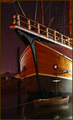
| 05/13/2006 11:37:06 AM |
The Santa Mariaby timfythetooComment: Yikes dude, this is an excellent shot, and stopped me in my voting tracks (I usually come back and comment after voting is done). I think this photo is an outstanding accomplishment. I love the choice of composition/crop, which works especially well due to the presence of the small boat at the bottom. If not for that, the crop on the larger ship would look awkward and unnecessary. The detail and texture throughout the photo are outstanding, my eyes just want to roam from top to bottom and from side to side, always finding something new to study and appreciate... I swear I've been hung up on this shot for 5 minutes now. I've got to move on, but I'll be back to read your photographer's comments after the challenge. Well done!! |
| Photographer found comment helpful. |
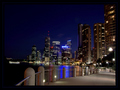
| 05/13/2006 11:32:29 AM |
Beaming Beantownby djhockmanComment: By this time, I'm sure you've been pounded to death with "size" comments so I'll spare you. ;-) This looks like a potential killer image of Boston. The colors are richly saturated and the sky is an amazing gradient that looks perfectly dusky. The horizon looks a bit tilted, which in a larger format, would be very annoying and cost you voter points. Though it's tough to tell at this size, I think your focus and sharpness are spot-on. If this image had been submitted at the full 640px, I'm guessing you would have had a top 10 image here, maybe a top five. Live and learn my friend. Study up on how to size those entries correctly for DP challenges!! |
| Photographer found comment helpful. |
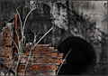
| 05/13/2006 11:28:41 AM |
Dragon’s Portal Courtyardby ShamanComment: This is a shot that I want to like, but something doesn't quite work. The dead branches in the foreground, which would otherwise add some interest and depth, just seem to be misplaced and don't really add much, IMO. I like the use of selective desat, and the textures on the far concrete wall/tunnel and the brick, I just wish there was some clear focus point and object of interest. |
| Photographer found comment helpful. |
| 05/13/2006 11:25:37 AM |
Demon Progeny Curseby ImagineerComment: I'll be back to check this one out after voting is over, hoping to see how you accomplished this haunting visual effect. Very powerful photo! |
| Photographer found comment helpful. |
Home -
Challenges -
Community -
League -
Photos -
Cameras -
Lenses -
Learn -
Help -
Terms of Use -
Privacy -
Top ^
DPChallenge, and website content and design, Copyright © 2001-2025 Challenging Technologies, LLC.
All digital photo copyrights belong to the photographers and may not be used without permission.
Current Server Time: 08/07/2025 04:05:30 AM EDT.