| Image |
Comment |
| 09/02/2004 04:41:33 AM |
|
 Photographer found comment helpful. Photographer found comment helpful. |
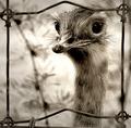
| 09/02/2004 04:35:03 AM |
Like a llama...or an Emu by PedroComment: Wow - amazing shot! This is absolutely perfect for this challenge and a really excellent photograph all around. Great job! |
| Photographer found comment helpful. |
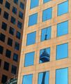
| 09/02/2004 04:23:18 AM |
CN Towerby JasperComment: This is a nice take on the challenge and a very clear and nicely composed photo as well. Good job! |
| Photographer found comment helpful. |
| 09/02/2004 04:22:08 AM |
Duo Frameby PhobosComment: I love this shot. After the challenge is over, I hope you go back and burn that bottom right corner a bit to even out the lighting, but this is a really nice photo even with the slight glare. |
| Photographer found comment helpful. |
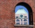
| 09/02/2004 04:19:32 AM |
Historical Perspectiveby ehowardComment: I would love this photo if it just consisted of the top right quarter of what you have here. I have no idea what that big dark thing in the foreground is and it doesn't seem to be essential to the shot. I really like what you were doing here since the contrast between what's inside and what's outside is so high. |
| Photographer found comment helpful. |
| 09/02/2004 04:09:40 AM |
Time Frameby longlivenyhcComment: I love this shot. Your composition is great and the focus and color are really nice throughout. Great job! |
| Photographer found comment helpful. |
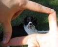
| 09/02/2004 03:43:36 AM |
Boxed in Pupby kidchicoComment: I think this shot would have been even nicer if the lighting were consistent throughout. Since the front is so bright, the dog comes out a bit dark. You might try just shooting the whole thing in shade next time and leaving the shutter open longer for even, richer colors. Still, cute shot! |
| Photographer found comment helpful. |
| 09/02/2004 03:39:20 AM |
Hole in the Wallby davehugeComment: I would be absolutely crazy about this picture if the FG wall were in focus too. All the other lines are so crisp that it would just be a great complement to the subject. But that would be pretty hard to accomplish and this shot is very nice like this as well. |
| Photographer found comment helpful. |
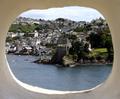
| 09/02/2004 02:11:52 AM |
View from a Castleby BobsterLobsterComment: This is a nice picture for this challenge, but I think it would have been better if the horizon didn't run through the center of the picture. Maybe if the lighthouse were lower it might have a more dramatic effect. Other than that, this shot came out very well. |
| Photographer found comment helpful. |
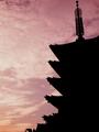
| 08/30/2004 07:18:07 AM |
Pagodaby NatashaComment: This is a really nice silhouette and a beautiful photo. It seems like the shot might benefit from having more uniform coloring in the sky, which would involve working on the orange in the bottom left corner, as well as a bit more contrast in the sky. This is a beautiful shot, but I think it would be even better with more contrast. |
| Photographer found comment helpful. |
Home -
Challenges -
Community -
League -
Photos -
Cameras -
Lenses -
Learn -
Help -
Terms of Use -
Privacy -
Top ^
DPChallenge, and website content and design, Copyright © 2001-2025 Challenging Technologies, LLC.
All digital photo copyrights belong to the photographers and may not be used without permission.
Current Server Time: 08/14/2025 10:02:32 AM EDT.