| Image |
Comment |
| 05/22/2004 09:19:48 AM |
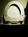
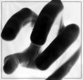
His Toiletby rezrosComment: I think you did a good job of presenting an unpleasant subject in an attractive manner.I would probably have cropped off more of the black at the bottom, to accent the abstract quality of the composition. This is one of the few compositions that would actually work well as a square instead of a rectangle. 7 |
 Photographer found comment helpful. Photographer found comment helpful. |
| 05/22/2004 09:13:43 AM |
|
| Photographer found comment helpful. |
| 05/22/2004 12:09:37 AM |
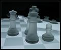
Seeing Doubleby agwrightComment: So, your habit is drinking vodka while playing chess on a board lit by cherenkov radiation? It really is an impressive image, but I can't help suspecting you just wanted to show off, and didn't really put much thought into presenting an image of a habit. 10 for image quality, 1 for insulting my intelligence, average 5.5 rounds up to 6. |
| Photographer found comment helpful. |
| 05/22/2004 12:04:13 AM |
|
| Photographer found comment helpful. |
| 05/22/2004 12:03:01 AM |
|
| Photographer found comment helpful. |
| 05/21/2004 11:59:19 PM |
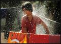
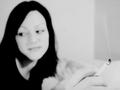
Smokeby matiscroComment: Not enough focus, and washed out. If her hand was held higher, so that you could crop real close in on it, and still keep her face in the shot, this would work better. Then, the focused part would take up more of the image. As it is, there is a lot of empty space that isn't adding to the image or the idea. |
| Photographer found comment helpful. |
| 05/21/2004 11:53:42 PM |
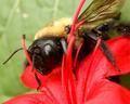
Bad Hbit - Stalking Beesby ladpupmoeComment: That's a wonderful photo of a bee, but c'mon, do you really want to brag about your habit of just entering anything you like, and trying to force it to fit the challenge with the title? |
| Photographer found comment helpful. |
| 05/21/2004 10:16:08 AM |
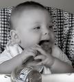
(Start them off with) Good eating habitsby redmondson01Comment: I really think black-and-white is unappetizing. In color, we would have the tasty orange of the sweet potatoes, the glow of the baby's face, and tghe lively colors of the blanket behind. Much more approprate for the subject. At least, you might want to try sepia tone, so the food doesn't look so much like axle grease. |
| Photographer found comment helpful. |
| 05/21/2004 10:11:24 AM |
CURIOSITYby MIN-BITERComment: Nice use of the border. However, I find negative images more "clever" than "talented". It makes it look like you are not confident on your abilities, so you rely on special effects. I inverted this, and it looked pretty good "straight". The overall effect is dramatic, though! And grabbing things is a habit I see a lot in my shop. So, an 8 from me. |
| Photographer found comment helpful. |
| 05/21/2004 10:04:53 AM |
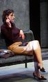
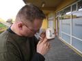
Deadly!!by Kalli99Comment: the composition is very cluttered. Particularly unfortunate is the coffee cup in front of the windows. They sort of run together and flatten out your perspective. I wonder if it would have been better to crop in very close to your center of interest, even to the point of cropping off the top of his head, the left shoulder to the neck, and everything to the right of the fingers. This would flatten the whole thing, and the coffee cup would be less distracting. |
| Photographer found comment helpful. |
Home -
Challenges -
Community -
League -
Photos -
Cameras -
Lenses -
Learn -
Help -
Terms of Use -
Privacy -
Top ^
DPChallenge, and website content and design, Copyright © 2001-2025 Challenging Technologies, LLC.
All digital photo copyrights belong to the photographers and may not be used without permission.
Current Server Time: 08/18/2025 06:01:54 AM EDT.