| Image |
Comment |
| 04/30/2004 05:38:46 PM |
Spicy!by cbellerComment: I like the colors in this very much. The lighting is a little harsh and I'd like to see the setup have a more interesting spice in the spoon in closest focus. I would, perhaps, consider focusing on the second spoon instead of the third. |
 Photographer found comment helpful. Photographer found comment helpful. |
| 04/30/2004 05:36:20 PM |
Wrenchesby jbeazellComment: I like the composition with the repetition of the wrench. It fits the challenge in the sense of perspective. The lighting is a little muted and I think the DOF could be improved - either catching most of the wrenches in focus, or one further down the line (maybe the third or fourth) in the crispest focus. The foreground/background is a little distracting, I'm not sure what those splotches are. |
| Photographer found comment helpful. |
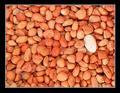
| 04/30/2004 04:24:15 PM |
a rockby 123takeComment: I love the colors in this and the soothing nature of all of the continuity of the pebbles. The composition doesn't thrill me, as it is only color that's guiding me to the larger rock, not necessarily its size, as the challenge of proportion would dictate. I don't usually like borders, but this one "contains" the image well. |
| Photographer found comment helpful. |
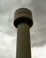
| 04/30/2004 04:22:13 PM |
Gigantic Drum Stickby dirtkahunaComment: Nice symmetry and I like how the clouds seem to be swirling around the tower. The saturation and contrast could really be bumped to make the tower pop like it should. |
| Photographer found comment helpful. |
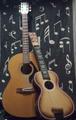
| 04/30/2004 04:15:45 PM |
guitars at restby taterbugComment: A good composition for the challenge. I like the choice of subject. I wish the shot was bigger and crisper so that I could see the details better. |
| Photographer found comment helpful. |
| 04/30/2004 04:12:01 PM |
Disproportionately long Eyelashes!!!by divernickComment: Wonderful closeup shot and depth of field. Nicely framed and composed. The strange white wirey hair kind of messes up the composition for me - I'm drawn to it because it doesn't seem to fit in. (I know you can't just go up and pluck it out though!) |
| Photographer found comment helpful. |
| 04/30/2004 04:10:27 PM |
Preferred pocket proportionsby dodeeComment: The stark symmetry of this shot is interesting, but I'd also like the focus to be just as crisp. I'd like a bit more interesting lighting on it too - it took me a while to figure out what the background was, but I like the abstract nature of it. |
| Photographer found comment helpful. |
| 04/30/2004 04:08:26 PM |
Porpotioned for a GIANTby adrenalindreamComment: I love the subject - the idea of a bat as tall as a building fits the challenge topic perfectly. I wish I could see the top of the bat - the composition leads my eye there and then I'm off in nothingness without the little endcap to allow my eye to come back down to the bottom of the frame again (and I think the edge of the building would do that). Nice colors. I'd like to be able to read the sign on the wall of the building a little better. |
| Photographer found comment helpful. |
| 04/30/2004 04:05:25 PM |
Raindropsby mannjuditComment: Lovely demonstration of proportion - the different sizes of the drops of water, with the largest one pushing its boundaries. Nice color saturation. I find the out of focus blade in the foreground a little distracting to the overall composition. Very nice ... gives me a soothing feeling. |
| Photographer found comment helpful. |
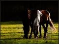
| 04/30/2004 01:59:41 PM |
Sunset Mealby frumoazniculComment: Greetings from the Critique Club
Composition: Wonderfully composed, the brightness of the right horse's mane pulls the eye towards the pair. The matching curves of the horses' backs is very pleasing. The dark background helps to pull the eye towards the highlights on their backs. The cropping is interesting, the way that the subjects are offset. I'm not sure if I'd like to see more of the empty area to the left, isolating the horses more or if I'd like to see it cropped closer.
Background: The darkness of the back makes the subjects pop the forefront. The velvety grass is a great tone/texture to offset their coats.
Camera Work: (Focus/DOF/Exposure) - the focus is crisp and feels right for this shot. DOF and exposure are very good.
Post Processing: The color/saturation/contrast is perfectly appropriate for this shot. If this were not for a silhouette challenge, I might like to see a little bit more detail of the right horse's head, at least a little more highlight on the eyes and brow area.
The Challenge: A nice change from the other challenge entries that were pure silhouette with very little subject detail. It's a wonderful shot in that the left horse is the silhouette, a virtual shadow of the right horse.
My Opinion: A beautifully peaceful shot with nice detail and an easy comfortable feel. I love how the sun hits the right horse's back and we can see the texture of the coat and contours of it's back and legs.
Please let me know if these comments are helpful. If you have any other comments or questions please feel free to PM me. |
| Photographer found comment helpful. |
Home -
Challenges -
Community -
League -
Photos -
Cameras -
Lenses -
Learn -
Help -
Terms of Use -
Privacy -
Top ^
DPChallenge, and website content and design, Copyright © 2001-2025 Challenging Technologies, LLC.
All digital photo copyrights belong to the photographers and may not be used without permission.
Current Server Time: 08/04/2025 10:58:10 PM EDT.