| Image |
Comment |
| 05/14/2004 05:58:25 PM |
Opposites Attractby rmlutgenComment: An interesting take - a large dog, a small dog, a curly haired dog, a straight haired dog, a white dog, a black dog. I might have liked to see the black dog more in frame or the white dog cropped out a little more. Nice balance - the background of a neutral red helps. |
 Photographer found comment helpful. Photographer found comment helpful. |
| 05/14/2004 05:56:29 PM |
The Optimist and the Pessimistby L1Comment: A very interesting set up for this challenge. I like the forced perspective, showing that it is point of view that allows one to judge something as a positive or negative. I would have liked to see a little higher contrast to this shot. Very well done. |
| Photographer found comment helpful. |
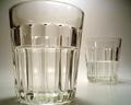
| 05/13/2004 12:37:28 PM |
Smell Dead Freshby frogsComment: You've succeeded in getting a visceral reaction from me! The colors and saturation are really great. The composition and set-up has me missing a little bit of the identity of the toothbrush because of the way it's pointed. But the textures really sell this one. |
| Photographer found comment helpful. |
| 05/12/2004 07:32:09 PM |
Opposite Worldsby the-O-sterComment: Very interesting shot. I enjoy your DOF and courage to leave Downtown out of focus. The color choice is great. |
| Photographer found comment helpful. |
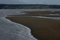
| 05/12/2004 07:31:20 PM |
Opposites Attract/Wet and Dryby ellamayComment: A great shot. I love the curves and forced perspective of the sandbars. The colors are a little muted, perhaps a bump on the contrast would help to brighten it up. Nice composition. |
| Photographer found comment helpful. |
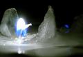
| 05/12/2004 06:21:43 PM |
Fire and Iceby Sweetheart02Comment: lovely color - I like the off-center composition, but I might like to see less on the bottom and more on the top. |
| Photographer found comment helpful. |
| 05/12/2004 04:26:05 PM |
Architecture: New and oldby eirasiComment: A wonderful and original interpretation for the challenge. The choice of framing really highlights the differences. I like the colors, especially the differences between the aqua of the glass and the blue of the sky and then the reflected sky in the left windows. I wonder if a slight rotation CCW wouldn't help to make the line of the walkway feel a little better. |
| Photographer found comment helpful. |
| 05/12/2004 04:24:00 PM |
Dark & Light in One Packageby pmichaudComment: Great colors and composition. I like the detail on the horses noes, showing the little folds. The appropriateness for the challenge is a little thin and I'd like to see a tad more contrast to really show up the black and white difference in the coat. |
| Photographer found comment helpful. |
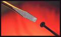
| 05/12/2004 04:22:44 PM |
Water and Fireby s4nd3r99Comment: Excellent idea! The colors on the fire are amazing and the texture and shapes that they create are very engaging. I'd like to see the water lit just a little more to highlight the "opposite" nature of your composition. Good work. |
| Photographer found comment helpful. |
| 05/12/2004 04:21:49 PM |
Different as Black and Whiteby sailracer_98Comment: Nice composition, the border dominates a little too much and I think I could use a little more contrast or sharpness on the phillips head screw ... I like the variations in the background. |
| Photographer found comment helpful. |
Home -
Challenges -
Community -
League -
Photos -
Cameras -
Lenses -
Learn -
Help -
Terms of Use -
Privacy -
Top ^
DPChallenge, and website content and design, Copyright © 2001-2025 Challenging Technologies, LLC.
All digital photo copyrights belong to the photographers and may not be used without permission.
Current Server Time: 12/21/2025 05:24:18 PM EST.