| Image |
Comment |
| 07/31/2007 12:38:31 AM |
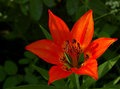
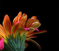
Day 7 - Wood Lilyby PrismComment: (Without reading anyone else's comments)
Very nicely composed and shot. Colors are just on the edge of being too saturated, perhaps dropping overall levels to deepen it would be more soothing. Nice shot regardless. |
 Photographer found comment helpful. Photographer found comment helpful. |
| 07/31/2007 12:37:07 AM |
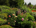
Day 6 - Cottage Gardenby PrismComment: (Without reading anyone else's comments)
Someone takes pride in surrounding them self with color.
Contrast & sharpness seem a touch high here. A deeper, richer green with a deeper black level, and perhaps with a soft focus filter lightly applied would lend to a more pleasing, and less harsh appearance. |
| Photographer found comment helpful. |
| 07/31/2007 12:34:44 AM |
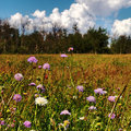
Day 5 - Wildflowersby PrismComment: (Without reading anyone else's comments)
Darn landscapes seem to get in the way at times - lol.
I like the natural look and feel here. A scene we can probably all relate to, seeing nature, just like this. |
| Photographer found comment helpful. |
| 07/31/2007 12:33:10 AM |
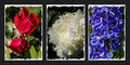
Day 4 - Red, White and Blueby PrismComment: (Without reading anyone else's comments)
Nice Triptych.
Outer images are directed inwards, which helps the balance.
A fine, white pinstripe around each image would have looked better in my opinion, as the white jaggies take away from the flowers.
|
| Photographer found comment helpful. |
| 07/31/2007 12:31:15 AM |
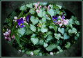
Day 3 - Violas and Friendsby PrismComment: (Without reading anyone else's comments)
I like medleys of colors. Done right, without over saturation can be a very pleasing palette. The oval mat / framing here doesn't work for me, as it detracts from the shot in many ways, making me want to see what behind it. |
| Photographer found comment helpful. |
| 07/31/2007 12:29:03 AM |
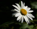
Day 2 - Daisyby PrismComment: (Without reading anyone else's comments)
Nice. Subtle colors, and great use of shadows.
I would prefer a composition with the center of the Daisy to be on the left side of the image, much in the same way a person should be looking or walking into the frame, not out. (most of the time anyway) |
| Photographer found comment helpful. |
| 07/31/2007 12:26:42 AM |
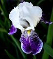
Day1 - Irisby PrismComment: (Without reading anyone else's comments)
I love Irises (or are they Irii? - jk)
The prominent leaf in the foreground serves as a strong leading line, drawing my eye to the delicate yellows. Overall contrast seems a bit high and sharpness seems a touch off in my opinion. This close and sharpness have a tough time finding a happy compromise. |
| Photographer found comment helpful. |
| 07/28/2007 11:59:24 PM |
I read the news today oh boy by whiteroomComment: Read the smile on my face oh boy.
This just makes me smile. Thought about how funny it would look with their papers upside down, but with that serious look, it wouldn't have had the impact this does, as it is. Congrats on another make it look so easy ribbon! |
| Photographer found comment helpful. |
| 07/28/2007 08:17:45 PM |
Day Sixby TuckersmomComment: I've spent too much time in Photoshop.
As I was looking at this on screen, I was looking for the Curves selection to bring down the levels a bit - lol - Firefox doesn't have curves adjustments! I think it could benefit from it some. |
| Photographer found comment helpful. |
| 07/28/2007 08:15:38 PM |
|
| Photographer found comment helpful. |
Home -
Challenges -
Community -
League -
Photos -
Cameras -
Lenses -
Learn -
Help -
Terms of Use -
Privacy -
Top ^
DPChallenge, and website content and design, Copyright © 2001-2025 Challenging Technologies, LLC.
All digital photo copyrights belong to the photographers and may not be used without permission.
Current Server Time: 06/21/2025 06:25:35 AM EDT.