| Image |
Comment |
| 04/26/2005 11:57:04 PM |
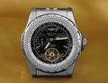
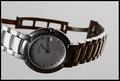
Bentleyby ChinabunComment: Very clean & sharp image.
A little more band showing would have helped this out in my opinion, along with a slight angle to it perhaps? (Seems a bit too static) (6) |
 Photographer found comment helpful. Photographer found comment helpful. |
| 04/26/2005 11:55:57 PM |
|
| Photographer found comment helpful. |
| 04/26/2005 11:55:06 PM |
The Gameby mpembertonComment: I think your intention here was good, but ended up being way too busy, with the jewelry being too small for the shot. Text portion is too wordy here also in my opinion. |
| Photographer found comment helpful. |
| 04/26/2005 11:53:04 PM |
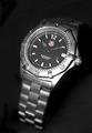
Tag-Heuerby michael_pComment: Well composed and good control of the lihting/lack of reflections.
Not real sure the band falling that much out of focus that fast feels right though. |
| Photographer found comment helpful. |
| 04/26/2005 11:49:08 PM |
The only one I wearby GautiComment: Good job on the lighting / shadows (or lack of) here.
Not sure I would be tempted to buy this one - it's all scratched up (just kidding!) - We gotta' work with what we have at times and pretended it was a brand new one for this shot. |
| Photographer found comment helpful. |
| 04/26/2005 11:47:14 PM |
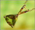
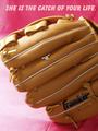
Catch of your lifeby lissylouComment: Clever idea, but the ring seems to get kinda' lost in the image. The glove is just taking control here. Perhaps a tigher crop may have helped. Pink background is a bit distracting in my opinion. If it were more subdued more, it possibly would have softened it a little.
Did you try this with different fonts? Needs a feminine feel. (6) |
| Photographer found comment helpful. |
| 04/26/2005 11:15:36 PM |
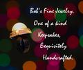
Bob's Fine Jewelryby strangeghostComment: Having a hard time with this one.
The ring isn't lit well enough in the band to really make out what it is.
The text is so big/spaced far apart it is difficult to read.
The background is pretty unique and cheerful. (5) |
| Photographer found comment helpful. |
| 04/26/2005 10:53:39 PM |
Visit Arizonaby justineComment: Lighting, background & composition work pretty well here.
Text/font used are taking a lot away from this submission in my opinion. |
| Photographer found comment helpful. |
| 04/26/2005 10:52:11 PM |
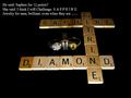
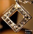
Diamonds Foreverby kevrobertsonComment: Composition works for me, as well as the text layout.
Personally the font used could have a little more feminine flair to it, which would soften teh feel there.
I'm sure you have received comments about the lack of detail here and can only suggest less of a crop, not shooting too close to the subject, a smaller aperature (if available).
Decent attempt at a difficult subject. (5) |
| Photographer found comment helpful. |
| 04/26/2005 10:33:34 PM |
Silver Heart Earringsby postoakinversionComment: Focal point seems to be more drawn to her eyes, than the earring (which looks a bit over-sharpened in my opinion)
I like the direction/idea you went with this to soften the overall look. |
| Photographer found comment helpful. |
Home -
Challenges -
Community -
League -
Photos -
Cameras -
Lenses -
Learn -
Help -
Terms of Use -
Privacy -
Top ^
DPChallenge, and website content and design, Copyright © 2001-2025 Challenging Technologies, LLC.
All digital photo copyrights belong to the photographers and may not be used without permission.
Current Server Time: 06/28/2025 12:01:24 AM EDT.