| Image |
Comment |
| 05/01/2005 04:19:13 AM |
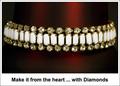
Keep them close to your heartby dsa157Comment: B & W works well here, and I like the offset comosition of this shot.
Your text / font is a style that seems to work with this, as it's not gawdy, nor too big.
Overall a pretty decent shot with one minor distraction: The black spots on the metal. (6)
|
 Photographer found comment helpful. Photographer found comment helpful. |
| 05/01/2005 04:16:03 AM |
*by Moose101Comment: As I sat here looking at this shot, I struggled to figure out what it was that was so different about it then it suddenly hit me - the white border/framing.
This is a case of the border/framing actually working for the shot instead of against it. An advertisement would/could look very similar to this kind of lay out.
Composition is decent and the red in the background adds dimension instead of the jewelry floating in space. Overall, a pretty good take on the challenge. (6)
|
| Photographer found comment helpful. |
| 05/01/2005 04:12:03 AM |
Take the Leap: Buy Me!by dsidwellComment: Pleasant shot to look at, with natural colors.
Background is complimentary with a natural feel and the lighting on the jewelry brought out it's colors. Detail level is good as is composition.
The title may be a bit too "cute" for advertising. (6) |
| Photographer found comment helpful. |
| 05/01/2005 04:08:28 AM |
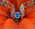
The Giftby GolferDDSComment: Unusually bright in a way, and is certainly one to pop off the page.
The Red/Orange is bolder than it really should be for an advertisement. The chice of the blue text to match the color of the stone would normally be good, but is very difficult to read against that color background. (5) |
| Photographer found comment helpful. |
| 05/01/2005 12:22:15 AM |
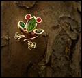
Girls can never have enough jewelry!!!by singsunshineComment: Ahh...kids being kids.
From a Jewerly Advertisement standpoint, this probably wouldn't work too well with the sepia toning used. Shadows from the flash add a certain element of harshness, but not all of us can have expensive equipment at our disposal.
Thanks for sharing a cute shot, that I'm sure will be far more meaningful in years otcome than just a macro picture of a ring or similar. (5) |
| Photographer found comment helpful. |
| 05/01/2005 12:19:19 AM |
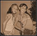
Diamonds Are A Girl's Best Friendby DeniseBernadetteComment: Cute shot and put a smile on my face when I saw it.
Not really sure this fits the "classic" Jewelry Advertising look, but this one will probably by far be more meaningful years down the road. (5) |
| Photographer found comment helpful. |
| 04/30/2005 05:01:53 AM |
February by nico_blueComment: This was a surprise.
The thumbnail certainly didn't do this justice. The reflected banding is a nice touch, and overall the clarity & detail is very good. Colors work well overall here, and the text / font used work for me. (7) |
| Photographer found comment helpful. |
| 04/30/2005 04:59:46 AM |
Citizen Blueby SandmanComment: Oh to have had just a little more in focus....
I really like the composition and lay-out here, and espcially like the color.
Well chosen title too. (6) |
| Photographer found comment helpful. |
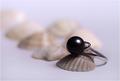
| 04/30/2005 04:58:27 AM |
The Black Pearlby vasilkovayaComment: Nice soft lighting used and a pretty decent lay-out.
I only wish the depth of field were a little wider so the focus didn't fall away so fast.
Good clarity & detail in the jewelry. (6) |
| Photographer found comment helpful. |
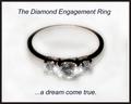
| 04/30/2005 04:54:44 AM |
...dream come trueby lilnukeeComment: Suspect you were thought to be a cheater in your editing?
I have no idea why either.
This is a nice image, but perhaps a littlon the too soft side. Text/font used is a bit plain and a more feminine/italic style would look a little nicer in my opinion. (6) |
| Photographer found comment helpful. |
Home -
Challenges -
Community -
League -
Photos -
Cameras -
Lenses -
Learn -
Help -
Terms of Use -
Privacy -
Top ^
DPChallenge, and website content and design, Copyright © 2001-2025 Challenging Technologies, LLC.
All digital photo copyrights belong to the photographers and may not be used without permission.
Current Server Time: 06/28/2025 08:48:41 AM EDT.